Hm.. as usual the composition is pretty good (for the most part you seem to have no problem laying things out), but something you still need to work on is your anti-aliasing. It's most prevalent in the text of the above image, but is much more obvious in the "logo" image in your DA account.
The thing you want to avoid is those little white "dots", which can especially be a problem when using fill colors. Take the below image for example:
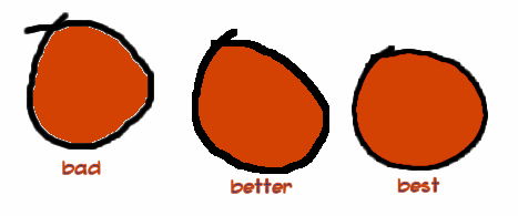
These were colored three different ways. The first circle was drawn with an anti-aliased brush (or scanned in) and then colored with the flood fill. Anti-aliased lines look smoother because of the little gray pixels along their edges, but if you try to fill the area around them it'll only affect the
pure white pixels. All the little in-between gray shades don't get colored, leaving behind the residual "white pixels".
The second circle was either drawn with an aliased brush (as in, no gray-shades near the edges; pure black and white) or scanned in and then reduced to two colors. A flood fill usually works fine on images like these, but their sharp, jagged edges don't look great. Most programs can anti-alias edges by shrinking the image down to 50% or so, though.
The last circle manages to have anti-aliased lines and nice coloring because I colored it on a separate, "multiply" layer. If Paint.net has layers, it probably has the option of changing their blending type. The "multiply" setting is kind of like coloring with watercolors; you can paint right over black and it'll still be black, but if you paint over white it'll get colored. Overall, I'd just suggest playing around a bit on a blank canvas with drawing basic shapes and coloring them to see what gives you the nicest looking lines with the least artifacts on them.
As far as lettering goes, your handwriting is okay, but the black text with a black shadow makes it difficult to read from more than about five feet away. Instead, consider no shadow or doing white text on a dark black shadow. With a T-shirt design especially, you want to aim to make it readable even from very far away. Also, for the logo, a ruler and compass (
this kind) will make your straight lines and circles much neater.
Do you have Open Canvas 1.1? If so, care to join a server with me sometime? Even if you don't have a tablet, I can show you a few tricks that will really improve your character illustration, and it's a pain describing visual concepts in text alone.