It's been a month, so this feels like a great time to take stock of people's votes and figure out how to go forwards from here. I'm including screenshots of the poll results because the pie charts are nice, but screenshots of text aren't accessible,
so you can still view the results in spreadsheet form too.
Individual question results:
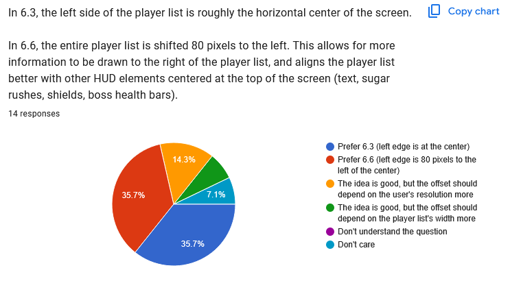
This is a pretty even split, but based on the next two questions, it seems we'll need more information drawn to the left of the player list, so it's going to make sense to move the list back to the right again.
I'm grouping these two together because they're so related. Additionally, Faw wrote in the "Is there anything else" question at the end:
Quote:
|
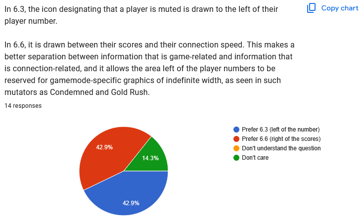
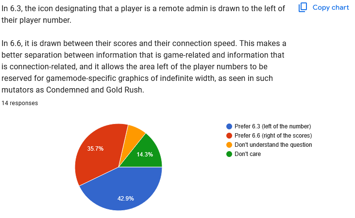
I've missed a question about the position of playerlist symbols (admin, mute). Upon playing I started to be frustrated to see them on the right, inbetween scores and ms. I prefer to group those all left of the player number. (Mute, version, admin, player number) in column order.
|
Faw had voted 6.6 (right) for the first question but 6.3 (left) for the second question, then forgot he'd done so partway through the survey, so really the first question should
also be a 6.3 plurality.
In summary, players prefer the Admin and Mute symbols to be on the left of the player list, not the right. Again, this means it is not practical to move the player list to the left, because that would leave very little room on the screen for gamemode information.
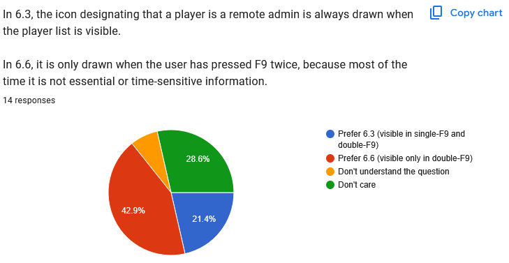
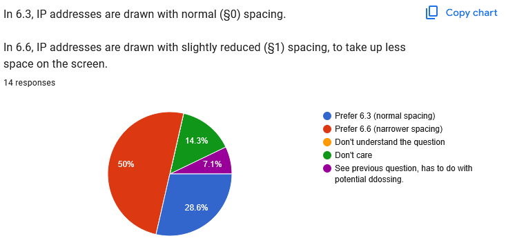
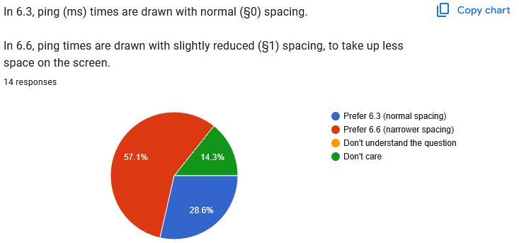
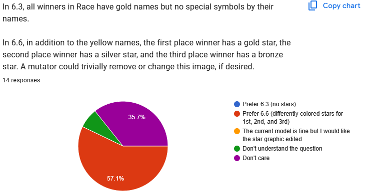
Clear 6.6. preference.

"Don't care" is the winner here. After making the above changes (moving the list back to the right, moving the icons back to the left), I'll see how much room there seems to be and how practical it is to allow two columns. I wonder if people just don't mute each other very much and that's what we're seeing here?

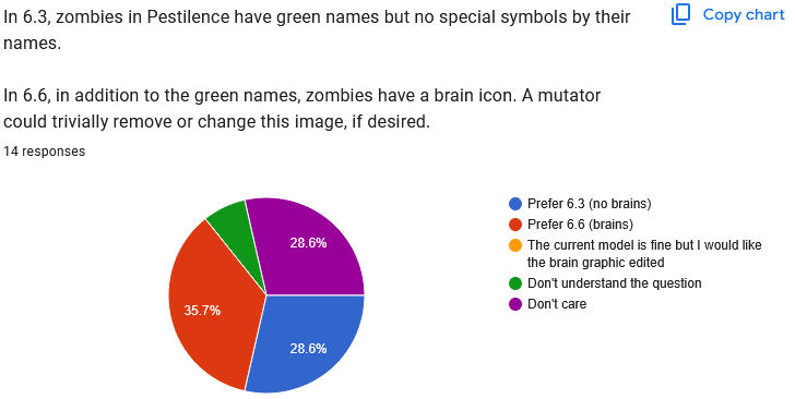
Perfectly even split. Just going to stick with 6.6 because it's cleaner.
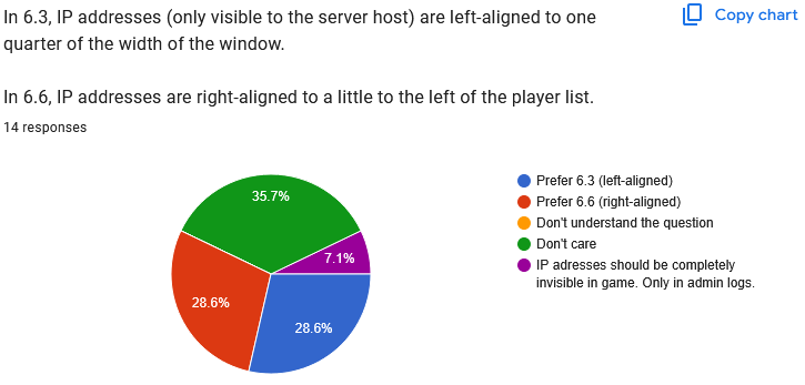
Another even split. Again, after moving the list/mute/admin symbols around, I'll have to see which option makes more sense for IP addresses.
Quote:
|
IP adresses should be completelyinvisible in game. Only in admin logs... has to do withpotential ddossing
|
(I combined the free-text responses from this and the next question.)
This seems to be based on a misunderstanding of either the question, the internet, or JJ2+. Let's go over these points:
- IP addresses have only ever been visible in this way to the server host, not to admins. The question is about the player list, not the /ip command.
- If you use the internet to connect your computer to another computer, inevitably they will see your IP address. This is just how the internet works. If you don't trust a server host not to ddos you, you should not join their server. Hiding your IP from the ingame player list has zero effect on whether they can ddos you.
- If you're worried that the server host might be streaming their server, and therefore your IP address might be visible to viewers, you can ask them to enable JJ2+'s Streaming setting.
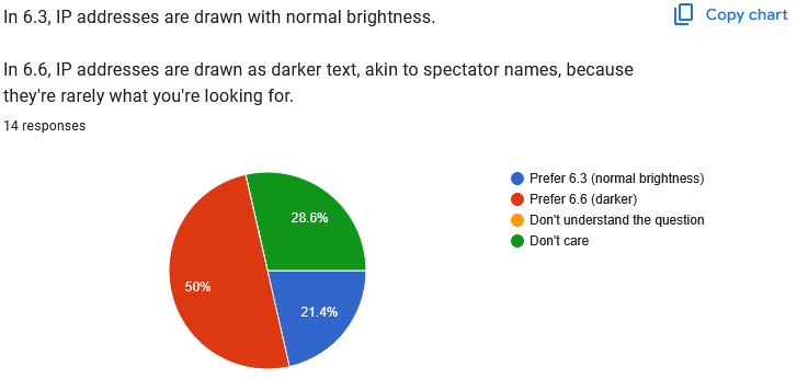
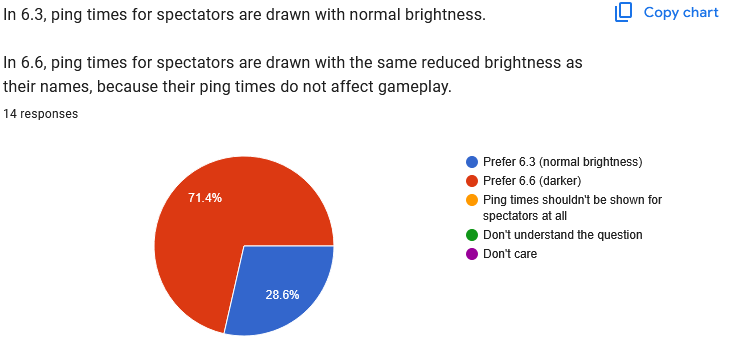
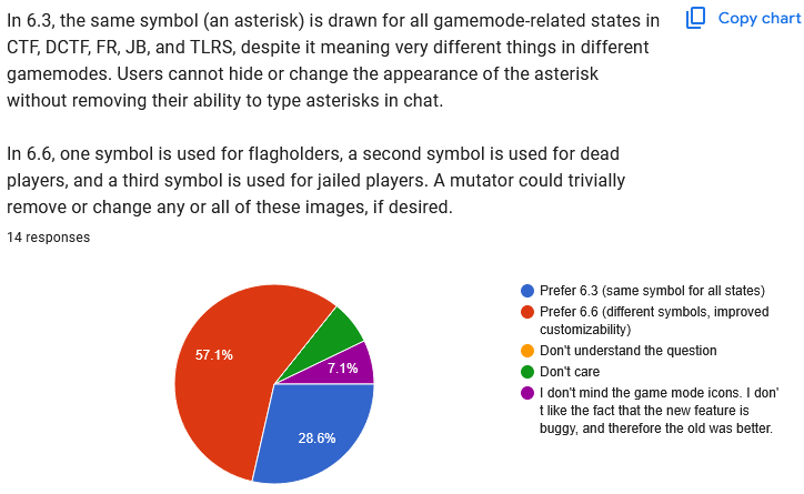
Clear 6.6 preference.
Clear 6.6 preference.

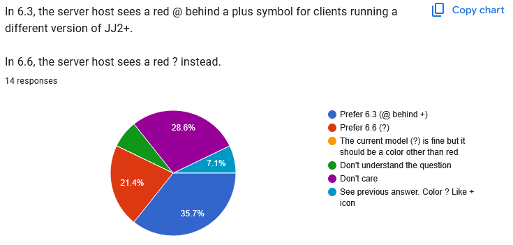
Okay, this one's hard. There's not an obvious answer here at all. I think you can make a case that a plurality of people doesn't want to see a + next to every player in servers where every player is running JJ2+. Whether to implement that with + or - symbols is a little murkier.
It's been mentioned to me that the - icons aren't currently showing while people are still connecting to the server, out of fear that the information will be inaccurate, but I don't know for sure whether it's inaccurate at that stage or not. I'll have to experiment and see if that would make a difference here, because that might be the reason for some people's hesitance.
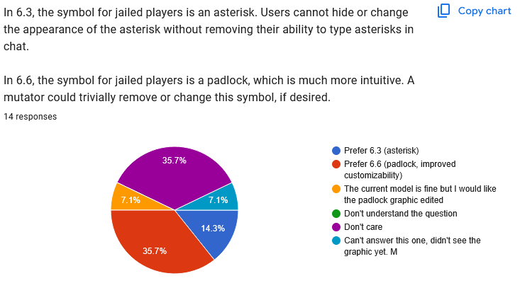
Clear 6.3 preference.

Clear 6.3 preference, at least within people who have opinions.
This is being discussed in this thread. My worry is that people want to see this information because there's some unknown problem with 1.23 clients that they haven't reported, so if that's the case, I hope it does get reported. In the meantime, sure, they can be distinguished somehow.
Clear 6.6 preference.
Clear 6.6 preference.
Clear 6.6 preference.
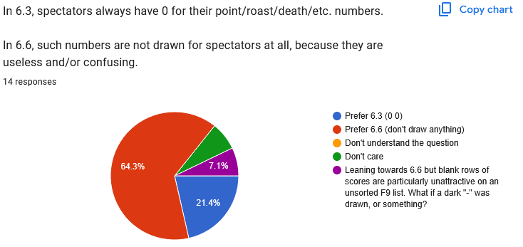
Quote:
|
Leaning towards 6.6 but blank rows ofscores are particularly unattractive on anunsorted F9 list. What if a dark "-" wasdrawn, or something?
|
This an interesting point. Maybe, yeah, do this
only when the list is unsorted? It's worth trying out at least.
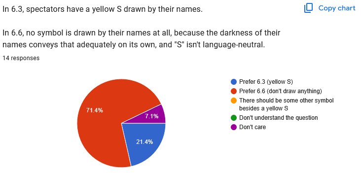
Clear 6.6 preference.

Clear 6.6 preference.
Quote:
|
This function resets every time I restart the game. This way Im definitely in favour of reverting.
|
This was user error. (See my previous reply.)
Clear 6.6 preference.
Clear 6.6 preference.
Clear 6.6 preference.
Quote:
|
I don't mind the game mode icons. I don't like the fact that the new feature isbuggy, and therefore the old was better
|
Currently there are
two known
bugs, and no clues for how to reproduce the second one. Any contributions to identifying these bugs is appreciated.

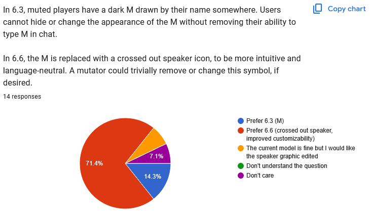
Clear 6.6 preference.
To the players who are asking for the flag icon to be redrawn, I don't have time right this minute, but later I'll try to track down the history of flag icon redraws we've had so far, for context, and we can definitely throw ideas around for further redraws from there, once we've identified what issues people may have with the current design.
Clear 6.6 preference.
Clear 6.6 preference.
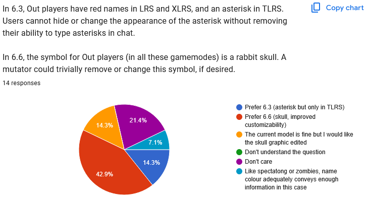
Quote:
|
Like spectatong or zombies, namecolour adequately conveys enoughinformation in this case
|
This is not true, name color does not change for Out players in TLRS.

Clear 6.6 preference.
Clear 6.6 preference.
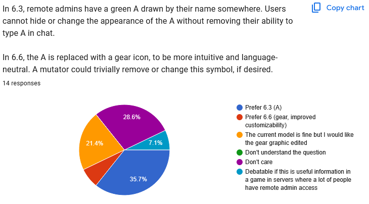
Clear 6.3 preference. It looks like we'll be reverting to a green A for now. To the people who would support the gear if it were redrawn, I support your efforts to redraw it, but I've drawn so many different gear icons at this point that I personally need a break.
Quote:
|
Debatable if this is useful information ina game in servers where a lot of peoplehave remote admin access
|
There are indeed some servers where lots of (or all) people are remote admins, but the default server behavior is definitely not that.

Well, this one is absolute chaos, huh? I have another idea that doesn't appear on the poll, maybe we'll try that, and then just keep experimenting with other ideas until we get to a point where people feel happy. This doesn't need to be solved in one update, we can keep trying.
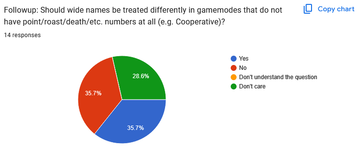
Yeah I dunno either!
Free text responses:
Quote:
|
Basically I just didn't like 1) the eyes icon for spectators 2) how freaking long my name looked as "[CDF]spaceboy" plus the flag icon when I had the flag, and 3) how cramped longer names look in the playerlist (almost unreadable) but everything else is good. I think greyed out names with no roasts/deaths indication suggest spectators anyway, so no need for something extra.
|
The eyes icons for spectators have already been removed, and based on question 16, most people agree that there's no need for an extra icon at all, so good news on this front.

Otherwise, yeah, the long names issue is a tricky one with no consensus on how to solve it! You very possibly have the longest name among active players, so it's no surprise that it affects you the most.
This next free-text response I am breaking into three because I think it covers several different points:
Quote:
|
Please do not change anything to the game unless you are sure it does not affect anything except for the fix... I do not see why this new playerlist couldnt have been tested thoroughly first.
|
In an ideal world, yes! This would happen! Let me be realistic here, however.
Releasing JJ2+ updates is the only reliable way to get code tested.
I've tried
public tests. I've tried
private test groups. I've tried sending test builds to other people on the JJ2+ team. All of them work
sometimes, but in general, the best case scenario is that somebody maybe tests some code
a year or two later, because otherwise, no matter how much people clamor for code to
be tested, people are not themselves willing to
be the ones who test it. And that's just not reasonable. I don't want to put together a feature and then forget about it for years until somebody finally downloads a zip. More to the point, I don't want to still be doing this a year from now! I want JJ2+ to be
done!
Quote:
|
Please refrain from doing anything that is not fixing.
|
This is not a good idea.
Quote:
|
Please find out how to communicate with the current playerbase. I recommend visiting the jj2 multiplayer discord and website. And I recommend joining zeal duels frequently on Saturdays.
|
I don't think this is a fair description. It's true that there are people who are using websites other than J2O, and there's nothing wrong with that. There have always, always been multiple active JJ2 fan websites, even if currently we have fewer than usual. But using a different website instead of J2O doesn't make someone the current playerbase, it makes someone
part of the current playerbase. People who don't use J2O (or the discord server that J2O links to) are deliberately choosing not to participate in the JJ2 community in many ways. They don't participate in discussions, they don't upload or review levels or tilesets, nothing. There are so many topics I've never seen them react to. There's nothing wrong with being more interested in competitive multiplayer than other aspects of Jazz Jackrabbit. There's nothing wrong with using a different website if it gives some functionality that they want, like tracking player scores across different levels. But there are other people in the community, people who do actually use J2O for example, and it's not fair to minimize them just because they interact with Jazz Jackrabbit in other ways.
And personally, whenever I look at Zeal Duels, it's hosting CTF. I am so tired of CTF. JJ2+ has so, so many gamemodes.
Quote:
|
I don't mind the new icons and some decisions, but I really don't like that these features broke functionality. More like: Why fix something when it wasn't broken?
|
I'm reposting the links to the
two known
bugs. As for what was broken, I've written about this a lot already, especially in
this news post and the text of the google form itself, which design issues were being fixed by each individual change.
Quote:
|
The option to turn off team colours in names (mainly for server hosting tests)
|
The
gamemode for test levels should take care of this problem better.
Quote:
|
Dynamically widen the score for wider names on top of paragraph 1 spacing, but max like 20 pixels. Acknowledge more just breaks it.
|
yeah, maybe, that's one option.
Quote:
|
I've missed a question about the position of playerlist symbols (admin, mute). Upon playing I started to be frustrated to see them on the right, inbetween scores and ms. I prefer to group those all left of the player number. (Mute, version, admin, player number) in column order.
|
(Addressed higher up in this reply.)
Quote:
|
There is a number next to the server name (on the left). (For example: "2 ZD 2"). I think that numbers should only appear next to player names. There should be no numbers next to the server name. Or perhaps they could be marked in pale gray or with a 0. Beginner players may think that the "player" marked with a number is in observer mode.
|
I believe you're the one who's confused here. The player marked with a number (ZD 2) is indeed a spectator, a spectator who happened to join the server with the name ZD 2. The server's name is not "ZD 2," it's "Zeal Duels 2." The server host is player 1, not 2, and you don't see them in the player list because they're using idle server mode, which hides them from the player list. When server hosts are
not idle, they
do appear in the player list, because they are players like anyone else.
Quote:
|
Perhaps there shouldn't be a rabbit's head next to the flag bearer's name. It takes up too much space in the background of the game. Maybe a smaller star symbol would be better.
|
I don't understand this point at all, because as far as I know, there is not a rabbit's head next to the flag bearer's name.
Summary:
For the most part, 6.6's changes have been received positively. The things that seem like they'll need to change back, or change again, are:
- The horizontal positions of the player list, the mute icon, and the admin icon. (And possibly IP addresses.)
- The admin icon itself.
- How to handle long names.
- Indicating (to server hosts) 1.23 clients.
- Indicating (to server hosts) players running a different plus version.
- Possibly how to distinguish plus and vanilla players.
I'd also like to thank everyone for sitting through a very long, very detail-specific poll. We're all in this together to find the best design for the player list--and for JJ2 in general--and granular feedback like this is really helpful.