People lose interest in your upload the very moment they see its preview. This is your level:

These are some other recent single player levels that use the same tileset:

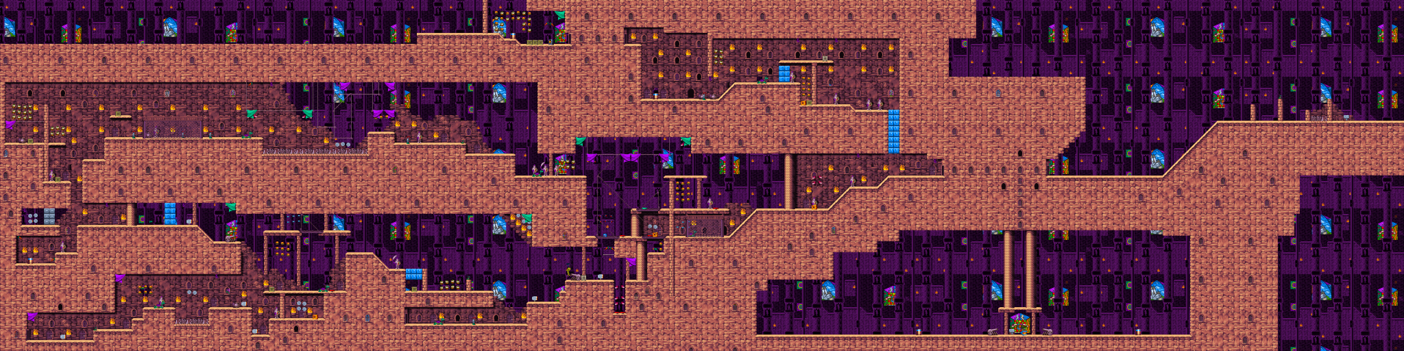

People who value their time initially judge uploads by preview, and if it doesn't catch their interest, they don't download. You don't have to spend a lot of time comparing these pictures to come to conclusion your level is not up to standards, and you don't have to download and play it to be able to tell it's probably not worth the time. Notice that the levels I used for comparison are not created by some sort of masters of level design - in fact, two of them come from their respective authors' first ever uploads on J2O.
I didn't download your level and won't review it but if you'd like a breakdown of what's so discouraging about your preview, I can criticize that. First thing that comes to mind is complete linearity - this level is one corridor and several detached rooms one can expect to be connected by warps. When I play single player, I generally want at least an illusion of non-linearity: alternative paths to the same place, small dead ends that contain pickups, secrets, trigger scenery that requires visiting another location, &c. Second but related flaw, this level looks like it could be beaten by simply running and ignoring whatever obstacles it throws at you. It depends on how exactly the rooms are connected and what's in them, but at least the corridor surely doesn't look long enough to lose all hearts by carelessly running through. Third and very obvious is visuals. Your level looks like it may be using only layer 4. There is only one small room in which the purple background is visible and from the preview I'm getting the feeling it's also placed on layer 4. This makes the level look flat and unappealing. Even interiors can use multiple layers to improve visuals. Layer usage is one thing, but the other is how uniform the level looks. All blocks are the same. There's one block you used for solid ground and one you used for background, using other blocks only where the two meet in order to avoid tiling bugs. The Castle tileset offers over 30 variatiations of basic ground blocks and background, and while nobody wants you to fill the level by picking them from the tileset and placing each individually, you should at least put minimal effort into providing some variety (the 'B' JCS hotkey comes in useful). Finally, there's eyecandy, of which this level appears to have very little. I can see some windows, some doors, one armor, one short bridge, and three torches in a single group. The tileset provides you with columns, cannons, vases, chains, and curtains, none of which are in this level. I'm not saying to use all of them, but you have to use a variety and place them often, in configurations that are pleasant to the eye. I think that's about it.
__________________
I am an official JJ2+ programmer and this has been an official JJ2+ statement. ||||||||||||||||||||||||||||||||||||||||||||||||||
|