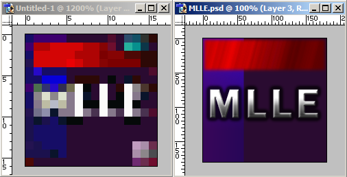
It occured to me rather quickly that remaking the original icon is useless:
So, I decided to try random things until I did something that I thought was decent:
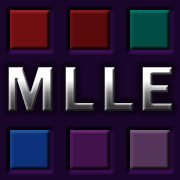
I think it resembles the original well enough. At first I tried to recapture the "multi-layer" part of the name but couldn't without making it look dumb, so I settled for some cheap bevel and decided to call it a bunch of buttons.
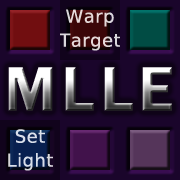
I also made a silly variation:
They even scale to 32x32 quite well!
 
Last edited by cooba; Dec 3, 2024 at 05:12 PM.
|