


| Jun 3, 2005, 04:15 PM | |
|
My art-warning: of very low quality.
    Yeah, It's all Sonic X, except the red-headed girl is my main fancharcter, Ki the fairy, I'm working on a bunch of JJ2 fanart, but considering how bad I am at drawing animals, It could take awhile. And again, I don't expect anyone to actually LIKE my art. |


| Jun 4, 2005, 11:32 AM | |
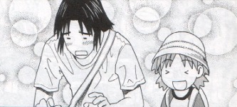
|
Yes, I am in fact a girl. Also, I'll try to get the face positions right next time.
|
| Jun 4, 2005, 12:24 PM | |
|
Ello, small child. If I have not introduced myself, my name is Radium, and I'm the local everything critic, and owner of http://www.foxmage.com, a website with no actual content (storage, mostly). I try my best to give insightful constructive criticism to help people improve, and insightful destructive criticism to amuse myself. I will now commense my detailed analysis of your four submitted drawings, in order to see if you redeem yourself for that unrhyming piece of poetry you posed in the Comedy Cafe. Heck, to see if you can redeem yourself for posting in the Comedy Cafe in the first place.
Allow me to start my process with the first piece of your work, the one that depicts two people either kissing or crying on eachother or whatever. I don't care what they're doing, in fact. At your level, I'm mostly here to critique digital things and anatomy. First off, a lesson in digital art: floodfill is a privelage, not a right. A common misconception by new artists is that they can scan in a sketch, reduce it to two colors, and floodfill away. Don't do this. It gives you ugly, blocky lines with white spaces in them. Work around this. If you have a tablet, color things in manually (usually on a multiply layer) instead of using the floodfill. If you don't have a tablet, learn to floodfill antialiased lines. How to do this really depends on the software you're using. Now, let's talk about shading. Your figures look flat. There's no depth to them. To correct this, shade! Highlight parts of the hair (ridiculously so, this is anime!). It will give your characters depth, and make them look better. Especially add some reflection on that tear. Make it shiny. Shiny things are powerful and special. Also, don't put a black outline around the white reflective thingies on her eyes. It ruins the shinyness. Anyway, on to anatomy. First of all, the girl's mouth is way too low. Go find a picture of a human skull (or, examine the one below). Note the chin part. She needs this. Also, your hair seems random. Go find someone with hair, and draw it. Hair is complicated and takes work to master, but it's not just random lines. Work on eye and ear positioning, too.  Anyway, now on to the happy winged gal. Let's start with a lesson in wings. Those are bad wings. What you intended them to look like depends on what sort of wings they were supposed to be.  This is a bird wing. It has three joints, two of which are important. Note how it has feathers, and they fan out on the last portion.  These are insect wings. They usually come in fours. I never studied into these much, but they are probably something closer to what you are looking for. Note the oval shape, and four-ness. Now, the most important part: body structure. First of all, she's way too thin. Her hips should be at least as wide as her shoulders, especially with her arms raised like that. Also, you might want to try planning out the basic form before you draw the character. They will end up a lot more realistic that way. Her arms are too thin, also. Anyway, next I'll critique this tied up guy. His neck should connect to the middle of his head, not the left side. And it looks like you tried shading this one. It's a good start, but if you shade something you can't pick-and-choose what parts to shade. His face in general seems a bit off. It's hard to tell what part is his face. I also wouldn't put outlines around the kiss marks; it puts too much emphasis on them. In general, outlines go on 45 degree or greater angles. Aaaand lastly, this dancing girl. Her right arm is longer, her right breast is larger, and her right eye is higher. Her other eye is a bit too far to the side, also. Again, the thing with the hips. The lines on this one look smoother, though, like you drew it larger and scaled it down. Good job on that. So, I ran out of things to say. Someone else continue.
__________________
GENERATION 22: The first time you see this, copy it into your sig on any forum and add 1 to the generation. Social experiment. <i>"This picture shows me that the gray bird man is just a bully and picks on smaller birds. Just because he has no friends and takes it out on others smaller than him to look good. I can see in the parrats eyes that it does however have a understanding of the gray bird man and is upset about getting cut."</i> - Speeza on cartoon birds. |

| Jun 4, 2005, 01:59 PM | |
|
Her wings were MEANT to be like that. She is a FAIRY. Not a bird. Not a bat or insect. A FAIRY. Her wings were MEANT to be like that.
Otherwise, thanks. |
| Jun 4, 2005, 02:18 PM | |
|
A fairy? Well most fairys use butterfly wings, but I n00b know better than to give youbog standard info! My knowledge told me of a fairy named Lumina(or something like that) from the game Sonic Shuffle! Since your art is Sonic related one way or another, I have decided that is the prime oppurtunity to show you the picture of said Lumina:
 Look at her wings, and let that sink in for a while. EDIT: I would like to tell you she is flying so her wings are in motion. |

| Jun 4, 2005, 02:44 PM | ||
|
Quote:
Why don't you let that info sink in for a while while I go spend my time doing somthing more productive than listing to you talk about what fairies SHOULD look like. |
||
| Jun 4, 2005, 02:57 PM | ||
|
Quote:
If a game bombed the character art must be of the lowest quality!!! And seriously, google Fairy and tell me if any of those pictures has wings like yours. EDIT: Ok, so now i have found a fairy with a wing style closet to yours (SURPRISE! It's based off an insect's)  And now look at that, and now look at yours. In a sec I'll have a drawing up explaining the difference. |
||


| Jun 4, 2005, 06:58 PM | |
|
Now kids, follow N00b and I's example and use hardcore logic to crush people's spirits, not petty attacks.
__________________
GENERATION 22: The first time you see this, copy it into your sig on any forum and add 1 to the generation. Social experiment. <i>"This picture shows me that the gray bird man is just a bully and picks on smaller birds. Just because he has no friends and takes it out on others smaller than him to look good. I can see in the parrats eyes that it does however have a understanding of the gray bird man and is upset about getting cut."</i> - Speeza on cartoon birds. |

| Jun 5, 2005, 07:17 AM | |
|
Why do I feel like everone except Sers, Fawriel, and Odin hate me. Okay, I get it, my art stinks, but are the aimated gifs of me getting beaten to a pulp really nessar? Oh and FOR THE LAST TIME: FAIRIES ARE MYTHICAL CREATURES!! THERE IS NO FIXED STYLE OF DOING THEM!
|
| Jun 5, 2005, 07:51 AM | |||
|
Quote:
Quote:
__________________
GENERATION 22: The first time you see this, copy it into your sig on any forum and add 1 to the generation. Social experiment. <i>"This picture shows me that the gray bird man is just a bully and picks on smaller birds. Just because he has no friends and takes it out on others smaller than him to look good. I can see in the parrats eyes that it does however have a understanding of the gray bird man and is upset about getting cut."</i> - Speeza on cartoon birds. |
|||
| Jun 5, 2005, 08:00 AM | ||
|
[QUOTE=Radium]I never said I HATED you. I'm a critic. This is my job. I either help people improve or crush their spirits. It's their choice how to take it.[QUOTE]
And I just followed Rad's example since I believe he said: Quote:
SONIC SHUFFLE BLOWED! AND BECAUSE THAT GAME BLOWED I'M NOW NOT TAKING OF YOUR ADVICE DESPITE THE FACT IT MAY OR MAY NOT BE HELPFUL! Or at least that's the impression I got. Oh, and I'm sorry to say but there is a rule that wings are wings, and therefore you cannot make up your own non-working wings and try to have your art taken seriously if it's not meant to be shoddy. |
||
| Jun 19, 2005, 06:23 AM | ||
|
The wings on the Faerie are just flat, not special or anything. They're not detailed. The pictures the others posted are good examples for detail. The bodies of the others are waaaaaaaaaaay to thin, the feet are too small and you don't shade. It looks just flat. The hair is also way to big, and don't dare blame it on style because style should atleast be somewhat anatomically correct. If you had hair like that it would probably rip your head off. The arms are too small and too thin. The shading on the third pic is well... bad, it is too dark and too fat. You should zoom in and do it carefully. Determine a light source. The shoulders are WAAAAAY to... well, Ki doesn't even have shoulders...
http://www.howarddavidjohnson.com/light_source-1.jpg http://www.howarddavidjohnson.com/light_source-2.jpg Oh, and it is dumb of you to not accept crits because someone said he took a quick ref from Sonic Shuffle -.-. If you continue doing that, you will never get better. Don't defend yourself with "My faerie should be like that stupid loser!!!" but try and improve your flat wings on the pictures and get some detail in it. Links to other faerie pics: http://www.sjgames.com/wallpaper/img/faerie-1024.jpg http://www.jalekro.nl/produkten/faer...ets/elfjes.htm Quote:
Edit: Okay, I removed the url thingie too. Here some more wing pics, they are a bit big though: http://www.unitedmaskandparty.com/Ha...airy_wings.jpg http://www.bumpinthenightproductions...4/flywings.jpg http://www.costumesinc.com/Costumes/.../60240-std.jpg
__________________

Last edited by Arti; Jun 20, 2005 at 08:11 AM. |
||


| Jun 20, 2005, 10:56 AM | |
|
Thank you all, and now, 2 more pics:
http://www.sonicverseteam.com/fanart....php?pos=-5596 (severly mutated ki) http://www.sonicverseteam.com/fanart....php?pos=-5802 (Don't ask, it just happend) Edit: Fixed the link Last edited by Kaine Jackrabbi; Jun 20, 2005 at 11:11 AM. |
| Jun 20, 2005, 11:12 AM | |
|
Hmmm, a pretty good start indeed. It looks pretty good. The only thing is that the arms and legs don't look right.. they look disjointed. Like they don't belong to the body, but are kind of floating in front of it.. see it?
EDIT: Uhm.. that was for the Chao thing.
__________________
 |
| Jun 20, 2005, 11:13 AM | |||
|
Quote:
Quote:
|
|||

 |
«
Previous Thread
|
Next Thread
»
| Thread Tools | |


|
|

All times are GMT -8. The time now is 11:07 PM.
Jazz2Online © 1999-INFINITY (Site Credits). Jazz Jackrabbit, Jazz Jackrabbit 2, Jazz Jackrabbit Advance and all related trademarks and media are ™ and © Epic Games. Lori Jackrabbit is © Dean Dodrill. J2O development powered by Loops of Fury and Chemical Beats. Powered by vBulletin® Copyright ©2000 - 2026, Jelsoft Enterprises Ltd.
Original site design by Ovi Demetrian. DrJones is the puppet master. Eat your lima beans, Johnny.