


| Jan 12, 2007, 01:59 PM | |
|
I draw stuff.
Umm, yeah.
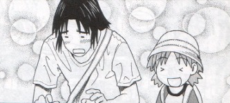
So.  Just the opening page of my current sketchbook.  Army girl. Yeah, girls must serve in the army too over here. Well army uniform isn't that bad   Ah-huh.  Those are Bunneez, actually.  Skinny Puppy fan art [I like them ^^].  By the way, the little Chibi me is saying "OMG freaks".  Me, in a less anime-ish way.  And this is just... well, a dragon. Au-revoir!
__________________
<a href="http://www.last.fm/user/omgklz/?chartstyle=GlowinGreen"><img src="http://imagegen.last.fm/GlowinGreen/recenttracks/5/omgklz.gif" border="0" /></a>
|


| Jan 12, 2007, 02:35 PM | ||
|
S'more.
   Quote:
I'm ok with that, I guess.
__________________
<a href="http://www.last.fm/user/omgklz/?chartstyle=GlowinGreen"><img src="http://imagegen.last.fm/GlowinGreen/recenttracks/5/omgklz.gif" border="0" /></a>
|
||
| Jan 12, 2007, 02:47 PM | |
|
kaleidoscopiklimax
also, SKWEEEE. this is win. |


| Jan 12, 2007, 08:17 PM | |
|
I like your work. Especially the stylized/surreal stuff. It looks like you have a good basis in art. Keep it up!
__________________
<div style="float: right; width: 100px; height: 70px; margin: 5px 15px;"><img src="http://madskills.org/monolith/idleserver.gif" style="width: 98px; height: 65px;"><img src="http://madskills.org/monolith/theserver.gif" style="width: 98px; height: 65px; position: relative; top: -65px;"></div><div style="margin: 0 3em; font-size: 80%; font-style: italic;">Love is patient, love is kind. It does not envy, it does not boast, it is not proud. It is not rude, it is not self-seeking, it is not easily angered, it keeps no record of wrongs. Love does not delight in evil but rejoices with the truth. It always protects, always trusts, always hopes, always perseveres.</div><div style="text-align: right; text-size: 80%;">1 Corinthians 13:4-7</div> |

| Jan 13, 2007, 02:16 AM | |
|
You're very good at human faces, I see. Stick with it. The way you have kirsikkakuunvalo5722872.jpg and Moi.jpg drawn is beautiful. A little work on the hair and how to make it flow, but the facial structure is awesome.
__________________
&amp;amp;amp;amp;amp;amp;lt;i&amp;amp;amp; amp;amp;amp;gt;&amp;amp;amp;amp;amp;amp;quot;j esus sorry maybe u think in your head thats a tallent but sorry i dont wanna say that u blow or anything but this aint art but complete crap&amp;amp;amp;amp;amp;amp;quot; -Shaney&amp;amp;amp;amp;amp;amp;lt;/i&amp;amp;amp;amp;amp;amp;gt; |

| Jan 13, 2007, 04:14 AM | |
|
Thankyou all!
Surreal stuff is quite old, and I do have some problems with drawing hair properly... But hey I'm trying ^^" And the Bunneez are a series of stickers, you know, street art. (: I plan on making loads of them. I like bunnies 
__________________
<a href="http://www.last.fm/user/omgklz/?chartstyle=GlowinGreen"><img src="http://imagegen.last.fm/GlowinGreen/recenttracks/5/omgklz.gif" border="0" /></a>
|


| Jan 13, 2007, 11:20 AM | ||
|
Perspective. A word you need to get familiar with.
All your drawings seem so empty. It's hard to understand where you try to put your attention in your drawings. There's no focus, no "golden cut". Let's take your second drawing as an example: Supposedly it's a portrait but she's not looking at us. She's looking at something else, drawing our attention to something that isn't drawn in the picture. And again: The dragon seems to be facing something we're not really able to see. It gives this empty feeling again as if the picture simply wasn't done. You also need to work more with your colors. Try using darker and lighter colors to express the theme of your picture. An illustration revolving sadness would obviously. Your chibi picture's colors are so much off that it looks like some combination of a gentle halloween picture featuring a rayman character. Smacking a black background on that and using some more "cold colors" for your chibi would have touched the theme much more than what you used there. I'm not sure how far you are willing to go with your art but with some work it could really get much better. The opinion I've formed of your current art lies in the lines of "talented school girl"; your pieces doesn't seem too worked through.
__________________
 Quote:
|
||


| Jan 13, 2007, 11:32 AM | |
|
I have to agree with Moonblaze. For example, take this mediocre painting:
 This gives the impression the girl is looking away from something. The object the girl was looking at the moment before is not visible. This is obviously bad practise, as it gives a great feeling of emptiness. It also makes the painting look only half-done. I advice that in the future you keep expanding your paintings until there are only people looking at each other left. A few other examples showcasing this terrible mistake: 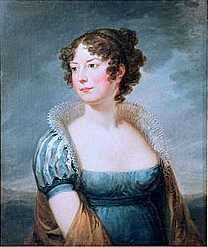  
|


| Jan 13, 2007, 11:35 AM | |
|
Emptiness isn't something to shy away from, especially if it's what you're trying to go for. But traditionally, focusing on the viewer is better for a portrait style, or if you want to convey greater action, focusing on something else in the picture.
You should be happy that people are giving such notice to this thread. Most of these things go unnoticed. |
| Jan 13, 2007, 11:36 AM | |
|
Like Anaiyu said, you can do a good job with faces. However, I encourage you to try some different expressions, or work more on bodies (bodies are people too!).
Moonblaze brings up a good point about color, but I'm not sure I'd worry about it for things like the chibi picture. I mean, if she's saying "omg freaks", super dramatic coloring won't fit. Try some drawings with colored light sources some time, though. Lastly, I'm not a huge fan of your surreal stuff. The concept is nice; it's like an assortment of objects that, together, tell a story or convey an idea. However, it ends up looking like a senseless jumble; I'm not sure where my eye is supposed to go. In ones like kirsikkakuunvalo5722872.jpg, for example, try making the S-shaped thing (a tail or a palm tree?) the focal point of the picture, so it leads the viewer on a guided tour through the rest of it. You can also use this to control the order in which people "read" the picture.
__________________
GENERATION 22: The first time you see this, copy it into your sig on any forum and add 1 to the generation. Social experiment. <i>"This picture shows me that the gray bird man is just a bully and picks on smaller birds. Just because he has no friends and takes it out on others smaller than him to look good. I can see in the parrats eyes that it does however have a understanding of the gray bird man and is upset about getting cut."</i> - Speeza on cartoon birds. |

| Jan 13, 2007, 11:47 AM | |||
|
Quote:
From a quick DA art search: Emptiness by *Zindy on deviantART It's actually a very good piece. The artist have stuck only to using a greyscale set of colors and left out space so that in a full view your attention befalls her eyes directly. It gives you a feeling of emptiness but not in the same way as yula's work - it doesn't feel as if there's something missing but instead when staring into the depth of the character, you feel her emotion and even thoughts are empty.
__________________
Quote:
|
|||
| Jan 13, 2007, 12:24 PM | |
|
Moonblaze, I agreed with you =P. You dont' need to explain to me that emptiness needs to be the focus or at least a major theme to contribute.
Anyway, you're quite talented and have a lot of potential to grow, keep that in mind. But if you want to bring a lot of life to your drawings, follow these simple steps!! You could learn a lot by trying to draw things from very different angles. Right now, everything seems to be a bit head on, or from the side. I try to picture all the objects in a drawing as a 3d model, and visualize what it looks like from all possible angles. For instance :  On the right is a house. The angle is flat on, viewing the front, completly making the sides invisible. It's not that exciting. On the right though, the viewing angle is high above the ground looking down across the facade of the building. The impression of height is given off and immediatly looks better. See the difference? If you can apply that concept to other drawings, you could give off great ideas about size. Consider how awesome the drawing of the dragon would be, if you had the angle of the drawing from ground level, looking up at it. The viewer would feel daunted by it's size, therefore the fear aspect would be accentuated. |
| Jan 13, 2007, 01:29 PM | |||
|
Quote:
__________________
Quote:
|
|||
| Jan 13, 2007, 01:46 PM | |
|
I like your surreal stuff the best. Everything is chaotic and jumbled up and make no sense, which means it's pretty awesome. Color could help, though.
__________________
Fear cuts deeper than swords |

| Jan 14, 2007, 07:44 AM | |
|
Wow, so many useful tips
Thanks. I never studied arts, I guess that's one of my major problems. But all those remarks upon a simple little sketchbook really gave me something to think about. Gracias!
__________________
<a href="http://www.last.fm/user/omgklz/?chartstyle=GlowinGreen"><img src="http://imagegen.last.fm/GlowinGreen/recenttracks/5/omgklz.gif" border="0" /></a>
|
| Jan 14, 2007, 11:19 AM | |
|
wow, ur art is rlly rlly good
|

| Jan 14, 2007, 11:22 PM | |
|
rlly rlly good indeed
|

 |
«
Previous Thread
|
Next Thread
»
| Thread Tools | |


|
|

All times are GMT -8. The time now is 04:44 AM.
Jazz2Online © 1999-INFINITY (Site Credits). Jazz Jackrabbit, Jazz Jackrabbit 2, Jazz Jackrabbit Advance and all related trademarks and media are ™ and © Epic Games. Lori Jackrabbit is © Dean Dodrill. J2O development powered by Loops of Fury and Chemical Beats. Powered by vBulletin® Copyright ©2000 - 2026, Jelsoft Enterprises Ltd.
Original site design by Ovi Demetrian. DrJones is the puppet master. Eat your lima beans, Johnny.