


| Jan 17, 2007, 05:40 PM | |
|
DeviantArt
Last updated: March 7th, 2007
UPDATE: Random things, worth a look, and a short story. Yo. I've started work on an RPG game, and would like someone to comment/just look at my character art. I've worked pretty hard on them, so please tell me what you think. (Preferrably using the comments in DeviantArt, but also here if you want.) ZAPPER's (Zapperoni's) DeviantArt Page
__________________
 Stop talking sense, this is an internet argument. ~Doubble Dutch Last edited by ShadeJackrabbit; Mar 10, 2007 at 05:19 PM. |


| Jan 17, 2007, 06:31 PM | |
|
Hey, overall I'm impressed =D. You clearly know what you're doing, but are lacking on the small how-tos. I'm posting criticism here, though, since I dislike DA.
Let me start with Gahrone; overall it's a very nice and simplistic character design that effectively conveys his character, but there's a few aspects of the pose that need work. Firstly, everything is from a very "flat" view. None of his body parts are facing towards the viewer; his head is to the side, his feet are to the side, and his arms are little L shapes. Instead of something like: 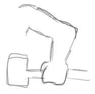 Consider having parts face directly/slightly towards the viewer, like: 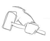 (only drawn better). Also, this is a good time to learn about aliased/antialiased lines. Consult the following image:  On the top is a zoom in on an aliased line. It's blocky and pixely. The bottom is an antialiased line, which is all smooth and sexy looking. However, if you try to use the fillbucket tool on the smooth, antialiased line, you'll get white pixely stuff along the sides (kind of visible on the dunes in Gahrone's picture). Also, JPGs. Keep in mind that saving as a JPG blurs the image. If you're going to use the fillbucket to color, ALWAYS make sure you are saving as a BMP, PNG, or other format that has no loss. When you're ready to upload your image to the interwebbings, save-as it as a JPG to reduce its size. Lastly, he is facing to the left, so his belt buckle and the place where his vest laces should be shifted to the left a bit more than they are. Anyway, next Zapher. A lot of new artists make this same mistake when drawing pointy teeth. Remember that teeth are BEHIND someone's lips, and are revealed when they open their mouth. Look at my example below; on the left the teeth are shaped to the lips, and on the right they are hidden behind the lips (I drew the hidden parts with dotted line so you can see what I mean). 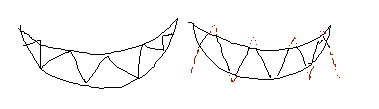 Other than that, Zapher looks good overall (though watch the aliasing/blurring on the sword; you want to keep those white dots away). Oh, and the "The Shark" is a bit hard to make out against the blue. Next Dizleia. Digleia? I don't actually remember how to read cursive. Anyway, her main problem is that the feathers are way too straight, like shingles. Have them fan out a bit; look at this:  Note how they all sort of go towards the bird's arm, but none of them are going the exact same direction. As for her anatomy, don't give her fingers. None of your other characters have fingers, and most the animals they are based off of DO, so it doesn't make sense that the falcon would be the only one with fingers. Her feet could use work too; the one on the right is far too straight and pitchfork-like. And I'd move her breasts to the left a bit, as she's facing to the left but they are relatively close to the middle placement-wise. Lastly, Shinkick. The lines on him are a bit higher quality than the rest of the pictures; did you use a different program or scale him down after coloring? I can't say I like the white outlines, though that's more of a personal problem I have. My main tip with Shinkick is to not draw lines signifying his muscles. A lot of new artists try to outline every muscle to make people look strong, but it ends up looking unrealistic. Focus on the overall limb shape to convey muscules; give him broad shoulders, a thicker neck, exaggerated calves and biceps, etc. So, overall the style is simple, but that works. I HIGHLY encourage you to try working with Flash if you get a chance (it looks like you might've used it for Shinkick, but I can't tell for sure).
__________________
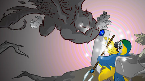
GENERATION 22: The first time you see this, copy it into your sig on any forum and add 1 to the generation. Social experiment. <i>"This picture shows me that the gray bird man is just a bully and picks on smaller birds. Just because he has no friends and takes it out on others smaller than him to look good. I can see in the parrats eyes that it does however have a understanding of the gray bird man and is upset about getting cut."</i> - Speeza on cartoon birds. |

| Jan 17, 2007, 07:31 PM | |
|
Actually, I used paint.net for all of them. It uses a layers based system for it's files, until saving as a bmp, jpeg, or other single layered image. Now, I'll see if I can do something about that anti-aliasing stuff. I probably just don't have it turned on.
And I have to admit, this is my first try at drawing characters. I haven't got much experience. So I thank you for the criticism, which I know is needed. I'll see if I can make some changes. Thanks, ZAPPER EDIT: What should I do for Dizleia and holding things? Claws/hands was my first idea, but I agree it doesn't really work.
__________________
Stop talking sense, this is an internet argument. ~Doubble Dutch |
| Jan 18, 2007, 05:56 PM | ||
|
Quote:
 Also, I have a little bit of criticism on the Red Dragon logo. First, as I already pointed out, you have to be careful with your aliasing (note the white dots along the sides of the outlines). If you're going to use the fillbucket tool to color, make sure you have sharp, aliased (blocky, not smooth) lines. The wing over the orb is kind of hard to make out as a wing, as it's too straight and flap-like. Practice drawing wings a bit; dragons usually have bat-style wings, which is essentially a hand with long, webbed fingers. The following image shows wings/arms pretty well:  Also, I'd make the body of the dragon darker. The light from the orb makes the wings stand out too much, and the bright pink is kind of hard to differentiate from the orb when not zoomed in. |
||
| Jan 19, 2007, 10:41 AM | |
|
Hmm... interesting. Guess I have a lot of work ahead of me. I guess fingerless arms would work (wing idea). I'll try to get some sketches this time. Maybe I'll do better at that. Also, I've got 2-3 more pictures which I still need to get scanned into my computer.
Well, thanks for the pointers. I'll update soon. (Hopefully)
__________________
Stop talking sense, this is an internet argument. ~Doubble Dutch |
| Feb 15, 2007, 06:34 PM | |
|
Sorry for double-posting, but I just wanted to say that Animala Tales will be on hold, as I am working on an adventure game. As for art, I'm putting up my hand-drawn stuff. So that's what to expect next.
Last edited by ShadeJackrabbit; Mar 10, 2007 at 05:21 PM. |
| Mar 10, 2007, 05:20 PM | |
|
*UPDATE*
March 7th, 2006 Fanart, short story, fantasy RPG characters. |
 |
«
Previous Thread
|
Next Thread
»
| Thread Tools | |


|
|

All times are GMT -8. The time now is 11:08 PM.
Jazz2Online © 1999-INFINITY (Site Credits). Jazz Jackrabbit, Jazz Jackrabbit 2, Jazz Jackrabbit Advance and all related trademarks and media are ™ and © Epic Games. Lori Jackrabbit is © Dean Dodrill. J2O development powered by Loops of Fury and Chemical Beats. Powered by vBulletin® Copyright ©2000 - 2026, Jelsoft Enterprises Ltd.
Original site design by Ovi Demetrian. DrJones is the puppet master. Eat your lima beans, Johnny.