
|
| Perspective | ||
|
Even though tilesets are 2D, there are several ways to simulate them to be a little more 3D. Why? Because 3D graphics are great! Just look at all the games in the market today, almost all of them use 3D graphics. Jazz2 hasn’t got some amazing engine to do all the hard work for us, instead tileset makers have to do all the hard work for this to work. Perspective is one of the ways of doing this (the other will be discussed later), but on a more general level.
Luckily this is really easy to do, and most people do it right without even knowing they did so you shouldn’t worry too much about this. However, there are different ways to make the perspective in your tileset, each unique with its own pros and cons and that’s what I’m going to explain in more detail in this section.
|
| Mez-like Perspective | ||
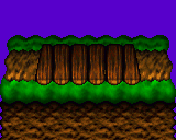
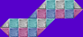 Ah yes, how can we forget good old Mez? I’m sure all of you know the Mez01 tileset (above example). If it’s not the first tileset using this method (I’m pretty sure it is), then it’s definitely the most popular. I haven’t seen it for download on J2O, and I never did re-download the set after formatting about 2 years ago, but it’s in my list of tilesets (along with Mez02, Mez03a and Mez03b). It’s just one of those tilesets everyone has even though you don’t know how you got it. 
Anyways, the funny thing about this perspective is that, well, it has no perspective. Apart from that, it’s more of a drawing method than a new perspective but it’s freakishly popular. I just have to comment on it. What is it exactly? It’s just a range of simple blocks placed next to each other. What’s so good about it? Well, it’s REALLY EASY TO DO! Honest, if you make a tileset like this there is pretty much nothing that can go wrong. Everything already tiles with each other (no need to make the textures you use tile-able), you don’t need to mask the tiles, and it’s so easy to use for making levels.
The scariest part is that even though this is all so simple and easy to do, these tilesets are amazingly popular. Add some extra eye candy and you have a winner. It’s a great place to start, why make something fancy if something simple does the job?
Pros and Cons:
|
||
| 2D Perspective | ||
 2D perspective is pretty much a fancy way of saying no perspective. You draw the whole tileset as if it’s viewed directly from the front, no top or side pieces showing. Much like the Mez perspective drawing this perspective is easy to do, but doesn’t just consist of blocks that tile together so tiling things will be more complicated. The problem with this is that unlike the isometric perspectives (below) you don’t really have a lot of space for extra eye candy on the platforms. All your detail is focused on the ground below, which will end up covering the huge majority of the tileset. This could be a good or bad thing. If you’re not as good in drawing the top pieces of a tileset then use this to your advantage, but most of the time the lack of extra areas to use is a bad thing for eye candy. However, not all tileset themes look good with an isometric perspective and not all tilesets are drawn with them. Futuristic tilesets are the best example; almost all of them use the 2D perspective. I’m not sure how it turned out this way, but all the different metal pieces are much easier to use and put together without having to add perspective. Apart from that, some things just look better without perspective, what you end up using will most likely depend on what you are planning to draw.
Pros and Cons:
|
||
| Isometric Perspective | ||
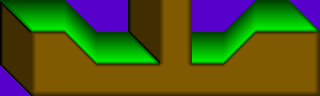 The isometric perspective is the closest to a 3D image you will get in tilesets. However, the best part is that you have a top view of the walking platform. This area is a goldmine in terms of adding eye candy, the amount of goodies you can add in this area is something that should be taken advantage of. Even if you don’t add all these extras, the area gives a bit of variety from the normal ground area, always a good thing. Drawing it can be a bit tricky, and if you have to insist on making sure (it’s a good idea) you have all the tiles you need to make the top pieces fit together, then this will use quite a lot of tileset space. Another bad thing about the isometric view is the dark piece on the side. It can cause quite a few problems when wanting to make a level, which are mainly problems with attaching event tiles (hooks, vines, sucker tubes etc.) to it. Not impossible to do it, but it can be difficult at times.
Pros and Cons:
|
||
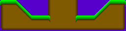
| Semi-isometric Perspective | ||
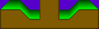 The semi-isometric perspective is a bit of a mix between the 2D and isometric perspectives. You can think of it as a 2D perspective with the top part of the platform viewable or the isometric perspective without the annoying side piece. Either way it’s a handy middle man that fixes some of the problems with the other two perspectives, but then also managing to create its own little problem. The good things you get to keep are the top part of the platform and the ease of use and tiling of the ground of the 2D perspective. It also doesn’t use as many tiles as the isometric perspective to fit all the pieces together. The bad thing however, is a little problem caused when wanting to add blocks to the top part of the platform. 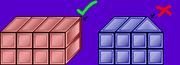 The Meza tileset (by Newspaz) is a great example to show what the problem is. If you look at the example below you will see that the red blocks on the normal isometric perspective look fine, but when using the semi-isometric perspective the blocks will reach an end where it doesn’t connect correctly.
Pros and Cons:
|
||
| Important Perspective Rules | ||
Apart from all these different perspectives to use there are two important perspective rules that apply to all of them:
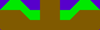
 However, this should also be taken into account in layer 4, especially when using the isometric perspective. The example shows this in some detail, the plants are smaller on the back of the platform than they are in the front. The texture on the top has these rules applied to it as well. Near the front of the platform the texture is much larger than near the back, which is darkened in this area to make it harder to see. Note: The large plants in the example would be placed in layer 3 so that the character can run behind them (they are in front of him in terms of perspective). ![Townsville ][ Tileset](tutorial/perspective5b.gif) 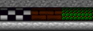 Some other examples are the floor in Townsville ][ and the floor inside the buildings of Mega Megatropolis.
|
| Shading vs. Perspective | |||||||||||||||||||||||||||||||||||||||||||||||||||||||||||||||||||||||||||||||||||||||||
 A lot of the time when talking about tilesets (or pretty much any other thing in drawing) people mention the word shading. Shading and perspective are very similar and the two things can easily be confused with one another. Let me explain: We all know that perspective is a way of simulating a 3D environment on a 2D surface; it is how we change the size of objects at different distances away from us. Shading is also a way of simulating a 3D environment on a 2D surface, but instead of changing the size of objects shading is casting shadows on different areas of the tileset. The shadows are supposedly a result of 3D objects blocking the source of light that would shine on it. Apart from that, shading also occurs on objects moving further away from a light source (The further something is from a light source, the darker it becomes). This light source is nonexistent; it is only an imaginary point and you don’t need to draw it in your tileset. People just assume it’s there without even knowing they assume it. Its actual position is somewhere in front of your tileset towards the top-left corner, but funnily enough you don’t need to know that because your brain also automatically assumes it is in this position. The important thing to remember is that shading is part of perspective; one can’t function without the other. In order to simulate a 3D environment you need both shading and perspective in the environment. Luckily, just like perspective you seem to automatically make shading in a tileset without even knowing it. Why do you think platforms have the dark borders around their sides? Because it looks right and you need it to show where the platform ends? Well, that too, but it is a result of shading and makes it look more 3D. You see, when the sides of a platform become darker it actually means that they are moving further and further away from the source of light at the front of the tileset until they are so far away that they are too dark to see. All the perspective example images above also include shading. Perspective isn’t much without shading, and shading isn’t much without perspective.
That’s all for perspective and shading, next up we’ll be looking at how to draw diagonals but first here’s the important stuff
|
| Drawing the Tileset | ||
|
Page 1: Drawing Methods/Feather and Blur |
||
-=Tutorials=-
[Part 1: Starting a Tileset|Part 2: Drawing the Tileset|Part 3: Making the Palette]

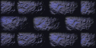
 Shading isn’t only used in perspective; it’s used in detail as well. Both are important, but this section focuses on perspective so I won’t go into more detail with this bit. The texture to the left doesn’t really have much perspective, but it is very detailed and seems ‘bumpy’ with pieces standing out because of all the shadows on its surface.

 Page 2: Perspective