


| Jan 18, 2006, 06:41 AM | |
|
Scribbles! Faw was creative today. =o
Considering how I didn't even want to wake up this morning and almost skipped school, today's school day turned out quite productive. =o
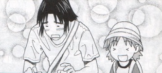
The first scribble I'm going to show you was inspired by and drawn during a History lesson.. We got a paper about The July Revolution in France 1830, which revolve for a great part around a certain "Charles X", one of the former kings of France... The first time I read that, I chuckled because "Charles X" made me think of... funny images. So in today's lesson, a girl from my class read out her homework.. and she kept saying not "Charles the Tenth", but really "Charles X"! The rest of the story is history. French class was even better. In a sudden bout of inspiration, I started scribbling a girl on the side of a French worksheet... And the result is the first real drawing of Fawriel's girlfriend in the story he's the main character of, designed after this (old) drawing: http://www.deviantart.com/view/20023189/ Meet Jaime H. Gardant: Big Version Small Version I hope you like the pictures. Especially the second. The first one lacks a certain.. something to make it worth a belly-laugh. As for criticism.. go easy on Jaime. D= Criticizing Charles X is fine as long as you consider that it was drawn with a biro. ;o
__________________
 |


| Jan 18, 2006, 07:41 AM | |
|
Well, my comments on ICQ when you showed me these pictures where just "W00t!" and "XD". You deserve better. =d
Soo, I'll say that I like Jaime a lot. =D She doesn't exactly look like the girl you met in Paris, but if you had that picture as desktop background for months like me, you'll certainly notice the similiarities. Especially the shy face reminds me a lot of the other picture. Nice work. =D If all of your characters are as good as this one, I'll certainly read the finished Manga with joy.  *edit* Oh, and nice new avatar. =d
__________________
Sober again. Still love it. |

| Jan 18, 2006, 08:04 AM | |
|
Well done.
But your girlfriend isn't wearing a bra. Don't blame me for noticing that first... |

| Jan 18, 2006, 08:13 AM | ||
|
Quote:
|
||

| Jan 18, 2006, 08:41 AM | |
|
Now that you mention it...
__________________
Sober again. Still love it. |
| Jan 18, 2006, 09:04 AM | |
|
I get to criticize before Rad. >D *laughs maniacally*
I'm not gonna bother with the first because it's... well... yeah. As for Jaime (YAY, we can stop calling her Faw's Love now!) I'll start with what I like. You did a good job with facial proportions. Her eyes, eyebrows and forehead all look about right, and she has pretty eyes (don't laugh). I also like her Haruko hair. Everytime I see the lady in the Tic Tac commercials her Haruko hair makes me smile, so ++hair that like. And now for meanness. D= Her neck isn't centered. It's more towards her left shoulder (her left, our right). Her face is sort of undefined, so maybe if you brought out the indentions where her eyes are and made her have a prominent muzzle she would look more distinct and less flat. Right now she looks to have a human face with no nose and two holes for nostrils. I know that's, like, "anime," but a furry's face should look a little more animalish. I think we're seeing too much of her right ear considering the angle, and you might want to have her legs spread slightly. You like drawing that pose, but not many people stand that way (I stumble if I try, but I'm a clutz so I don't count). Overall, good job. I'm glad to see you working on character designs again (it seems like it's been a while). You know I want to say something about her hair rising too high... but I can't because it's your style and I'll just have to accept it.  Keep it up Faw (and start drawing that comic or I'll start yelling at you, in a loving and friendly way). Keep it up Faw (and start drawing that comic or I'll start yelling at you, in a loving and friendly way).
__________________
We can make the cure. We made the disease. |

| Jan 18, 2006, 09:16 AM | |
|
It's kind of ironic that your description of the Louvre girl on DA fits better to Jaime.
__________________
Mystic Legends http://www.mysticlegends.org/ The Price of Admission - Hoarfrost Hollow - Sacrosanct - other - stuff |


| Jan 18, 2006, 09:19 AM | |
|
Ah, well that is a factor. D= But when you're working on something small just remember those guys who can draw things on grains of rice, and you'll be INSPIRED or something! =D
I'm not fit to criticise her breasts, though. *waits for Rad or Dal to show up and save the day*
__________________
We can make the cure. We made the disease. |
| Jan 18, 2006, 09:25 AM | |
|
Dev you perfectionist! >O
Really, I wouldn't have noticed the thing with the neck if you hadn't criticised it. =d
__________________
Sober again. Still love it. |
| Jan 18, 2006, 10:01 AM | ||
|
Quote:
__________________
We can make the cure. We made the disease. |
||
| Jan 18, 2006, 10:30 AM | |
|
Yeah, you're probably right. =d
I should learn to criticise better, I'll have to anyway, as art pupil.
__________________
Sober again. Still love it. |
| Jan 18, 2006, 11:39 AM | ||
|
Quote:
__________________
|
||
| Jan 18, 2006, 01:08 PM | |
|
I dunno, 'Charles X' more puts me in mind of a SPACE-AGE SPACE KING then a superhero king.
__________________
<img src="http://i25.photobucket.com/albums/c100/Ashton_JX/the_web/stupid_prize.gif" border="0" alt="The rodent thingy wasn't worthy."> I would not want anyone having sex with my cocktail. ~ Radium |

| Jan 18, 2006, 02:11 PM | |
|
Curse you, Dev and your evil faster-than-Radium powers D=. Anyway, I haven't done the critic thing for a while, so if you disagree on something please point it out.
First I'd like to say you've improved. The rest of this post is going to be nothing but negative comments. Don't take that offensively, just presume I liked anything I didn't complain about. Okay, first, Charles X (in my classes we have similar fun with Pope Leo X). Two main things strike me as being wrong with this picture. The first is the pose. You're making a common mistake where you act as though you are drawing him in two dimensions (you actually are, but it's not supposed to look like that). Both arms are positioned as though he's laying dead on the ground; nothing is coming towards or away from the viewer. His arm with the Spanish (??) flag looks awkward being perfectly straight like that, and his other arm is in a position that's actually kind of painful. Remember, for something to have depth it doesn't only need things overlapping, but things coming towards the viewer. The other thing is the (presumed) wind. His cape is being blown right, and his Spanish (?????) flag is being blown almost straight up. Making all the blowy things go in the same direction will help unify the picture. Since you want the flag to be visible, a wind going up and to the right might work well, but the cape would need to reflect that. As for more minor things, another problem I notice is his hands. Both hands are clenched around something, though his fingers don't wrap all the way around. His neck seems a bit thin for a superhero parody type. Also, his feet could use a little bit of work; this is the most minor thing ever, but I think the middle part needs more definition to separate feet from wedges. And superhero feet are fun to draw. EDIT: I completely missed the "go easy on Jamie" part. I felt bad and removed the rest pf this post. Last edited by Radium; Jan 18, 2006 at 02:21 PM. |

| Jan 18, 2006, 06:36 PM | |
|
Que Passa!!!!
Well, you already KNOW what I think... And I'm still looking for any more of your stuff...
__________________
 "I must be the personification of the rage to live, hit me, dunk me, insult me, I'll still hang in there... ...I wonder why..." -Howard the Duck Proud to be the 100th, 600th, 666th, and 1000th poster in the "Slime the Poster above you" thread... Even though I had to cheat... Thank you, The Cheat. (RIP William Hanna) "I claim Page 4 in the name of my sexy female self." -Radium. |

| Jan 19, 2006, 03:06 AM | |||
|
Quote:
And you are right. I'm still going to excuse myself by saying that I didn't really put effort into the finer parts of the picture and I didn't use guidelines and etc. I would've uploaded it to Comedy Cafe, but it's not good enough for that, either. D= It lacks POW. You know, like, a dramatic background and dramatic pose and stuff. Quote:
And *of
__________________
|
|||
| Jan 19, 2006, 03:15 PM | ||
|
French is three vertical stripes of three different colors, isn't it? That flag is Spanish, I say D=
Quote:
__________________
GENERATION 22: The first time you see this, copy it into your sig on any forum and add 1 to the generation. Social experiment. <i>"This picture shows me that the gray bird man is just a bully and picks on smaller birds. Just because he has no friends and takes it out on others smaller than him to look good. I can see in the parrats eyes that it does however have a understanding of the gray bird man and is upset about getting cut."</i> - Speeza on cartoon birds. |
||
| Jan 20, 2006, 04:48 AM | |
|
By God, Radium is right! You've humiliated the sacred Tricolours!
|
 |
«
Previous Thread
|
Next Thread
»
| Thread Tools | |


|
|

All times are GMT -8. The time now is 03:35 PM.
Jazz2Online © 1999-INFINITY (Site Credits). Jazz Jackrabbit, Jazz Jackrabbit 2, Jazz Jackrabbit Advance and all related trademarks and media are ™ and © Epic Games. Lori Jackrabbit is © Dean Dodrill. J2O development powered by Loops of Fury and Chemical Beats. Powered by vBulletin® Copyright ©2000 - 2026, Jelsoft Enterprises Ltd.
Original site design by Ovi Demetrian. DrJones is the puppet master. Eat your lima beans, Johnny.