


| Aug 3, 2007, 06:29 AM | |
|
These arts of mine
Sneriously!?
http://i44.photobucket.com/albums/f3...riousSnail.jpg Grawr! http://i44.photobucket.com/albums/f3...21813122_1.jpg A couple of furry sketches. The one in the lower left is my favorite. http://i44.photobucket.com/albums/f3...15213143_1.jpg Please excuse the lined paper in this one. http://i44.photobucket.com/albums/f3...15212735_1.jpg This won't make much sense, but it's one of the better things I've drawn. He's an anthropomorphic banana, by the way. http://i44.photobucket.com/albums/f3...perAwesome.jpg People tell me this one looks like anime; well, it's not! I drew it at a request from a friend. http://i44.photobucket.com/albums/f3...gmaColored.jpg One of my friends compared me to Tears for Fears after I drew this one of myself. http://i44.photobucket.com/albums/f3...fPortrait2.jpg Pretty average stuff, I guess, but I think they're half-decent, at least. Thoughts?
__________________

|


| Aug 3, 2007, 09:47 AM | |
|
Hi, I'm Radium and I'm an everything critic. I prowl around the Art Forum and tear apart stories and drawings. Some people come to me because they want to become better, other people avoid me because they want to keep thinking they're perfect. Either way, I do this because it's fun.
While I agree that most your stuff is average, it's at least on the better side of average. I don't know your age, but since you have a friend who would seems to like anime and would actually name a character Enigma I'm going to assume you're like 16-17; and I can say for a fact that you draw better than most 17-year-olds I've known. I'd say the monster-type thing (second on the list above) is the best thing you've drawn. It has a very smooth, professional look to it and the muscles and bones turned out really nice. And the hands, while evil demon hands, are much better defined than those in your other work, as is his head shape. I like the guy with the gun (lined paper one) second most. His apathetic pose and expression give him a lot of personality. However, his left arm (as in, the arm on the right side of the picture) looks too "rigid"; his overall pose is very relaxed, but rather than looking like it's hanging in his pocket, it looks almost napoleonic. Arms are pretty heavy; to be as relaxed looking as the rest of his pose, it'd need to be pulling the pocket down a bit with its weight. The rest of your stuff is more "average", so to speak. The Enigma one and "self" portrait are way too rigidly posed, and color can't make that better. In the Enigma one especially; he is theoretically holding a fairly heavy object over his shoulder, but he looks as though the only parts of him that have even moved are his arm and head. Also, the neck connection in the "self" portrait is all wrong; keep in mind that necks attach towards the back of the head, while yours seems to attach right under his jaw. This looks fine in your other drawings, so I'll assume the "self" portrait is just older. Hm... lastly I want to talk about head shapes, namely those in the third picture on your list. Personally, the only one I really like is the top left, which is the most "normal" angle, so easiest to get right. The problem on the right two is that all you're really doing is moving their nose down a bit and getting rid of their chin. Keep in mind that what you're aiming for is a full downward head rotation! By "full", I mean that if the head turns down, the muzzle, ears, eyes, cheeks, chin, etc. are all going to move too, and each a different distance depending on its relative position to the pivot point on which the head turns. Imagine if the top left guy looked downward. His nose would not only move down, but his muzzle would get "longer" because it's being viewed from the top rather than the front. His cheeks would move downward too, since they are slightly towards the front of his face, but not as much as his nose since they are closer to the "pivot" point. While most his features would move downward, his ears would actually move upward, increasing the apparent distance between his eyes and ears (since the ears are on the back/top of his head and therefore the other side of the "pivot" point). Also, because eyebrows generally stick out farther than eyes, they would move "down" faster. However, in the right two sketches, nothing really has dimension. The distance between the eyebrows and eyes stays the same, implying they are the same depth; the distance between the eyes and ears stays the same, leading heads to turn lemon-shaped as they turn down, and the muzzle stays the same length as it is in a front view, making it look shorter in a top view. Remember, to imply that something complex has depth, features that are farther forward need to move faster than those closer to the pivot point when it turns. Anyway, I don't really like the side view one at all. The first thing that sticks out is that, like mentioned above, nothing appears to have any depth except the muzzle. The eyes and eyebrows both look like they are on a flat plane at the front of the face. Like I said above (only on a different axis), remedying this is easy: when the head turns left, make the eyebrows and cheeks move left faster than the eyes, which are set back a bit in eye sockets. Also, the nose looks wrong, maybe even broken, because it is at a different angle than the rest of the head. If you draw and continue a line between the bottom of both eyes and the corners of the nose, you get this: 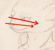 implying that they are at a different angle. Pay attention to stuff like that. Lastly, it looks like you're connecting the sternocleidomastoid muscles in the neck too far back, but this is kind of questionable territory. In humans, they attach right behind the ears, but since you are drawing fictional creatures with their ears mounted fairly far back, I'm not sure what to consider right and wrong. Personally, I'd lean towards making the neck muscles more human and attaching the sternowhatevers a bit farther forward, but you could definitely make a case for attaching them further back if you were really bored enough to try. Overall, though, your drawings are very good. A tip, though, for the future: always put the best drawings first and last in a list and all the bad ones in the middle, as it will give people a better overall impression after they look at them all. This applies to everything; resumes, portfolios, galleries, etc.
__________________
GENERATION 22: The first time you see this, copy it into your sig on any forum and add 1 to the generation. Social experiment. <i>"This picture shows me that the gray bird man is just a bully and picks on smaller birds. Just because he has no friends and takes it out on others smaller than him to look good. I can see in the parrats eyes that it does however have a understanding of the gray bird man and is upset about getting cut."</i> - Speeza on cartoon birds. |

| Aug 3, 2007, 10:01 AM | |
|
Wow, thanks! That's the most comprehensive criticism I've ever got before.

__________________
|
 |
«
Previous Thread
|
Next Thread
»
| Thread Tools | |


|
|

All times are GMT -8. The time now is 12:22 AM.
Jazz2Online © 1999-INFINITY (Site Credits). Jazz Jackrabbit, Jazz Jackrabbit 2, Jazz Jackrabbit Advance and all related trademarks and media are ™ and © Epic Games. Lori Jackrabbit is © Dean Dodrill. J2O development powered by Loops of Fury and Chemical Beats. Powered by vBulletin® Copyright ©2000 - 2026, Jelsoft Enterprises Ltd.
Original site design by Ovi Demetrian. DrJones is the puppet master. Eat your lima beans, Johnny.