


| Sep 2, 2007, 06:20 PM | |
|
Nagrand
 (@ the first pic) (@ the first pic)
__________________
<center>somebody holds the key</center> |


| Sep 13, 2007, 01:43 PM | ||
|
I was really looking for critique on the above picture. No one has anything to add?
__________________
 Quote:
|
||


| Sep 14, 2007, 08:20 PM | |
|
Incredible
__________________
Yes, I am, in fact, ALWAYS the one to blame for everything. And none of your are full of yourself. Good job. Do you like Stijn? Take my poll!   Windows is not a virus. A virus is small and efficient... Note to Stijn: how am i even getting away with this |


| Sep 16, 2007, 08:20 AM | |
|
I really really like the above picture. I'm no art critic, but I still give it two thumbs up. ;p
|

| Sep 16, 2007, 08:24 AM | |
|
I agree with Free Full. There, now that compliments are out of the way I can be purely negative =D
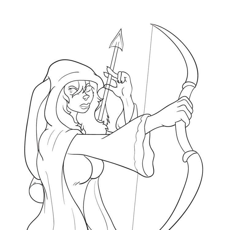
First of all, regarding hands, I recommend knuckles. The hands, especially the girl's right hand (as in, her right) seem to suffer from a lack of bones. You can usually get away with skipping a few, but try to at least define the joints that connect the palm of the hand to the fingers. Oh, good job on making her recognizably female, though =P. Her her hip shape looks a bit wrong (too thin?), but it's hard to tell since it's dark and the picture pretty much ends there. Also, her horns don't look even. By the looks of it, one is coming out of the back of her head and one is coming out of the left side. Realistically, since the left side of her head is in front of the guy's face, it seems like her left horn should be in front of his face, too. That or her head should be more tilted towards the "camera". On the guy, this is super-minor but I think his bicep should be bulging a bit more with his arm bent like that. It's almost flat there, despite lifting his forearm up. Also, his deltoid looks tensed even though it's not doing much of anything. Oh, and his hair. How does his ear fit into that? It looks like it was just put overtop the hair. Critical enough? ;D
__________________
GENERATION 22: The first time you see this, copy it into your sig on any forum and add 1 to the generation. Social experiment. <i>"This picture shows me that the gray bird man is just a bully and picks on smaller birds. Just because he has no friends and takes it out on others smaller than him to look good. I can see in the parrats eyes that it does however have a understanding of the gray bird man and is upset about getting cut."</i> - Speeza on cartoon birds. |

| Sep 16, 2007, 09:39 AM | |
|
in that case, you suck at drawing, get a life.
__________________
Yes, I am, in fact, ALWAYS the one to blame for everything. And none of your are full of yourself. Good job. Do you like Stijn? Take my poll! Windows is not a virus. A virus is small and efficient... Note to Stijn: how am i even getting away with this |


| Sep 16, 2007, 01:13 PM | ||
|
The clouds are just layered to show the distance, the golden ratio lies just below them. If you can point out specifically how you think it could be improved it would help though, DoubleGJ.
And Radium, thanks a lot. The hands are better than what they usually are but at this point it's hard to tell how to improve them on my own so I really appreciate you pointing it out to me. Your advise has been a great help and hopefully you notice me learning from it? :P So yeah I will keep working out from your great critique. As for the horns, well yeah I had a problem placing them without getting them into his face, and the rest of the character issues are how they designed them really (especially his hair  ). ).To the rest of you, thanks for the compliments. I appreciate it as well.
__________________
Quote:
|
||
| Sep 16, 2007, 02:55 PM | |
|
Dang Critics end up killling everything. Just shuddup it's a great picture. We don't need idiots (-)ing up somebody's drawing they probably spent forever on.
__________________
Yes, I am, in fact, ALWAYS the one to blame for everything. And none of your are full of yourself. Good job. Do you like Stijn? Take my poll! Windows is not a virus. A virus is small and efficient... Note to Stijn: how am i even getting away with this |
| Sep 16, 2007, 04:08 PM | ||
|
Quote:
__________________
GENERATION 22: The first time you see this, copy it into your sig on any forum and add 1 to the generation. Social experiment. <i>"This picture shows me that the gray bird man is just a bully and picks on smaller birds. Just because he has no friends and takes it out on others smaller than him to look good. I can see in the parrats eyes that it does however have a understanding of the gray bird man and is upset about getting cut."</i> - Speeza on cartoon birds. |
||
| Sep 16, 2007, 04:20 PM | |
|
I don't mind your signature. It's just that the critics could take an authentic 100% true book filled with the answers to all of anything and call it bull(-).
__________________
Yes, I am, in fact, ALWAYS the one to blame for everything. And none of your are full of yourself. Good job. Do you like Stijn? Take my poll! Windows is not a virus. A virus is small and efficient... Note to Stijn: how am i even getting away with this |
| Sep 17, 2007, 09:54 AM | ||
|
Without criticism, this wouldn’t be much of a discussion and therefore belong on some art gallery instead. When I started this thread, it was to ask for critique to become a better artist. You can learn a lot from your mistakes! By having people point out mistakes in my art - no matter how beautiful it may seem to the inexperienced viewer - I learn how to make it better and therefore improve.
It's becoming difficult for me to find helpful places for critique, when you surpass the traditional level of art and start grasping out for professionalism, then the critiquer also needs a certain level of knowledge on how to setup a scenery or how the atomy of a figure should be. For example, if I drew a muscular leg, would you be able to tell if it’s correct without knowing the muscle structure first? I really appreciate the critique that people give. Even if it's not professional or just personal opinion, it still gives me a general idea of how anyone would look at the picture (because of DoubleGJ's comment, I am going to try and find a tutorial on painting clouds better, for example).
__________________
Quote:
Last edited by MoonBlazE; Jun 27, 2008 at 08:27 PM. |
||
| Sep 17, 2007, 11:48 AM | |
|
MoonBlaze has got a point. One that I completely agree with. If anyone read both versions of the first chapter of Tale of the Psi, it's all thanks to Radium's critique that it's now 40 times better. I always want critique, so I can't see anything wrong with critiquing.
That being said, ignoring all the posts about how the author loves all the critique and then claiming that the critic isn't being nice....
__________________
 Stop talking sense, this is an internet argument. ~Doubble Dutch |

| Sep 18, 2007, 04:48 AM | ||
|
Quote:
__________________
my stuff |
||
| Oct 2, 2007, 03:31 PM | ||
|
This one was rather experimental, so don't hold back your opinions.
 (Thumbnail, click for full size)
__________________
Quote:
|
||
| Oct 2, 2007, 07:38 PM | |
|
Something about the pinky finger bothers me. Not sure what.
Other than that, I love the above image. |
| Oct 4, 2007, 12:55 PM | |
|
Before Radium comes in and murders the picture with his helpful constructive crit:
The piece is rather good, however the angle keeps making me feel theres something off about the overall pose when there isn't anything wrong in general at all with it. It's distracting me from the overall art piece, but it's probably just me. Aside from that I love it as well. |

| Oct 4, 2007, 06:29 PM | |
|
It's a nice picture, but first I want to talk about lens flare, and when you shouldn't use it - such as in this picture.
A lens flare requires you to be looking directly at a bright light or the light to be slightly off to the side. You could've passed a lens flare off on the Enoki picture, or even maybe the first one in this thread (maybe), but here there's just not enough of a light source. Even though the picture gets pure white up in the corner, the rest of it is bright enough for the sun to not seem that bright by comparison. Such an even spread of bright lighting is usually due to a bright day with lots of cloud cover (which you drew). However, that many clouds would probably block any lens flare business. Anyway, you understand how to do clothing well enough. And you mostly get anatomy by now, except for one thing: gastrocnemius. This is the third criticism today in which I've used the word gastrocnemius, so I'm very tired of the word. Gastrocnemius gastrocnemius gastrocnemius. This guy's gastrocnemius is expecially important since he's two-legged and digitigrade, meaning each one is probably constantly bearing at least 60 pounds. Digitigrade things need pretty powerful gastrocnemii. My main criticism, though, is that there's nothing really tying the picture together. The character is standing there with all his limbs spread, I presume because it's a windy day and that feels awesome when in a loin cloth. He's looking at something to his right, maybe his hand. There are rocks behind him, looming. Your first picture was really great, composition wise. Everything was casting shadows from a single light source, it was heavily obedient to the "rule of thirds", it had a definite path for your eye to follow, and the lighting color tinted everything, making the grass a bit paler green, the character a little bit purple, and his cloak a bold red (not that all those things are important, but they all worked together great). Here, everything is very well lit, the character is almost centered and isn't really "doing" anything (other than probably enjoying the wind), and the background is just kind of "there". The viewer is left with a lot of questions about what's going on, but doesn't really care enough to ask. Your rendering is great, but alone it's not enough to make it a great picture. Oh, and nobody will notice this because the character is so obvious, but those rocks look amazing. How did you do them?
__________________
GENERATION 22: The first time you see this, copy it into your sig on any forum and add 1 to the generation. Social experiment. <i>"This picture shows me that the gray bird man is just a bully and picks on smaller birds. Just because he has no friends and takes it out on others smaller than him to look good. I can see in the parrats eyes that it does however have a understanding of the gray bird man and is upset about getting cut."</i> - Speeza on cartoon birds. Last edited by Radium; Oct 4, 2007 at 07:37 PM. |

| Jun 27, 2008, 04:29 AM | ||
|
Could you tell me what's wrong with her lips and help me fix them? I used several tutorials and I still think they look like crap. ;|
__________________
Quote:
|
||
| Jun 27, 2008, 06:33 PM | |
|
Yes, the lower lip shouldn't curve up toward the mouth. Otherwise it seems like you have the right idea, but it's exaggerated. Reduce the maximum distance between the three lip lines to make it more subtle.
__________________
<div style="float: right; width: 100px; height: 70px; margin: 5px 15px;"><img src="http://madskills.org/monolith/idleserver.gif" style="width: 98px; height: 65px;"><img src="http://madskills.org/monolith/theserver.gif" style="width: 98px; height: 65px; position: relative; top: -65px;"></div><div style="margin: 0 3em; font-size: 80%; font-style: italic;">Love is patient, love is kind. It does not envy, it does not boast, it is not proud. It is not rude, it is not self-seeking, it is not easily angered, it keeps no record of wrongs. Love does not delight in evil but rejoices with the truth. It always protects, always trusts, always hopes, always perseveres.</div><div style="text-align: right; text-size: 80%;">1 Corinthians 13:4-7</div> |

| Jun 28, 2008, 12:01 AM | |
|
the cg isn't bad. i dislike the sky's texture, kinda sloppy. make a better one? the grass is kinda off. i don't really like the shading on the coat of the character either. kinda pillow shaded and it looks hella ugly. just fix it up y'all
__________________
<!-- images may be 80 kilobytes max --> |

| Jun 28, 2008, 04:33 AM | ||
|
Can someone translate what the above poster just said? I don't really understand it.
__________________
Quote:
|
||
| Jun 28, 2008, 06:50 AM | ||
|
Quote:
__________________
GENERATION 22: The first time you see this, copy it into your sig on any forum and add 1 to the generation. Social experiment. <i>"This picture shows me that the gray bird man is just a bully and picks on smaller birds. Just because he has no friends and takes it out on others smaller than him to look good. I can see in the parrats eyes that it does however have a understanding of the gray bird man and is upset about getting cut."</i> - Speeza on cartoon birds. |
||
| Jun 28, 2008, 09:17 AM | ||
|
Seriously, even my first posts in this thread are easier to understand.
__________________
<img src="http://www.majhost.com/gallery/Lijik/Star-Wars-Figures-1/ewjclay.png" alt="I miss the techno Cheat." style="float: left; display: block;"> ((\_/)) ((<a href="http://www.explosm.net/db/files/Comics/Dave/comicbullyroot.jpg" target="_blank">o</a>.<a href="http://drmcninja.com/page.php?pageNum=44&issue=11" target="_blank">o</a>)) (()_()) Classical zombie retro extra fur rabbit. Guys, remember 2010? LOL Quote:
|
||

| Jun 28, 2008, 10:04 AM | ||
|
Quote:
__________________
<!-- images may be 80 kilobytes max --> |
||
| Jun 28, 2008, 11:16 AM | ||
|
Thank you, Radium.
Bboy, he doesn't even wear pants. You can stop trying to give criticism now.
__________________
Quote:
|
||
| Jun 28, 2008, 03:25 PM | |
|
His statement makes sense to me, if it is a bit... late?
__________________
GENERATION 22: The first time you see this, copy it into your sig on any forum and add 1 to the generation. Social experiment. <i>"This picture shows me that the gray bird man is just a bully and picks on smaller birds. Just because he has no friends and takes it out on others smaller than him to look good. I can see in the parrats eyes that it does however have a understanding of the gray bird man and is upset about getting cut."</i> - Speeza on cartoon birds. |
| Jun 29, 2008, 12:04 AM | ||
|
Criticizing old art is not smart.
Criticizing old art is not smart. Criticizing old art is not smart.
__________________
<img src="http://www.majhost.com/gallery/Lijik/Star-Wars-Figures-1/ewjclay.png" alt="I miss the techno Cheat." style="float: left; display: block;"> ((\_/)) ((<a href="http://www.explosm.net/db/files/Comics/Dave/comicbullyroot.jpg" target="_blank">o</a>.<a href="http://drmcninja.com/page.php?pageNum=44&issue=11" target="_blank">o</a>)) (()_()) Classical zombie retro extra fur rabbit. Guys, remember 2010? LOL Quote:
|
||

| Jun 30, 2008, 09:15 PM | |
|
The point of posting art is to get feedback. If you don't want feedback, then what's the point of starting this thread? If you want critiques or feedback, then post elsewhere. The forum is already a sad excuse.
__________________
<!-- images may be 80 kilobytes max --> |
| Jul 1, 2008, 11:48 PM | |||
|
Quote:
If you paid any attention to the posting dates, you might notice the art you criticized is almost a year old. That’s a year of drawing experience. Everything you pointed out I already knew, therefore your posting is rather useless and to some extend, annoying. I suggest you read the whole thread next time and stop trying to lead on a discussion because it simply isn’t wanted.
__________________
Quote:
|
|||
| Jul 13, 2008, 02:15 PM | |


 |
«
Previous Thread
|
Next Thread
»
| Thread Tools | |


|
|

All times are GMT -8. The time now is 02:35 PM.
Jazz2Online © 1999-INFINITY (Site Credits). Jazz Jackrabbit, Jazz Jackrabbit 2, Jazz Jackrabbit Advance and all related trademarks and media are ™ and © Epic Games. Lori Jackrabbit is © Dean Dodrill. J2O development powered by Loops of Fury and Chemical Beats. Powered by vBulletin® Copyright ©2000 - 2026, Jelsoft Enterprises Ltd.
Original site design by Ovi Demetrian. DrJones is the puppet master. Eat your lima beans, Johnny.