


| May 31, 2007, 09:32 AM | ||
|
Something from me for a change...
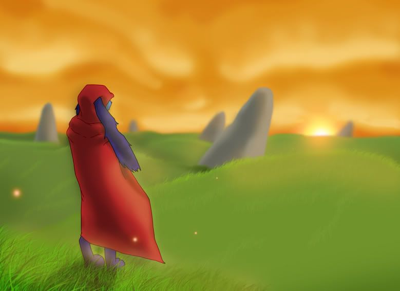 As I won't be uploading anymore pictures to my DeviantArt account, I figured I could ask you guys for some critism once a while, no?  This is yet another scenery, featuring the one character of mine that you're familiar with, walking down some plains in a sunrise. It's a really simple picture with main focus on the atmosphere, so I'd like to know how you feel it turned out. This is yet another scenery, featuring the one character of mine that you're familiar with, walking down some plains in a sunrise. It's a really simple picture with main focus on the atmosphere, so I'd like to know how you feel it turned out.
__________________
 Quote:
|
||


| May 31, 2007, 10:15 AM | |
|
Hrm... Looks luffy.
Some crits: The ground is too bright, should be more dusk/dawn shadows, especially on the lower parts of the hills. The shadows of the rocks should be longer, as well. The other thing is that the rock on the horizon by the sun looks friggin huge. If it is so far away that the base of it is past the horizion, then it is hard to get the size right, but if that rock is about the same size as the others, then it should be drawn smaller. Oh, and there should be more fireflies.
__________________
<.<
>.> -.- |

| May 31, 2007, 10:59 AM | ||
|
This drawing is filled with koolness.
There are only two things that bothers me. That character wich could look alot better, if you only added some details. And the sun. Some sun effects will realy help to the leafy-blurry-dizzy style wich rule the image. Koolnesityoolneghnestym.
__________________
<img src="http://www.majhost.com/gallery/Lijik/Star-Wars-Figures-1/ewjclay.png" alt="I miss the techno Cheat." style="float: left; display: block;"> ((\_/)) ((<a href="http://www.explosm.net/db/files/Comics/Dave/comicbullyroot.jpg" target="_blank">o</a>.<a href="http://drmcninja.com/page.php?pageNum=44&issue=11" target="_blank">o</a>)) (()_()) Classical zombie retro extra fur rabbit. Guys, remember 2010? LOL Quote:
|
||

| May 31, 2007, 07:32 PM | |
|
awesome.
i usually do not like the grass brush, but you use it well and pretty much make it your own, with the use of lighting/highlights, size, et cetera. the character looks awesome - i gotta disagree with iconguy, i think it has a cool cell-shaded look to it. very smooth. i also like the grass the color and brightness it is - but, if it was a darker bluish hue that would be cool too, and probably would go better with the sunset/sunrise lighting. the pose of the character is also cool and well drawn - to have so much of the body hidden by clothing, you do well at having the parts shown line up as if there's an actual anatomical form beneath the clothing, so it doesn't look like you're just covering up an inability to draw anatomy, if you get what i mean. awesome. |

| May 31, 2007, 07:55 PM | |
|
Overall, the image seems too bright to me. If it's sunrise (or sunset, either one) the sky should be darkening. The atmosphere should be more dusky, for lack of better words. The contrast between shadows and light would be much more pronounced as well.
The character could use a little more detail - folds in the cloth, etc. Other than that, I like it
|


| Jun 16, 2007, 09:06 PM | |
|
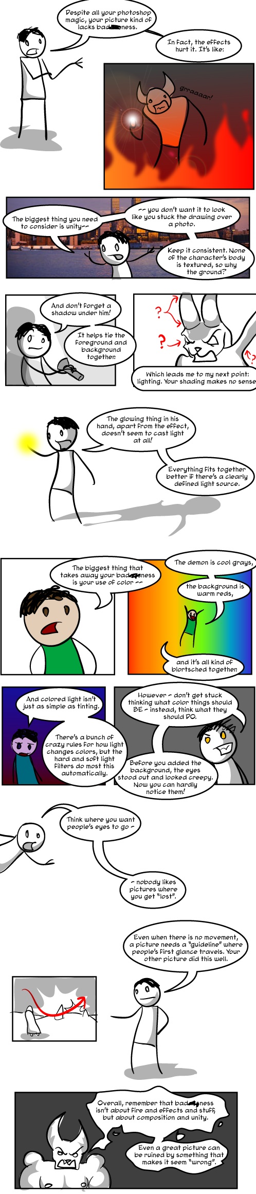
In order to be original, I am going to state my opinions in the form of a comic.
__________________
GENERATION 22: The first time you see this, copy it into your sig on any forum and add 1 to the generation. Social experiment. <i>"This picture shows me that the gray bird man is just a bully and picks on smaller birds. Just because he has no friends and takes it out on others smaller than him to look good. I can see in the parrats eyes that it does however have a understanding of the gray bird man and is upset about getting cut."</i> - Speeza on cartoon birds. |

| Jun 16, 2007, 10:27 PM | |
|
Dear lord! Even the criticism here is art! How can a girl compete with that.
I fully endorse all pictures here as brilliant as I don't know any better.
__________________
 nonne amicus certus in re incerta cernitur? /)_/)
(^.^) ((")(") |

| Jun 17, 2007, 01:31 AM | |
|
Radium, you're amazing.
|

| Jun 21, 2007, 06:35 PM | ||
|
Another, following Radium's advice (I think... Well, hope). Adding thumbnails to reduce the thread page's loading time:
The lights come from below (the banshee fog) and a slightly weaker source of light coming from the frosty... blue magic. And I drew a woman, LAUGH AT ME FOR TRYING.
__________________
Quote:
|
||

| Jun 22, 2007, 03:22 AM | |||
|
Quote:
I dont wanna be mean, but the light (wen.. the... umm... you? holds the flashlight) is not brighter with more light near it..... read Hitches sig sometimes. ") EDIT: Oh right, the new drawing. If the light comes from the fog, and you see it is strong eanogh to light the front b(lo)ody, why is the back all shady? Or is it jost the DemonWolfs (wht the... its a curse? wutever. Il say butt ;-; )? XD The light from te orb thing should be blue, no? and dim...... I think. It looks like continuation to the fog light. How did the light came to the face? The breast is blocking it.. and I cant see the horns!... And kool fog-clothes thing. nice. But the hands are not.
__________________
<img src="http://www.majhost.com/gallery/Lijik/Star-Wars-Figures-1/ewjclay.png" alt="I miss the techno Cheat." style="float: left; display: block;"> ((\_/)) ((<a href="http://www.explosm.net/db/files/Comics/Dave/comicbullyroot.jpg" target="_blank">o</a>.<a href="http://drmcninja.com/page.php?pageNum=44&issue=11" target="_blank">o</a>)) (()_()) Classical zombie retro extra fur rabbit. Guys, remember 2010? LOL Quote:
Last edited by Stijn; Jul 15, 2007 at 03:01 AM. Reason: avoid quoting giant images |
|||
| Jun 22, 2007, 04:25 AM | |||
|
Quote:
But the fog isn't flag, e.g. if you've seen a ghostly scene, you may recon there being fog all over the place... And this fog apparently glows. D:
__________________
Quote:
|
|||
| Jun 22, 2007, 11:47 AM | |
|
I'm not sure I understood everything Icon said, but I think I agree with him.
__________________
GENERATION 22: The first time you see this, copy it into your sig on any forum and add 1 to the generation. Social experiment. <i>"This picture shows me that the gray bird man is just a bully and picks on smaller birds. Just because he has no friends and takes it out on others smaller than him to look good. I can see in the parrats eyes that it does however have a understanding of the gray bird man and is upset about getting cut."</i> - Speeza on cartoon birds. |
| Jul 4, 2007, 10:17 AM | |
|
I like the foreground grass, but it's a little bit strange that it goes flat around where she's standing. If it's supposed to be trampled looking like it's on a path, then the grass near her foot should be laying more sideways, and maybe have a bit of texturing on the ground. If it's just a lack of detail from being farther away, why is the back of the hill textured?
The biggest problem, IMO, is that you still seem to have light affecting each object differently. The background hills are all affected by the yellowish-white light from the sun, but the foreground is lighted by some white light that is behind the viewer and a bit to the left. Like I've said before, having light affect all objects the same way helps tie a drawing together. It's likely that you put the shadow behind her out of habit, but you have to start paying conscious attention to things like that. The main light source in the drawing is the sun, which would cast a sharp, yellow-white light on her back (since it's a relatively cloudless, happy day), and the secondary source is the light scattered by the clouds and grass, which would illuminate the rest of her so the unlit parts aren't entirely dark. If you want a good read about how light works, I highly reccomend "Digital Lighting and Rendering" by Jeremy Birn. It's about 3D lighting and animation, but it's always nice to understand the mechanics and lingo. Anyway, other than that I have a few anatomical quarrels. Mainly, you drew way too many lines on things that wouldn't be accented that sharply (cleavage, collarbone, abs). There's no concrete rules associated with when to draw lines and when not to, but when making "toon renderers" for 3D graphics, the general guideline is that bends that are more than 45 degrees get a line. Consider that since she's presumably covered with fur, a lot of things that might be 45 degree bends on humans will be a bit smoothed over. Instead, try use shading to show details. Something that I like to do is, after I put down the flat colors, move my sketch layer over it (and set it to "multiply" if it's raster). This way I can see everything I marked in the sketch and base my shading off it without necessarily drawing a sharp line.
__________________
GENERATION 22: The first time you see this, copy it into your sig on any forum and add 1 to the generation. Social experiment. <i>"This picture shows me that the gray bird man is just a bully and picks on smaller birds. Just because he has no friends and takes it out on others smaller than him to look good. I can see in the parrats eyes that it does however have a understanding of the gray bird man and is upset about getting cut."</i> - Speeza on cartoon birds. |
| Jul 4, 2007, 08:36 PM | |
|
This is the first time i've ever bothered to check this forum and right now I find it so amazing that at this point, I'm going to never try drawing anything in my life, ever again.
__________________
Yes, I am, in fact, ALWAYS the one to blame for everything. And none of your are full of yourself. Good job. Do you like Stijn? Take my poll!   Windows is not a virus. A virus is small and efficient... Note to Stijn: how am i even getting away with this |


| Jul 6, 2007, 07:24 AM | |
|
*Exactly* my feelings on the matter.
__________________
nonne amicus certus in re incerta cernitur? /)_/)
(^.^) ((")(") |

| Jul 6, 2007, 01:51 PM | |
|
*high fives FreeFull*
__________________
GENERATION 22: The first time you see this, copy it into your sig on any forum and add 1 to the generation. Social experiment. <i>"This picture shows me that the gray bird man is just a bully and picks on smaller birds. Just because he has no friends and takes it out on others smaller than him to look good. I can see in the parrats eyes that it does however have a understanding of the gray bird man and is upset about getting cut."</i> - Speeza on cartoon birds. |
| Jul 13, 2007, 06:26 AM | |||
|
Quote:
Thanks for the rest of the critique though, I realized a few mistakes from it. \o/
__________________
Quote:
|
|||
| Jul 14, 2007, 11:51 PM | ||
|
After drawing that sexy BR (-) in OC with you guys in OC, I got inspired to do another female:
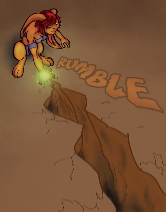 She's casting an earthquake spell. I tried to get the focus right this time (including the shadows)! What'd you think?
__________________
Quote:
Last edited by MoonBlazE; Jul 15, 2007 at 07:56 AM. |
||


| Jul 15, 2007, 05:43 AM | |
|
I'll give a quick few comments.
Your pose seems to not match the intensity of the spell. I think it'd be neat to see a more dynamic thing, like slamming their fist into the ground or something. This is more of a "catch a firefly, then let it go" type of deal. Of course, that could be a part of the composition too. And don't hide hands behind spell effects. To most people it looks cool, to me it looks like your trying to cover up for mistakes. And judging from how those fingers look, I'm inclined to actually beleive that too. The fissure doesn't look all that fissurey. You need to have ripples and rises, like a sine wave. But you also have to show that there was resistance. Some of the sides kinda curve and are soft. Instead go for angles and hard attacks. There is also something strange about it..I can't visualize the fissure. To me it looks like she's casting a mud beam spell. It's like an optical illusion. Just a funny observation. Lastly, spellcheck. Good drawing besides these points though. |

| Jul 15, 2007, 07:38 AM | ||
|
Lol rubmle, :X that's what I get for working past midnight till morning.
I didn't really think the fingers looked bad, your monitor might be a little bright (or mine a little dark) if you can't see the hand's shape from the spell effect. I'll keep that in mind though and try to use less light in the future. Thanks for the advices though, I <3 them.
__________________
Quote:
|
||
| Jul 15, 2007, 04:07 PM | ||
|
Quote:
You have some problems with making things look female, at least judging from this picture and that Blackraptor one in OC that I do not want to remember - though the pic for Dal looks okay. You need to remember to give female characters wider hips (at least equal to their ribcage width), less upper-body muscles, and an overall smoother and curvier form. And less of a chin; she looks kind of like Jay Leno. Also, the secret to making shattering spell effects look awesome is to have little bits of rock mid-air or falling into the pit. Rock rarely breaks that cleanly, and having things mid-air gives cues to the speed or intensity to which something is moving.
__________________
GENERATION 22: The first time you see this, copy it into your sig on any forum and add 1 to the generation. Social experiment. <i>"This picture shows me that the gray bird man is just a bully and picks on smaller birds. Just because he has no friends and takes it out on others smaller than him to look good. I can see in the parrats eyes that it does however have a understanding of the gray bird man and is upset about getting cut."</i> - Speeza on cartoon birds. |
||
| Jul 15, 2007, 04:57 PM | ||
|
Thanks for the tips Radium, I'll just keep trying until I get them woman right, even if it means pulling you into OC for more of my sexy female drawing. =)
__________________
Quote:
|
||
| Jul 16, 2007, 04:53 PM | ||
|
Hehe. I realize that the hand could have been done better, aaand I did look it up after Strato first said it. The finger lengths don't match exactly as it should. After every picture I have done I take a second look sometime after and first then realize the mistakes. You might say "look at a hand and draw it" but it's easier said than done, it's also very rude the way you picked to say it Freefull.
Just as you have defination for good and bad art, I have definations for good and bad critique as well. The two above comments may have been meant to be witty but in case you didn't notice this is a serious thread and I'm going to have to ask you to not to troll it.
__________________
Quote:
|
||
| Jul 16, 2007, 05:04 PM | ||
|
Quote:
__________________
GENERATION 22: The first time you see this, copy it into your sig on any forum and add 1 to the generation. Social experiment. <i>"This picture shows me that the gray bird man is just a bully and picks on smaller birds. Just because he has no friends and takes it out on others smaller than him to look good. I can see in the parrats eyes that it does however have a understanding of the gray bird man and is upset about getting cut."</i> - Speeza on cartoon birds. |
||
| Jul 28, 2007, 10:13 PM | ||
|
Quote:
__________________
GENERATION 22: The first time you see this, copy it into your sig on any forum and add 1 to the generation. Social experiment. <i>"This picture shows me that the gray bird man is just a bully and picks on smaller birds. Just because he has no friends and takes it out on others smaller than him to look good. I can see in the parrats eyes that it does however have a understanding of the gray bird man and is upset about getting cut."</i> - Speeza on cartoon birds. |
||

| Aug 3, 2007, 03:53 AM | |
|
The picture of bat-rabbit-thing without the background is made of pure awesome. He should have actual hips, though; it sorta looks like the legs are just sticking out of the body, like on a lizard, and both legs together look like they're wider than the pelvis itself.
__________________

|

 |
«
Previous Thread
|
Next Thread
»
| Thread Tools | |


|
|

All times are GMT -8. The time now is 03:41 PM.
Jazz2Online © 1999-INFINITY (Site Credits). Jazz Jackrabbit, Jazz Jackrabbit 2, Jazz Jackrabbit Advance and all related trademarks and media are ™ and © Epic Games. Lori Jackrabbit is © Dean Dodrill. J2O development powered by Loops of Fury and Chemical Beats. Powered by vBulletin® Copyright ©2000 - 2026, Jelsoft Enterprises Ltd.
Original site design by Ovi Demetrian. DrJones is the puppet master. Eat your lima beans, Johnny.