


| Jul 17, 2007, 06:00 PM | |
|
Art, stories, and more from ShadeJackrabbit
This is now my official art thread. I finally got why the others were failing. Sorry for all the trouble. To start off, here's my newest picture:
Alien World by ~zapperoni on deviantART Again, sorry for all the hassle. Constructive criticism please, and any compliments as well. Also, please no "it sux" since that's a pointless statement. IMPORTANT UPDATE ON TALE OF THE PSI! DeviantArt Journal Update
__________________
 Stop talking sense, this is an internet argument. ~Doubble Dutch Last edited by ShadeJackrabbit; Nov 26, 2007 at 03:44 PM. Reason: updates |


| Jul 20, 2007, 02:48 PM | |||
|
Alright, just finished TotP Part3. Overall, it did an alright job developing the innkeeper and explaining the situation, though (as usual) I unearthed a multitude of minor problems.
Quote:
Moreso, though, it's important to consider the definition of "ranger". Even if you draw from Dungeons and Dragons influence, you have to remember that a character's "class" isn't just something they picked off a list. Rangers in fantasy are usually people who defend a natural area or nature as a whole via their tracking and hunting skills, so working as a guard in a city is likely outside their "comfort zone" (unless they are guarding the vicinity around the city). Furthermore, the ability to talk to animals is presumably not "because they are rangers", but a skill that they picked up from being outdoors so long. Also, it is pertinent to differentiate between "talk to animals" and "understand animals", and having animals understand you is another thing entirely. Anyone can talk to animals and, though this is never clarified, I presume Slipstream can understand English. So really, it seems unrealistic that one of the guards would happen to be a ranger, and thus perfectly understand every animal. More likely, one of them would happen to understand a sufficient amount of Horseish to get the general idea of what Slipstream was saying. There are definitely different "levels" to understanding any language. On an entirely different note, "guffawed" doesn't sound right. It means to laugh, and someone waking up doesn't strike me as particularly funny. Also, typo! You said "the room was quite", not "quiet". So, a knight in black armor. "That sounds just like some other evil person" is a somewhat hasty conclusion. I mean, it is a typical rule that the bad cowboys wear black hats, so to speak, but characters usually don't openly acknowledge this. The innkeeper also mentions that the knight was a ranger because he could talk to a horse, which, as I mentioned before, doesn't really work. Also, can someone be a knight and ranger at once? I'm not sure. Anyway, there's something strange about the line "I took some spells and left". Presumably, what Keiy took was either spell scrolls, or he learned some spells. Lastly, I think this line would work better as "they want our world back": Quote:
"World", on the other hand, is a more "vast" word. People think of a world as a big thing, because it's being compared to smaller things on it. Most importantly, though, is to consider that this is presumably a pre-space travel culture you are writing about, and there is likely to still be differentiation between planets and the world.
__________________
GENERATION 22: The first time you see this, copy it into your sig on any forum and add 1 to the generation. Social experiment. <i>"This picture shows me that the gray bird man is just a bully and picks on smaller birds. Just because he has no friends and takes it out on others smaller than him to look good. I can see in the parrats eyes that it does however have a understanding of the gray bird man and is upset about getting cut."</i> - Speeza on cartoon birds. |
|||

| Jul 20, 2007, 03:14 PM | |
|
Like I mentioned earlier, I really like the composition on "Alien World". The way you took one picture and divided it into frames is pretty creative, especially the way the order the frames are placed in matches the text (Planet, Monster, Man). And the panel with the alien's head turned out really nice.
One thing that stands out about it is that space is white. It's understandable that it could be day, except I don't think a moon could be shadowed like that in day. A gradient, white near the surface and gray towards the moon, might look better anyway. When I was talking to Stato, we also talked about how something might look neat in the background behind the panels, like a faint image of the side of a planet, but I'd definitely keep it white/very light gray. As for anatomy, the guy's arms are too far down on his body. Remember that they need to attach at the shoulders. Also, make sure the length of the arms is appropriate; when standing and with your arms out, the distance from fingertip to fingertip is generally equal to your height. The biggest thing you need to work on, though, is aliasing. If you can avoid aliased lines, do! If you don't know the difference between alised and anti-aliased, look at this thing:  Anti-aliased lines are smoother; they lack the "jagged edges" people associate with MS Paint. There's three ways to avoid aliased lines: -Work big. People that work with raster art draw things 2-4 times their final size, then shrink them. Most advanced art programs, when scaling things down, will average pixels in a way that will make the lines look smoother. -Work vector. Vector lines are made of math, not pixels, and will look fine no matter their size. Consider programs like Inkscape, or try out the trial version of industry-standard software like Illustrator and Flash. -Work real. Try either inking your sketch with an inking pen and then erasing the initial sketch, inking your sketch with a pen on a piece of tracing paper, or sketching with one of those special blue pencils and then inking, so the sketch won't show up when you scan. A scanned image will usually be anti-aliased. This is a way NOT to avoid aliased lines: -Blurring. Blurring does NOT make lines look smoother, just blurrier! I know on some old artwork I used blur filters to "make my lines smoother", but that was because I was like 12 and couldn't draw (see sig).
__________________
GENERATION 22: The first time you see this, copy it into your sig on any forum and add 1 to the generation. Social experiment. <i>"This picture shows me that the gray bird man is just a bully and picks on smaller birds. Just because he has no friends and takes it out on others smaller than him to look good. I can see in the parrats eyes that it does however have a understanding of the gray bird man and is upset about getting cut."</i> - Speeza on cartoon birds. Last edited by Radium; Jul 20, 2007 at 07:33 PM. Reason: Got aliased and anti-aliased mixed up in a spot. Anti-Aliased is the good one, FYI. |
| Jul 21, 2007, 12:33 AM | ||
|
Quote:
|
||


| Jul 21, 2007, 07:46 AM | |
|
TotP: Chp3 was I think the best chapter of them, but the whole explanation of the town and the guard and stuff were very sketchy, I know. It honestly was a continuity cover-up. The main problem was that I forgot to explain that the town was in the middle of the forest, and so, yes, the town guards also patrolled the surrounding woods. At least I can remember this for the re-write.
Also, after a night of fighting the psi, black things would look evil to you. I'll have to explain Keiy's perception a bit better... In Alien World, the aliased lines were kinda necessary because I used Paint .net, but I see what you mean. As for the white sky, It is supposed to look like daytime, as you thought, but I understand what you're talking about. Still, a gradient I think would subtract too much from the general simplicity. Probably just an almost black color for the planet and black for the sky would've worked. Anyways, thanks for the input. I'll keep it in mind.
__________________
Stop talking sense, this is an internet argument. ~Doubble Dutch |
| Jul 28, 2007, 09:37 AM | |
|
Alright, since some of you were waiting for it (I hope), I'm giving a little preview of chapter 4 of Tale of the Psi:
EDIT:The entire thing so far is being re-written, so all previous versions of the chapters are being removed.
__________________
Stop talking sense, this is an internet argument. ~Doubble Dutch Last edited by ShadeJackrabbit; Sep 15, 2007 at 04:56 PM. |
| Aug 3, 2007, 02:08 PM | |
|
Hi all! Chapter 4 of Tales of the Psi is out, though it's slightly shorter than the other chapters. This is also the point where the narrator stops talking in the present, and focuses more on the story.
Some criticism would be much appreciated! EDIT:The entire thing so far is being re-written, so all previous versions of the chapters are being removed.
__________________
Stop talking sense, this is an internet argument. ~Doubble Dutch Last edited by ShadeJackrabbit; Sep 15, 2007 at 04:55 PM. |
| Aug 25, 2007, 05:02 PM | |
|
Chapter 5 is done, in case anyone wanted to know...
EDIT:The entire thing so far is being re-written, so all previous versions of the chapters are being removed.
__________________
Stop talking sense, this is an internet argument. ~Doubble Dutch Last edited by ShadeJackrabbit; Sep 15, 2007 at 04:55 PM. |
| Aug 25, 2007, 08:15 PM | |
|
please don't quadruple post it's really annoying just use the EDIT button plz thx.
__________________
Yes, I am, in fact, ALWAYS the one to blame for everything. And none of your are full of yourself. Good job. Do you like Stijn? Take my poll!   Windows is not a virus. A virus is small and efficient... Note to Stijn: how am i even getting away with this |


| Aug 26, 2007, 03:01 PM | |
|
In case you didn't notice, the edit button doesn't let anyone know there has been an update. Plus, there was more than a week between posts. It's pretty sad when the only thing you can say to me is that I should kill my topic.

__________________
Stop talking sense, this is an internet argument. ~Doubble Dutch |
| Aug 26, 2007, 04:47 PM | |
|
I just revived your topic by saying that. You should be thanking me!

__________________
Yes, I am, in fact, ALWAYS the one to blame for everything. And none of your are full of yourself. Good job. Do you like Stijn? Take my poll! Windows is not a virus. A virus is small and efficient... Note to Stijn: how am i even getting away with this |
| Aug 27, 2007, 09:34 AM | ||
|
You wanna know what I think? It doesn't matter if people double post as long as they are content and with reason, however useless off-topic posts that doesn't contribute to the topic at all are much more annoying.

__________________
 Quote:
|
||


| Aug 27, 2007, 10:29 AM | |
|
Thanks MoonBlazE.
__________________
Stop talking sense, this is an internet argument. ~Doubble Dutch |
| Aug 30, 2007, 08:02 PM | ||
|
Quote:
Okay, sorry I've been putting this off for so long D=. Just read 3 and 4. You're definitely improving with narration, but there's still a few things that read awkwardly. A few typos too, but I'll just skip that (the only one that really affects the flow is in Ch5 where you said "me" as "more"). It's a fairly original idea having Nyte as the narrator, but it feels inconsistent; like, as though narration switches between First Person (as Nyte) and Third Person Omniscient. If you're aiming for First Person Omniscient (as in, Nyte knows everything that's going on), or even just regular first person and presuming that Nyte has, after or during the events of the story, learned what was happening to everybody else, it needs to be made clear that Nyte is still narrating scenes in which he's not present. The easiest way to do this is to throw in more opinion statements, rhetorical questions, or even direct references to himself ("While I was still riding away..."), giving it a more conversational tone like Nyte has at the beginning and in his dialogue. Anyway, moving on, I don't particularly like Nyte's explanation of his god and powers. Not only is "kinetic", at least in that scientific definition, is a rather modern word that doesn't really fit the medieval theme, but Kinetica's name alone is enough to get the point across, as is the description of how Nyte doesn't stop the arrow, but redirects its energy. The way Keiy asks "what other spells" Nyte has strikes me as awkward, but it could just be a personal bias of mine because I tend to shy away from viewing spells as "definite" things. For instance, if you were basing a story off a computer RPG you might have a character say "I've finally mastered my ice magic!", but not "I got Frost II!". Nyte is, even if he channels the powers from his god, a telekinetic. Realistically, his focus should be on what he is capable of doing with his godgiven powers, not what "spells" he "has". Also, I have a minor nitpick about the concept of dropping a flying citadel on a castle: walls and fortifications are still part of a castle. What you mean is to drop the citadel on the keep. The thing that baffles me the most, however, is the final section, where in the course of three paragraphs you describe a woman as being 40, young, and old. Forty is kind of between young and old, but pick one side or the other D=. |
||
| Aug 31, 2007, 06:33 AM | |
|
I'll try to fix up some of the problems with using advanced terms.
Ah, darn it! Young is a typo... I'm doing a minor re-write of chapter 5 because of some of my typing errors. Nothing really different, other than the removal of the term kinetic. Hmm... I'll try to fix the narration aspects... Chapter 6 is on it's way, and I think you'll enjoy it. It's got the most... (meat?) to it.
__________________
Stop talking sense, this is an internet argument. ~Doubble Dutch |
| Sep 5, 2007, 09:55 AM | |
|
Removed because it sucks. Also removed from DA.
Planned to be used as the front of a Tale of the Psi t-shirt. What do you think?
__________________
Stop talking sense, this is an internet argument. ~Doubble Dutch Last edited by ShadeJackrabbit; Nov 26, 2007 at 03:43 PM. |
| Sep 5, 2007, 06:20 PM | |
|
Hm.. as usual the composition is pretty good (for the most part you seem to have no problem laying things out), but something you still need to work on is your anti-aliasing. It's most prevalent in the text of the above image, but is much more obvious in the "logo" image in your DA account.
The thing you want to avoid is those little white "dots", which can especially be a problem when using fill colors. Take the below image for example: 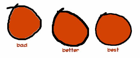 These were colored three different ways. The first circle was drawn with an anti-aliased brush (or scanned in) and then colored with the flood fill. Anti-aliased lines look smoother because of the little gray pixels along their edges, but if you try to fill the area around them it'll only affect the pure white pixels. All the little in-between gray shades don't get colored, leaving behind the residual "white pixels". The second circle was either drawn with an aliased brush (as in, no gray-shades near the edges; pure black and white) or scanned in and then reduced to two colors. A flood fill usually works fine on images like these, but their sharp, jagged edges don't look great. Most programs can anti-alias edges by shrinking the image down to 50% or so, though. The last circle manages to have anti-aliased lines and nice coloring because I colored it on a separate, "multiply" layer. If Paint.net has layers, it probably has the option of changing their blending type. The "multiply" setting is kind of like coloring with watercolors; you can paint right over black and it'll still be black, but if you paint over white it'll get colored. Overall, I'd just suggest playing around a bit on a blank canvas with drawing basic shapes and coloring them to see what gives you the nicest looking lines with the least artifacts on them. As far as lettering goes, your handwriting is okay, but the black text with a black shadow makes it difficult to read from more than about five feet away. Instead, consider no shadow or doing white text on a dark black shadow. With a T-shirt design especially, you want to aim to make it readable even from very far away. Also, for the logo, a ruler and compass (this kind) will make your straight lines and circles much neater. Do you have Open Canvas 1.1? If so, care to join a server with me sometime? Even if you don't have a tablet, I can show you a few tricks that will really improve your character illustration, and it's a pain describing visual concepts in text alone.
__________________
GENERATION 22: The first time you see this, copy it into your sig on any forum and add 1 to the generation. Social experiment. <i>"This picture shows me that the gray bird man is just a bully and picks on smaller birds. Just because he has no friends and takes it out on others smaller than him to look good. I can see in the parrats eyes that it does however have a understanding of the gray bird man and is upset about getting cut."</i> - Speeza on cartoon birds. |
| Sep 6, 2007, 09:27 AM | |
|
Yeah, I just got OpenCanvas. It looks interesting. Anyways, I'll look into some layer options in Paint.net, to see if I can get a better image....
As for OpenCanvas, PM me some time soon. EDIT: Chapter 6 of Tale of the Psi EDIT:The entire thing so far is being re-written, so all previous versions of the chapters are being removed.
__________________
Stop talking sense, this is an internet argument. ~Doubble Dutch Last edited by ShadeJackrabbit; Sep 15, 2007 at 04:56 PM. |
| Sep 11, 2007, 07:09 PM | |
|
Tale of the Psi - Desktop by ~zapperoni on deviantART Kinda less art, but I might as well post it here.
__________________
Stop talking sense, this is an internet argument. ~Doubble Dutch |
| Sep 14, 2007, 11:00 PM | |||||
|
Okay, got a chance to read Chapter 6. There's a lot more first-person narration than the previous ones, but in a way you still seem stuck in a third-person point of view. Like, take this line for example, Nyte refers to himself and Keiy in the third person:
Quote:
There's a principle that comes up in writing a lot called "show, don't tell", and it applies double to first-person narration. Rather than saying it was hot, tell how the heat felt; instead of saying there were many merchants, describe a few; in the place of "we sat thinking", show what's going through Nyte's head, and through what visual cues he is able to tell that his cohorts are thinking as well. Vivid description is what really pulls a reader into the story, making them feel as though they're in the world you describe. On a lighter note, you misspelled "quiet" again. I'm not sure I like the necromancer's exclamation of "Time for the dead to start walking!" I admit I'm basing this off common stereotypes, it just doesn't sound... necromanceresque. Necromancers are usually eccentric people that fill their diction with flourish. Simple sentence structures are more "cowboy" than "necromancer". While a necromancer-cowboy would be incredibly original, I can't really see a cowboy using "wish" like your necro does. Instead of "Time for the dead to start walking!", consider "The hour has come for the flesh of the departed to rise to my bidding!" With some practice, you can necromanticize any phrase. "Please enter through the left door" becomes "You would be wise to limit your entrance to southernmost gateway." "Go refill my soda for me" becomes "I, as acolyte to my thirst - unquenchable as it may seem - implore that you, now that through my twisted hand no longer flows the strength to do so myself, shall raise my chalice in my stead and into it pour the effervescent nectar from yonder dispenser." Moving right along, the part where you describe the skeletons seems to more or less say the same thing twice. Namely, the mention of some being skeletons: Quote:
Twilyte... I don't like her much. Partly because she's the third protagonist to have a Y in their name (though first to lack it in her chromosomes), and partly because I have no reason TO like her. In fact, I hardly know anything about her other than her gender and her job. The remedy to this is fairly simple: have Nyte think more. When he first sees Twilyte, he has to notice more than her gender and age. If she's a captain, she has armor and weapons, right? And if one of those weapons is enchanted, it probably looks elaborate or special (foreshadowing that would be good, since her magic sword seemed almost deus ex machina during the undead fight). And if she almost kills Keiy in a hug, she is probably pretty built, right? She sounds anything but ordinary, yet her description is limited to "a young woman". Speaking of killing, you didn't kill off the king very well. For one, he only lived for all of two and a half pages. While he presumably existed years before those unfortunate two-and-a-half, there is no mention of this. After seeing his son for the first time in a while, his reaction is "Ah! My son!", and then he proceeds to show an equal amount of interest to Twilyte, who is at the castle every day. After he gets impaled, Nyte's first reaction is to ignore the king and have a short conversation with his murderer. Overall, the king doesn't seem to matter much. I'm not saying every death should be an Aeris, of course; it'd be downright out of place if Nyte picked up the king's body and said "The unnamed king is gone... the unnamed king will never laugh, cry, or get angry...". It'd be nice if you'd at least develop him a little though, before kabobbing him, and have the characters have some reaction. Remember, this is first person: Nyte's reaction doesn't have to be anything visible. He doesn't even have to be sad, but he should at least acknowledge the ramifications of the king's death. Furthermore, the king's murder is the first action of what I presume is your primary antagonist (I think; I forget if he appeared in the village attack). When I said "not every death should be an Aeris", I meant they shouldn't all be soppy sad turning points. The Aeris death in Final Fantasy did something else very important, though: made the players hate Sephiroth. Bad guys have to do bad things that make readers dislike them, otherwise they won't care if the protagonists win or not. Killing off nameless minor characters is okay, but only if it's the icing on an evil cake. If killing the king is supposed to be enough to make Dalganoth a villain, it's not successful. And lastly, two very little things I noticed: Quote:
Quote:
So, yeah, the main things that you need to pay attention to are developing your characters in a way that makes the reader care about them and describing environments from a first-person perspective. The solution to both is to focus on people more, especially Nyte: his thoughts, feelings, ideas, and so on.
__________________
GENERATION 22: The first time you see this, copy it into your sig on any forum and add 1 to the generation. Social experiment. <i>"This picture shows me that the gray bird man is just a bully and picks on smaller birds. Just because he has no friends and takes it out on others smaller than him to look good. I can see in the parrats eyes that it does however have a understanding of the gray bird man and is upset about getting cut."</i> - Speeza on cartoon birds. |
|||||
| Sep 15, 2007, 06:10 AM | |
|
...That's it I'm rewriting all 6 chapters.
__________________
Stop talking sense, this is an internet argument. ~Doubble Dutch |
| Sep 15, 2007, 06:57 AM | |
|
If you want a few more tips, talk to me later today. I've worked with starting fantasy authors before, and there's same few things they forget to concentrate on that can make a normal story a great story.
__________________
GENERATION 22: The first time you see this, copy it into your sig on any forum and add 1 to the generation. Social experiment. <i>"This picture shows me that the gray bird man is just a bully and picks on smaller birds. Just because he has no friends and takes it out on others smaller than him to look good. I can see in the parrats eyes that it does however have a understanding of the gray bird man and is upset about getting cut."</i> - Speeza on cartoon birds. |

| Sep 15, 2007, 12:40 PM | ||
|
Quote:
__________________
GENERATION 22: The first time you see this, copy it into your sig on any forum and add 1 to the generation. Social experiment. <i>"This picture shows me that the gray bird man is just a bully and picks on smaller birds. Just because he has no friends and takes it out on others smaller than him to look good. I can see in the parrats eyes that it does however have a understanding of the gray bird man and is upset about getting cut."</i> - Speeza on cartoon birds. |
||
| Sep 15, 2007, 02:39 PM | |
|
Great... thanks for making me feel guilty about always asking you for help...
__________________
Stop talking sense, this is an internet argument. ~Doubble Dutch |
| Sep 15, 2007, 03:15 PM | ||
|
Quote:
FreeFull, give me your story as a Microsoft Word DOC file and I'll give it back to you with the full editor treatment; red underlines, comments, strikeouts, everything.
__________________
GENERATION 22: The first time you see this, copy it into your sig on any forum and add 1 to the generation. Social experiment. <i>"This picture shows me that the gray bird man is just a bully and picks on smaller birds. Just because he has no friends and takes it out on others smaller than him to look good. I can see in the parrats eyes that it does however have a understanding of the gray bird man and is upset about getting cut."</i> - Speeza on cartoon birds. |
||
| Sep 15, 2007, 03:36 PM | |
|
It isn't really long enough for that... and OpenOffice does all the job with red underlines. http://www.freewebs.com/freefull/necrigod%5Ftlc.doc
__________________
I am. |
| Sep 15, 2007, 05:43 PM | |
|
http://foxmage.com/necrigod_tlc_reviewed.doc
See why I try not to criticize stories? It wrote more there than you did D=.
__________________
GENERATION 22: The first time you see this, copy it into your sig on any forum and add 1 to the generation. Social experiment. <i>"This picture shows me that the gray bird man is just a bully and picks on smaller birds. Just because he has no friends and takes it out on others smaller than him to look good. I can see in the parrats eyes that it does however have a understanding of the gray bird man and is upset about getting cut."</i> - Speeza on cartoon birds. |
| Sep 16, 2007, 07:38 AM | |
|
Or at least hit them over the head until they get it right.
Hey, if it works.... which it does...
__________________
Stop talking sense, this is an internet argument. ~Doubble Dutch |
| Sep 16, 2007, 07:23 PM | |
|
Chapter removed, see first post.
They're done. Tell me what you think people!
__________________
Stop talking sense, this is an internet argument. ~Doubble Dutch Last edited by ShadeJackrabbit; Nov 26, 2007 at 03:42 PM. |
| Sep 27, 2007, 05:10 PM | |
|
Chapter removed, see first post.
A few comments?
__________________
Stop talking sense, this is an internet argument. ~Doubble Dutch Last edited by ShadeJackrabbit; Nov 26, 2007 at 03:42 PM. |
| Oct 10, 2007, 11:46 AM | |
|
Chapter removed, see first post.
Either nobody cares or they're all speechless... I'll just be optimistic and go for the latter.
__________________
Stop talking sense, this is an internet argument. ~Doubble Dutch Last edited by ShadeJackrabbit; Nov 26, 2007 at 03:42 PM. |
| Oct 28, 2007, 01:53 PM | |
|
__________________
Stop talking sense, this is an internet argument. ~Doubble Dutch |

| Oct 29, 2007, 08:54 AM | ||
|
Nice.
No wings perspective. And the fingers.... how does this guy cand hold things? Oh and what Nova sayed. + the hands. yah. And these brown things should have some thickness I think.
__________________
<img src="http://www.majhost.com/gallery/Lijik/Star-Wars-Figures-1/ewjclay.png" alt="I miss the techno Cheat." style="float: left; display: block;"> ((\_/)) ((<a href="http://www.explosm.net/db/files/Comics/Dave/comicbullyroot.jpg" target="_blank">o</a>.<a href="http://drmcninja.com/page.php?pageNum=44&issue=11" target="_blank">o</a>)) (()_()) Classical zombie retro extra fur rabbit. Guys, remember 2010? LOL Quote:
Last edited by Nonomu198; Oct 29, 2007 at 02:34 PM. Reason: It was brows instead of brown. |
||

| Oct 29, 2007, 12:00 PM | |
|
Hmm... good points all of those...
__________________
Stop talking sense, this is an internet argument. ~Doubble Dutch |
| Nov 26, 2007, 03:42 PM | |
|
IMPORTANT UPDATE ON TALE OF THE PSI!
DeviantArt Journal Update In short, I'm not putting it up any longer.
__________________
Stop talking sense, this is an internet argument. ~Doubble Dutch |
 |
«
Previous Thread
|
Next Thread
»
| Thread Tools | |


|
|

All times are GMT -8. The time now is 10:31 AM.
Jazz2Online © 1999-INFINITY (Site Credits). Jazz Jackrabbit, Jazz Jackrabbit 2, Jazz Jackrabbit Advance and all related trademarks and media are ™ and © Epic Games. Lori Jackrabbit is © Dean Dodrill. J2O development powered by Loops of Fury and Chemical Beats. Powered by vBulletin® Copyright ©2000 - 2026, Jelsoft Enterprises Ltd.
Original site design by Ovi Demetrian. DrJones is the puppet master. Eat your lima beans, Johnny.