


| Jul 18, 2006, 01:47 PM | |
|
I tried my hand at something new...
I already asked several people what they thought about it. I got various comments, ranging from "OMG GREAT!" to "OMG STOP TRYING!"... I just wanted to know what you think about this:
The Antagonist Returns by ~CrimiClown on deviantART "What have I done..." by ~CrimiClown on deviantART "If you take the red pill..." by ~CrimiClown on deviantART 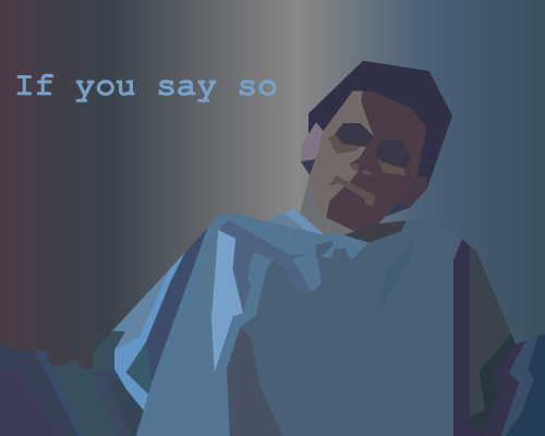 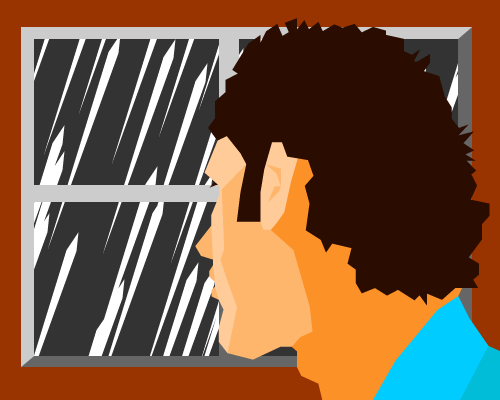 Thank you for your time.
__________________
buy shoes shoes for sale 50% discount on shoes shoes made in China look like real thing did I mention shoes? Last edited by CrimiClown; Dec 8, 2008 at 06:41 AM. |


| Jul 18, 2006, 05:24 PM | |
|
I predict Radium coming in here to tell you that you are better than me.
It's actually quite cool. Brilliant style. It has something to it. Elaborate on that more. And give the eyes a bit of shading or lighting, too. Then again, maybe not. *shrugs*
__________________
 |

| Jul 18, 2006, 05:47 PM | |
|
A very interesting choice of title. Is the said drawing of the "antagonist" archetype? It appears to be, as the aggression is shown very clearly given the hand guesture (Universal Semiotics). It was created using a strange method of combining blocky shapes, as well... Interesting.... Mmmm.....
__________________
<center>  <center>OWIE. |

| Jul 18, 2006, 05:48 PM | |
|
Wha?
__________________
Guess what? I'm Back.  I Don't care about caring. Enjoy your malware-infested computer at the price of a few annoying animated GIF smilies! - Odin G |

| Jul 19, 2006, 02:53 PM | ||
|
Quote:
Anyway, as I've already told you, the style is very nice. Simple graphic art; you can make money off this kind of stuff. I feel I should point out, though, that the hand wasn't clear to me until Sucka pointed it out. Maybe it's just me, but at first it struck me as some kind of armor on his shoulder. It would be a bit more clear that it's a hand if I had noticed the faint gray lines that are his actual shoulders (blame my monitor, maybe). I think it would work better if the gray shoulder line (at least on the left) was brighter, or maybe his hand was changed a bit so it wasn't in such a shoulder-and-collar-y place. I disagree on Faw with shading the eyes. The lighting is from behind; the eyes being in shadow works great. I'd suggest making them smaller, though, as it would make him look a bit more evil.
__________________
GENERATION 22: The first time you see this, copy it into your sig on any forum and add 1 to the generation. Social experiment. <i>"This picture shows me that the gray bird man is just a bully and picks on smaller birds. Just because he has no friends and takes it out on others smaller than him to look good. I can see in the parrats eyes that it does however have a understanding of the gray bird man and is upset about getting cut."</i> - Speeza on cartoon birds. |
||

| Jul 21, 2006, 03:52 AM | |

| Jul 21, 2006, 05:49 AM | |
|
Hmm, not bad at all, either... only that part seperating the front and back halves of the head... it's too straight even in comparison to the rest of the image. Unless he's wearing a mask or something.
__________________
|
| Jul 21, 2006, 06:11 AM | ||
|
Quote:
:P *** EDIT!! *** Another one... *sigh*
__________________
buy shoes shoes for sale 50% discount on shoes shoes made in China look like real thing did I mention shoes? Last edited by CrimiClown; Jul 21, 2006 at 07:40 AM. |
||
| Jul 21, 2006, 07:57 AM | ||
|
Quote:
This one looks like a pretty boy posing for a magazine covershoot. |
||

| Jul 21, 2006, 08:16 AM | ||
|
Quote:
... I should have given him a 3-day old beard... :/ |
||
| Jul 21, 2006, 09:10 AM | ||
|
Quote:

|
||
| Jul 21, 2006, 08:55 PM | ||
|
Quote:
__________________
<center> <center>OWIE. |
||
| Jul 22, 2006, 06:42 AM | |
| Jul 22, 2006, 05:49 PM | ||
|
Quote:
n00b: waa dun u shut yo mowt? Stijn: filter bypass edit
__________________
<center> <center>OWIE. Last edited by Stijn; Jul 23, 2006 at 05:42 AM. |
||
| Aug 18, 2006, 03:51 PM | ||
|
Quote:
Purdy... I need to try something new with my drawings too, but I don't know what D= I've already changed from freehand to using shapes but some don't look good doing that =(
__________________
NOM
|
||

| Apr 15, 2007, 03:42 AM | |
|
I'm getting better and better at this.  (sorry for reviving an old topic, but I thought it was a waste of space to make a new one) |
| Apr 15, 2007, 04:13 AM | |
|
Nice, allthough his eyes could've used some more colours, just to give him a tad more detail. Now he looks like a zombie with his eyeballs ripped out of their sockets...

__________________
Earth Mantra, for all your ambient music needs. |


| Apr 16, 2007, 09:38 AM | |
|
Reminds me of the graphics style in "Another World."
__________________
 Stop talking sense, this is an internet argument. ~Doubble Dutch |

| Apr 16, 2007, 11:28 AM | |
|
Indeed! It looks quite the same...
__________________
Earth Mantra, for all your ambient music needs. |

| Apr 17, 2007, 11:29 AM | |
|
You'll have to make a new thread soon because it's no longer new.
__________________
GENERATION 22: The first time you see this, copy it into your sig on any forum and add 1 to the generation. Social experiment. <i>"This picture shows me that the gray bird man is just a bully and picks on smaller birds. Just because he has no friends and takes it out on others smaller than him to look good. I can see in the parrats eyes that it does however have a understanding of the gray bird man and is upset about getting cut."</i> - Speeza on cartoon birds. |
| Apr 17, 2007, 12:15 PM | ||
|
(hello jcf ppl)I jost came and saw it and the newer pics r alot better
.ppl rly do make money outa this style, u can see alot at museums and 2d pre-graphics at 3-d movies (if u get 2 see em,imean). u can use some more colors,some weirder ideas, and u gut urself a pro modern art ([lol i use 2many notes]not that these takes "pro".All bout....well idk these stuff r way complicated [haha more notes  {w8 this smiley is evil?}]) . If u like this style then go on and master it =D.You r rly good at it {w8 this smiley is evil?}]) . If u like this style then go on and master it =D.You r rly good at it
__________________
<img src="http://www.majhost.com/gallery/Lijik/Star-Wars-Figures-1/ewjclay.png" alt="I miss the techno Cheat." style="float: left; display: block;"> ((\_/)) ((<a href="http://www.explosm.net/db/files/Comics/Dave/comicbullyroot.jpg" target="_blank">o</a>.<a href="http://drmcninja.com/page.php?pageNum=44&issue=11" target="_blank">o</a>)) (()_()) Classical zombie retro extra fur rabbit. Guys, remember 2010? LOL Quote:
|
||

| Apr 17, 2007, 04:46 PM | |
|
Aye, it exceeds brainfart many times over. It has my dolphin of approval.
__________________
 nonne amicus certus in re incerta cernitur? /)_/)
(^.^) ((")(") |

| Apr 17, 2007, 05:05 PM | |
|
You have a dolphin of approval? Where do I get one?
__________________
Stop talking sense, this is an internet argument. ~Doubble Dutch |
| Apr 18, 2007, 04:50 AM | |||
|
Quote:
__________________
 Quote:
|
|||


| Apr 18, 2007, 07:06 PM | |
 There we go! There we go!
__________________
Stop talking sense, this is an internet argument. ~Doubble Dutch |
| Apr 18, 2007, 08:40 PM | |
|
Hmmm, It's not bad, but not as much fun as mine.
I got mine from Nick Kim, he *invented* the seal of approval: http://www.nearingzero.net/250dpi/nz034.jpg
__________________
nonne amicus certus in re incerta cernitur? /)_/)
(^.^) ((")(") Last edited by Doubble Dutch; Apr 18, 2007 at 08:41 PM. Reason: Image too big. |
| May 30, 2008, 11:04 AM | |
|
It seemed unnessecary to me to open a new topic about my vector artwork, so here ya go:
I call it "Longing for Sunshine" Notice how the rain'drops' are semi-transparent? Gives you a nice effect on all kinds of forum backgrounds! |
| May 30, 2008, 07:44 PM | ||
|
Quote:
Criticism-wise, the back of his head looks a little sloped off. More importantly, though, I think you missed some potential to do more with the lighting and color. I'm not sure the bright blue shirt and warm red woodwork on the window go great with the deary gray outdoor sky and white (or potentially yellow) rain.
__________________
GENERATION 22: The first time you see this, copy it into your sig on any forum and add 1 to the generation. Social experiment. <i>"This picture shows me that the gray bird man is just a bully and picks on smaller birds. Just because he has no friends and takes it out on others smaller than him to look good. I can see in the parrats eyes that it does however have a understanding of the gray bird man and is upset about getting cut."</i> - Speeza on cartoon birds. |
||
| May 31, 2008, 02:09 AM | ||
|
Quote:

|
||
| Jun 1, 2008, 08:13 AM | |||
|
Quote:
I think you posed the middle bright colur a little badly... Also, the yellow rain reminds me of Pako's Mona Lisa ( http://www.jazz2online.com/jcf/showthread.php?t=17169 )
__________________
<img src="http://www.majhost.com/gallery/Lijik/Star-Wars-Figures-1/ewjclay.png" alt="I miss the techno Cheat." style="float: left; display: block;"> ((\_/)) ((<a href="http://www.explosm.net/db/files/Comics/Dave/comicbullyroot.jpg" target="_blank">o</a>.<a href="http://drmcninja.com/page.php?pageNum=44&issue=11" target="_blank">o</a>)) (()_()) Classical zombie retro extra fur rabbit. Guys, remember 2010? LOL Quote:
|
|||
| Jun 1, 2008, 12:17 PM | |
|
Raindrops widen in the wrong direction, it looks as if it was ascending, not descending. You could also turn the window a bit with the perspective, because the character seems to look at the left edge of the window, not the rain itself.
Other than that, very good job!
__________________
my stuff |


 |
«
Previous Thread
|
Next Thread
»
| Thread Tools | |


|
|

All times are GMT -8. The time now is 03:41 PM.
Jazz2Online © 1999-INFINITY (Site Credits). Jazz Jackrabbit, Jazz Jackrabbit 2, Jazz Jackrabbit Advance and all related trademarks and media are ™ and © Epic Games. Lori Jackrabbit is © Dean Dodrill. J2O development powered by Loops of Fury and Chemical Beats. Powered by vBulletin® Copyright ©2000 - 2026, Jelsoft Enterprises Ltd.
Original site design by Ovi Demetrian. DrJones is the puppet master. Eat your lima beans, Johnny.