
 |
| Palette Suite | ||
 Palette suite is heaven for anyone who works with palettes. The amount of things it can do is simply breathtaking, which is why I’m dedicating this whole section to explaining all the different aspects of Palette Suite. For those of you who are left in the dark, Palette Suite is used to edit palettes, nothing more. It’s not a drawing program you can use as an alternative to Paint Shop Pro, so it’s not the only thing you need in making tilesets. However, when it comes to making palettes there’s nothing better, so what are you waiting for? Download it HERE and let’s get started!  Note: This section is based on version 2.31 of Palette Suite, which is the latest version at the time of writing.
|
| Menu Options | ||
File
|
| Palette File Tab | ||
|
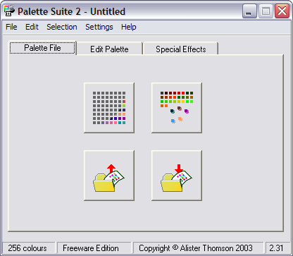
The 'Palette File' tab is a basic place to get started with Palette Suite. It’s got nothing new or important, all it’s features are accessible from the menu bar anyway. All it has is four large buttons with simple functions for starting a palette. The first button on the top-left is ‘New Blank Palette’, which makes a new palette and directs you to the ‘Edit Palette’ tab. The second button on the top-right is ‘New Custom palette’ which will make a new palette with varying shades of red, green and blue and then direct you to the ‘ Edit Palette’ tab. The third button on the bottom-left is ‘Open Palette…’ which will open a palette from an image or palette file before directing you to the ‘Edit Palette’ tab. The last button in the bottom-right is ‘Save Palette As…’ which will allow you to save your palette.
Note: A new feature in version 2.31 of Palette Suite allows you to save your palette as a 16x16 bitmap image. VERY HANDY feature! If you copy and paste this small image into your tileset it will fix MANY different things that could go wrong when compiling your tileset. It also fixes one of the most common problems that cause a textured background not to work in Jazz2, but I’ll explain that in more detail later. For now you should know that if you place this image in your tileset it will fix lots of potential problems, so go do it now!
|
| Edit Palette Tab | ||
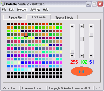 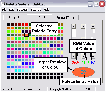 The ‘Edit Palette’ tab is where you are able to manually edit the colours of all the palette entries. It is also the place that gives you the most information about your palette, like the exact RGB value of the palette entry and the value of the palette entry itself. It’s much easier to explain the different parts of the ‘Edit Palette’ tab with an image, so I’ve included one above to show where the parts are. Note: You can change the RGB value of a palette entry either by dragging the three scroll bars above the RGB value, or you can click on the palette entry value to open up a new window to choose the colour (example shown below). 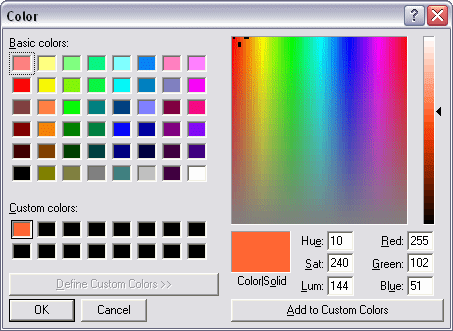
|
| Special Effects Tab | ||
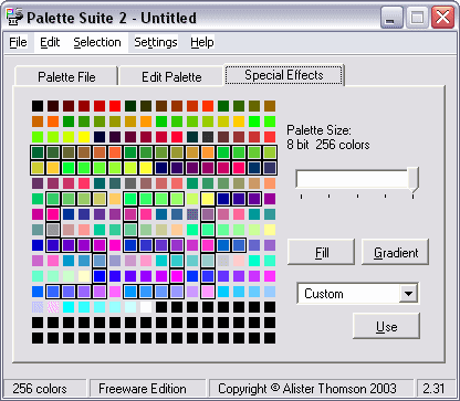 This is where the fun starts in using Palette suite! The ‘Special Effects’ tab has, you guessed it, a range of special effects you can apply to your tileset to satisfy even the biggest palette editing junkie, some of which are very useful indeed, I couldn’t live without it even if I tried. All the options in the ‘Special Effect’ tab is accessed by some buttons and a drop-down box to the right of the palette preview, the first of which is a small bar that you can choose the size of your palette with. I suppose it could be useful, but in tileset making you always use an 8-bit palette (256 colours), so we don’t need this option that much. The rest of the tools require you to make a selection it will apply the effect too. Since these tools can be useful for tileset making, I’ll give a more in-depth explanation on them. Fill Button: The fill button will change the colour of all the selected palette entries to the colour of the lowest selected palette entry. Let’s say we have a selection from palette entries 23-78 and the colour of palette entry 23 (lowest selected palette entry) is green then pressing the ‘Fill’ button will change all the other selected palette entries to green as well.
|
| Effects | |||||||||||||||||||||||||||||||||||||||||||||||||||||||||||||||||
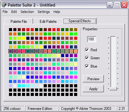 The rest of the tools in the ‘Special Effects’ tab are all effects chosen from the drop down box. They are all used in the same way, just select the effect you want and press the ‘Use’ button. This will open up a new properties box (above example) to the right of the preview palette where you can change the different values of the effect. While it looks the same for all the effects, the bar on the right acts differently depending on what effect you use, this is because some effects use different number values (some even use negative values). However, for every effect you can choose which channels (red, green or blue) you want it to apply to. The ‘Preview’ button shows you what the new values would change without actually applying the effect and the ‘Apply’ button applies the effect and removes the properties box. Note: Even though there is no way to cancel an effect once you have opened its properties box, you can cancel anything it would apply to your palette by deselecting all three channels (red, green and blue) and then pressing the ‘Apply’ button. Average: The average effect is used to smooth out the different RGB values while preserving the overall luminance of the original colour. Basically it’s a way to remove saturation (purity of the colour) and spread it out evenly between the selected colours. If you select all thee channels and use the full 100 average value then you will have a greyscale palette. +/- Brightness: This effect will increase or decrease (if you choose negative values) the brightness of the selected colours with exact values. Let’s say you choose to increase it by 16 on the red channel only then all the selected entries will have its RGB value of red increased by 16 regardless of what it was before. % Brightness: Like +/- brightness, this will increase or decrease the brightness of the selected colours. The difference is that this effect works on a percentage basis. So once again if you increased the brightness of red throughout the palette, then colours that had 0 red wouldn’t increase at all. The most that a colour can increase is doubling its original value (64 red could change to 128 red), as you can set the brightness to no more than 200%. Contrast: Contrast is used to increase or decrease (with negative values) the difference in luminance of colours. Light colours would become even lighter, while dark colours would become darker. A by-product of using contrast is that it also increases or decreases (with negative values) saturation, but not in the same way that the ‘Average’ effect does. No contrast would mean that there is no difference in luminance and saturation, making everything the same grey colour instead of preserving luminance like the ‘Average’ effect. Negative: The negative effect gradually changes the selected colours to its exact opposite. The values in between 0 and 256 don’t seem to work as well as they should, only a few ranges actually change the overall colour, so I would recommend mostly using it for value 256, which is the exact opposite of the original colour. A palette version of the oh-so-popular ‘Negative Image’ effect you can find in most drawing programs (even Paint has it, called ‘Invert Colors’).
Paint: Paint is a very strange effect that would seem to do nothing until you set it to really low values. It works very much like making a new custom palette in Palette Suite where you select the amount of shades of each different channel. The difference with paint is that it will change your current palette to a new one with fewer shades while preserving the actual colour indexes. You guessed it, the effect cannot increase the number of shades your palette currently has because that would need more palette entries which would break the preserved indexes of the colours. Because most palettes (except for a greyscale one) barely have more than 32 shades you will only be able to see a change when it is set to really low values. Setting it to 2 looks really funny too, it’s worth checking out. Superimpose: Superimpose is used to increase the brightness of the selected colour channels. It works in almost exactly the same way as ‘+/- Brightness’ except that it won’t brighten colours greater than its set value. Let’s say its value is set to 128, then it will change any value lower than 128 (0, 64, 75, anything) to 128 but any value higher than 128 (129, 156, 237) will remain unchanged.
The graph in the example above is the default graph and is what your palette looks like right now (as a representation on a graph of course), if you haven’t got a clue what the line means, you can always look at the gradient bar at the bottom as a guide to how your palette is changed. The fact that the gradient bar is grey doesn’t necessarily mean that your palette is grey; it’s only used to represent the different shades of your palette. You can draw on the graph if you like, but it’s very difficult (almost impossible) to get a line from the start to end, instead you can make a line much easier by editing the values in the four textboxes in the bottom-right corner. While it’s possible to add any value from -32768 to 32767, the graph only represents values from 0 to 255, so you’ll barely need anything else. The first box is the first value (left side) of the graph; second box is the last value (right side); third box is the amount the graph twists (in %) and the final box is how much it curves (in %).
So what exactly do all these values do? And how do they affect the palette? The graph is split into two separate axis (no I’m not going to call them x and y, you maths junkie you!
Increasing the height of the line at the left side of the graph will brighten all the dark colours of the palette, while decreasing the height of the line along the right side of the graph will decrease the brightness of all the light colours in your palette. Everything explained in one sentence, easy stuff. AND: This effect can be explained in one word: strange. I have no idea exactly how it works, only parts of it. ‘AND’ seems to apply multiple effects at once, altering the palette in different ways at different values. I’ll start with the things I know: value 255 is where it starts and is what your palette looks like right now. Reducing this value will reduce the brightness of the palette, which is one of the effects it does. It will also slowly reduce the amount of shades in your palette (just like the ‘Paint’ effect) until a range of colours are exactly the same value. When this happens, it will create a gradient in this set of colours to remove all the colours of the same value. I’m not sure if it will then apply ‘Paint’ again to repeat the process, at this point the palette is so dark because of the brightness reducing it’s impossible to tell for sure what happens. OR: This works exactly like the ‘AND’ effect except for one obvious change. Instead of decreasing the brightness it increases it, and the default palette starts at value 0 instead of 255. Once again it’s hard to tell what happens because by the time it’s about to repeat the process almost every colour is white or near white. XOR: If you thought ‘AND’ and ‘OR’ was strange, then this will be another nice surprise for you. I have no idea how this effect works, all I know is that it’s an alternative to the ‘Negative’ effect, as setting it to value 255 will create a negative of your original palette.
Advanced Paste: This is a great alternative to normal copy and paste. It works in very much the same way. Copy a selection and select a new area where you want to paste it (once again you can make any selection and load new palettes), but instead of using normal paste use the ‘Advanced Paste’ effect. This will allow you to blend the copied selection with the current selected palette entries, just imagine that the copied selection is in a new layer above the current palette and values 0-100 is the opacity. Works just like layers in an image, fun!
And that’s it for all your info on Palette Suite. I hope it was as useful to you as it was for me, I only knew about 40% of the stuff it could do before writing all that.
|
| Making the Palette | ||
|
Page 1: Palette Basics / Palettes for Different Drawing Methods |
||
-=Tutorials=-
[Part 2: Drawing the Tileset|Part 3: Making the Palette|Part 4: The Textured Background]
 ).
).
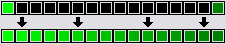 Gradient Button: This has arguably got to be the most useful feature of Palette Suite in terms of tileset making. The gradient button will make a perfect gradient of colours between the highest and lowest selected palette entries. Look at the above example; let’s say you have a selection from palette entries 160-175. Palette entry 160 is bright green (255 green) and entry 175 is a darkish green (128 green), then pressing the gradient button will fill all the colours in between with a gradual gradient of colours slowly blending from the first colour to the last.

 Page 2: Palette Suite