
 |
| Making the Palette (Palette Basics) | ||||||||||||||||||||
 From the basics section you’ll know that every tileset needs a palette. Some of you know what this means, but others don’t. Before actually getting to the important things you need to know to make a tileset palette I’ll explain some of the basics so you have a better understanding. So what exactly is a palette? In a short simple explanation, it’s a file that stores the colours you use in your tileset. Normal images that use the hexadecimal colour values (256 different shades of red, 256 green and 256 blue) have around 16.7 million (16,777,216 to be exact) different colour values to use. Kind of scary when you realise that tilesets can only use 256, but there is some good news. Palettes are used to store these 256 colours, and while this is much lower than the total possible colours, you can store ANY of the 16.7 million colours you want. This means that with the help of a palette you can choose exactly what colours you want to use with your palette.
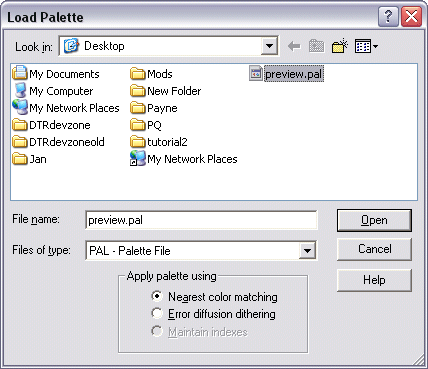 Loading these palettes into an image is really with Paint Shop Pro. Firstly, select the image you want to load the palette into and go to ‘Colors --> Load Palette…’ A new window (above example) will then pop up where you will be able to choose a ‘.pal’ format (File format for palettes used in both Paint Shop Pro and Palette Suite) palette. At the bottom of the example image you will see a box titled ‘Apply palette using’. This is where you can choose how you wish to load the palette into the tileset. The first option (Nearest color matching) is the most commonly used; it will automatically choose the closest colour for each one of the colours in your palette. ‘Error diffusion dithering’ works much in the same way, but when it doesn’t find the exact colour it will try to blend different colours together to get the correct colour. It’s not recommended for use in tilesets, as the result can be really messy if you don’t know what you’re doing, I never use it myself.
The final option (Maintain indexes) is greyed out unless the image already has a palette. In that case it will load the new palette but keep the indexes of the colours the same no matter how different the new colours are. It’s a handy way of changing the colour of some tiles without having to redraw them e.g. changing red flowers to pink.
|
| The Jazz2 Palette | ||
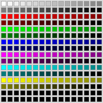
 Palettes sound easy enough right? Well, there’s a catch to all this, your tileset image isn’t the only thing that uses the palette, Jazz2 does too. Therefore there are some things you need to place inside your palette that Jazz2 can use. The most important of all these is the Jazz2 palette, it is a small set of colours used by almost every event, character, monster, effect, piece of interface, almost anything you can think of apart from the tileset itself uses this set of colours. It’s not built into the game; it’s built into the tileset, so you have control over it and can modify it quite a bit (change lightness, hue and saturation), as long as the shades from light to dark are in the same palette entries. Ever seen a tileset where everything is darker? Perhaps the some colours are swapped around, or some things are completely different colours. It’s all because the Jazz2 palette was tweaked. There is a catch to this; the Jazz2 palette uses quite a few palette entries, which means you have fewer colours for your tileset. Palette entries 0-95 (96 entries) are used for the Jazz2 palette, leaving you with 160 colours to use for your tileset. If you plan on making a textured background as well you’ll also use entries 176-207 (32 entries), taking the total amount of colours you can use down to 128, which only leaves you with half of a palette to use for your tileset. Note: Even though most of the palette entries in 0-15 are unused you should leave them as they are because Jazz2 needs the empty entries during compiling. You could place these empty entries elsewhere if you like, but it’s better over there so they don’t interfere with the rest of the tileset space you have. The best thing about the Jazz2 palette is that it’s already made for us tileset makers, we just need to place it in the correct palette entries (0-95) in the tileset. You can download a copy by clicking the link HERE. |
| Palettes for Different Drawing Methods | ||
When you look at the very basics, the difference between the two drawing methods is all because of the way they deal with making palettes. Just like drawing with the two methods, the way you make the two palettes for these methods are completely different, even when you make them during the tileset is different. Luckily palette editing never takes too long, and as soon as you understand how to make them (there’s very little to understand in the first place) you’ll end up enjoying the little bit of effort for its customisability. 
|
| 256 Colour Method | ||
 Making a palette for this method is the easiest, thought you have to make it before actually drawing the tileset. Always start with the Jazz2 palette first, every palette for tilesets MUST include it. If you plan on making a textured background, then make sure you’re not using palette entries 176-207 for your custom colours either. With the other palette entries you can add just what colours you want. If you’ve planned your tileset, you should know what colours you intend on using (lots of blue for an underwater tileset, grey for metal in a space tileset etc.) then this wouldn’t take too long.
Normally when you add a range of colours to a palette you start with the colour you want and make a gradient down to near-black (black is transparent so won’t help at all). In 256 drawing you would barely use more than 16 different shades of the same colour, even 8 is enough to work with, so making more would be a waste.
|
| 24-bit Method | ||
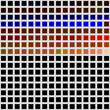  The palette for the 24-bit drawing method is a bit trickier than the one for the 256 colour method. With this method you make the palette after you have finished drawing everything, which means that you must do something every 24-bit tileset maker fears: Colour reduction!  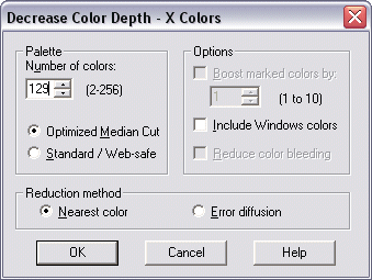 Doing it is really easy. Firstly, select your image and go to ‘Colors --> Decrease Color Depth --> X Colours (4/8 bit)…’ A new window will appear, just select all the options like in the above example image. If you’re making a textured background, set it to 129 colours. If not, then set it to 161 and press ‘OK’. That’s all there is to doing it, note that I chose 1 colour more than what I want because I’m taking the transparency colour into consideration (It’s in the Jazz2 palette anyway). That was the easy part; the hard part is actually making the results to work. 24-bit tileset images use approximately 10,000+ colours (My tilesets range from 6,000 to 23,000 colours, averaging at around 13,000) and colour reduction reduces it to a palette image of 128 colours. It sounds scary, and believe me; once you’re used to a lovely 24-bit image then 128 colours will look really scary. Ultimately your tileset WILL look worse than what you were drawing no matter what you do to try and prevent it, but there are ways to reduce loss of quality to the point where it doesn’t affect the quality by much, here are a few pointers:
|
| The GOLDEN RULE OF COLOUR REDUCTION | |||||||||||||||||||||||||||||||||||||||||||||||||||||||||||||||||||||||
|
Apart from the three above pointers, there is one more thing to always keep in mind when making tilesets, the GOLDEN RULE OF COLOUR REDUCTION, which is:
NEVER EVER blend different colour hues together!
I cannot stress just how important this is. If you blend different hues together then not only will you make a completely different gradient of colours, but you will make a different one for each different shade of the two hues blending together. Let me say that again in a simple English example: The different amount of combinations because of the different shades used in the textures will increase the amount of colours by extremely large amounts, which will let colour reduction turn into a nightmare. I know I’m turning this into something big, but there are a LOT of people who don’t know it, and once you make the mistake it’s extremely difficult to fix. It could even mean that you need to completely redraw tiles because the colour reduction went wrong. Quite a few people blindly tell me that “The borders in your tilesets look ugly; you should blend the parts of your tileset together”. If someone ever tells that to you, ignore what they say and link them to this page, under no circumstances should you EVER break the GOLDEN RULE OF COLOUR REDUCTION.
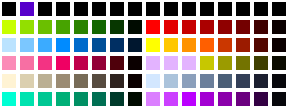
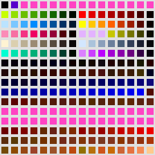
After colour reduction is done, you need to save the new palette (‘Colors --> Save Palette’) So that you can copy and paste all the colours inside it into a new palette along with the Jazz2 palette, and then place your textured background colours in the palette too if you’re making one. The example above shows a palette (The one I used for Eternal Agony) made after colour reduction and then the new palette that includes the Jazz2 palette. The pink strip in palette entries 176-207 is a placeholder for the textured background. You can easily do all this in Palette Suite, which is what I’m going to explain in the next section after this short list.
|
| Making the Palette | ||
|
|
||
-=Tutorials=-
[Part 2: Drawing the Tileset|Part 3: Making the Palette|Part 4: The Textured Background]

 Page 1: Palette Basics / Palettes for Different Drawing Methods