


| Nov 18, 2006, 03:49 PM | |
|
They contrast nicely, but I think the ground tiles are a little too intense for my shade of orange. The eyecandy looks great.
|


| Nov 19, 2006, 12:09 AM | ||
|
Quote:
__________________

Last edited by Camou; Nov 19, 2006 at 12:23 AM. |
||


| Nov 19, 2006, 12:42 AM | |
|
Hmm... with such powerful colors in the foreground, I don't think strong background color is needed... in fact, the contrast may be a little painful on the eye ( I say that a lot, eh? ). May be. Try simple white or grey. Something dim.
EDIT: that tileset is teh sex btw D===
__________________
 |


| Nov 19, 2006, 04:24 AM | |
|
hahaha
__________________
Mystic Legends http://www.mysticlegends.org/ The Price of Admission - Hoarfrost Hollow - Sacrosanct - other - stuff |


| Nov 19, 2006, 05:20 AM | |
|
Errrrrr........... a bit too simple.....
|

| Nov 19, 2006, 05:30 AM | ||
|
Quote:
Oh well.
__________________
Proud noob member of the Cracco Clan. |
||

| Nov 19, 2006, 05:35 AM | ||
 And I've made a pack like that before, but this one will be better than that one ;p. But will you make 2 Battle levels and 3 CTF levels as well?
__________________
the epicness itself:  Quote:
|
||


| Nov 19, 2006, 08:30 AM | |
|
Woah, those levels look excellent!
|
| Nov 19, 2006, 08:49 AM | ||
|
Quote:
I think I'll just upload them in two packs, 2 levels each.
__________________
Proud noob member of the Cracco Clan. |
||
| Nov 19, 2006, 08:55 AM | ||
|
Quote:

__________________
<a href="http://ut3.com.pl/7ds/news.php"><img src="http://img15.imageshack.us/img15/9643/polisharmy.png" border="0" alt="[polish_army]"></a> <a href="http://profile.xfire.com/pfourul"><img src="http://miniprofile.xfire.com/bg/sh/type/1/pfourul.png" border="0" width="277" height="63" /></a>
|
||


 Just too many.
| Nov 19, 2006, 08:14 PM | |
|
Something keeps screwing up when I try to convery the .pcx to a different format, so here's the only salvageable screenshot.
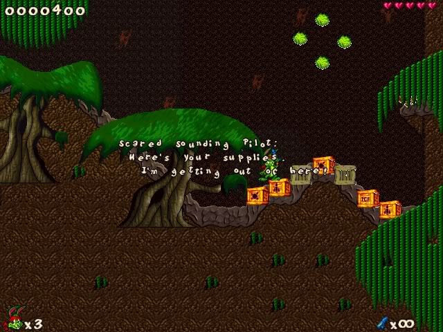 I'll probably never finish this pack, but this is a preview of what it might look like. I'll see if I can't make some better screenshots. |
| Nov 20, 2006, 12:10 AM | |
|
That's the only ammo supply for the first portion of the level, though :P
|
| Nov 20, 2006, 09:46 AM | |
|
Lol..that never occurred to me. Thanks.
|
| Nov 22, 2006, 09:41 AM | |
|
The background trees don't really look good on layer 3.
|
| Nov 22, 2006, 01:40 PM | |
|
That's easily fixed. Thanks for the input.
|


| Nov 23, 2006, 01:43 PM | |
|
..........................
Make the rain go away. Or replace it with better rain. Then you have created at least visually the level of my dreams. PS: Well, actually I like the first screenshot the best, the other two are a tad too cluttered. But dang.
__________________
|
| Nov 23, 2006, 01:47 PM | |
|
Yes, you can see the bullets.
You don't like the rain?  But there's thunder, too! But there's thunder, too!Just for you I'll make a Fawriel version without rain. ;P Edit: Rainless Fawriel version and bullets firing, yay! 
__________________
some kind of nature
|
| Nov 23, 2006, 01:52 PM | |
|
Hmmm, especially compared to the rest of the set, the rain seems cartoony, unrealistic and just too simple. Single drops. And raindrops aren't even shaped like that, I believe. Thunder in levels also tends to look kind of cheesy..................
You'd have to prove me that it doesn't look as bad as I picture it in practice.
__________________
|
| Nov 23, 2006, 02:12 PM | |
|
Okay, enough of 56k destroyers. >D
I'm testing another version with another type of rain, less cartoony, I think. Rain, rain, rain!
__________________
some kind of nature
|
| Nov 24, 2006, 10:48 AM | |
|
And like I said before: more visible eyecandy wouldn't hurt. I have trouble finding my way around -- even in the example level.
|
| Nov 25, 2006, 05:03 AM | |

|

| Nov 25, 2006, 08:46 AM | |
|
The eyecandy isn't finished yet, Birdie.
|
 |
«
Previous Thread
|
Next Thread
»
| Thread Tools | |


|
|

All times are GMT -8. The time now is 10:31 AM.
Jazz2Online © 1999-INFINITY (Site Credits). Jazz Jackrabbit, Jazz Jackrabbit 2, Jazz Jackrabbit Advance and all related trademarks and media are ™ and © Epic Games. Lori Jackrabbit is © Dean Dodrill. J2O development powered by Loops of Fury and Chemical Beats. Powered by vBulletin® Copyright ©2000 - 2026, Jelsoft Enterprises Ltd.
Original site design by Ovi Demetrian. DrJones is the puppet master. Eat your lima beans, Johnny.