


| Nov 22, 2025, 10:40 AM | |
|
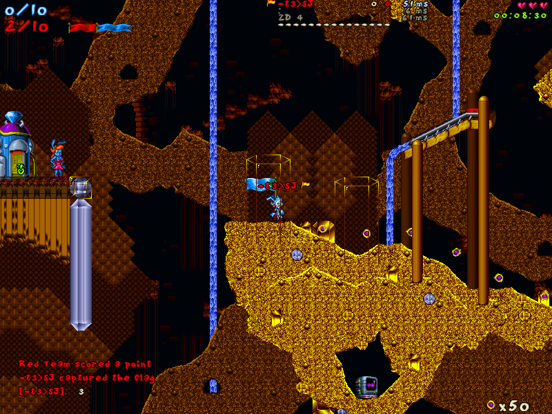
6.4 flag symbol
hello,
in 6.4 the flagholder has the orange flag symbol added at the end of his name above the rabbit in the game. can you please make this feature toggleable? since the rabbit is already carrying the big flag, it's clear that his player is the flagholder so it seems like that little flag symbol makes the player name longer for no important reason. the yellow star being attached directly onto the name took a bit less horizontal space. at least so far multiple players have stated that they dislike the name being made longer by the flag symbol being attached to it. in the playerlist the orange flag symbol appears at the left side, away from the player name. when we want to QUICKLY see in playerlist who is flagholder, it's sometimes not clear who it is using only a blink of an eye, bcs the symbol is now farther away from the name. when the flag star was still written directly at the flagholder's name in the playerlist, one could always identify the flagger quickly enough. would be cool if the flag symbol (whether its an actual flag or just the start like before) can be attached directly onto the name of the flagholder in the playerlist like before. this way its always INSTANTLY clear who is flagholder and a blink of an eye is 100% enough to see it correctly. |


| Nov 22, 2025, 12:12 PM | |
|
actually on a second thought, we do we need any symbol at all added to the nickname of the flagholder above the rabbit ingame? since the big flag is attached to the rabbit, everyone who sees that player knows that this is the flagholder. perhaps one doesnt need any symbol there at all.
as for the flag symbol in the playerlist: ofc it looks cleaner this way when its on the side and not attached to the nickname in the playerlist and it works out in most situations. but like i said, sometimes in some chaotic/fast paced moments u only wanna spend a blink of an eye to check in playerlist which opponent has the flag now. and in those moments it's simply easier when the flag symbol is attached to the nickname (like the yellow star was before) and now away from it. so u cant mistake which player has the flag, which is possible when u only spend a blink of an eye checking who is flagholder now when the symbol is on the left side there like it is now. |
| Nov 22, 2025, 01:44 PM | |
|
Personally yes, I strongly want the symbol next to the flagholder ingame. Everything else in CTF is red and blue, so seeing a little orange symbol makes me think "oh this is a flag holder, this is actually important." BlurredD made a good decision adding that to the game. And of course you want it for all the other gamemodes and mutators.
I'm absolutely open to discussion about where the flag (, padlock, star, brain, skull, assorted mutator icons...) should appear in the player list or the chat. I would just caution people to wait a few days before having strong opinions. Whenever there's a visual change, it's really easy to say the old way was better no matter what the change was. First impressions aren't always the most reliable. One particular problem with having the symbol be on the right of the player's name in the player list is that it looks bad on players with long names. It starts running into their stats and making everything hard to read. If the symbol is always in the exact same horizontal spot in the list, independent of the length of players' names, it should be much easier to find. |

| Nov 22, 2025, 02:30 PM | |
|
yes i get the idea of visually highlighting the flagholder bcs of importance. but we can see it already bcs he is carrying a big flag, even if its red/blue. would it be possible to make it toggleable? in wrn's mutator there are multiple toggleable visual features as well. this way everyone can adjust the settings to their liking.
yes, if the nickname is too long it can also get confusing if the symbol is hidden behind stats, but afaik there are not many players where this applies. myb splat when he changes his nick sometimes XD however i agree, lets wait a while and play some more before making a final judgement |
| Nov 23, 2025, 10:18 PM | |
|
Regarding the player list and being able to check it quickly, I think we could do well by just moving some things around, here's an initial take:
Current:  Alternate:  Some caveats:
ETA: some possible muted player designs 
Last edited by Violet CLM; Nov 24, 2025 at 01:11 PM. |
| Nov 29, 2025, 01:00 PM | |
|
i like the idea of having flag symbol being closer to nickname in your alternate version. but if one would login as admin there, would the flag symbol and nickname be separated farther by the "A" symbol?
from what i read in the community, most active players prefer the old design with "S" instead of eyes symbol and the flag symbol (whether it's flag or star) being attached directly to the nickname in playerlist. can these features be made toggleable so everyone can just select their perfered visual settings? |
| Nov 29, 2025, 05:44 PM | ||||
|
Quote:
Quote:
So if there are people who don't like one sprite or another, but do prefer a different sprite, it would be so much more helpful if they could say what they like about one sprite and what they don't like about a different sprite. Falling back to 'S' or '*' is not great, we want something that new players can look at and actually understand, but for that, we need people to actually say what their feelings are. Quote:
Like, there are a whole bunch of different possible layouts for the player list, and some of them we just don't bother with. We could put the roasts on the left side of the player name, and the deaths on the right side. But we don't, and we don't even make that a toggleable option, because it's so intuitive that would be bad. In the current design, having player icons like skulls and flags and brains in a consistent horizontal location is much more intuitive: you can easily find the icon, and then you know exactly where to look to find the name from there. It's slower if they're attached to a bunch of jagged, variable-width player names which you have to scan individually. Again, it's also a problem with long names and/or wide icons: the old design would look pretty bad when playing Condemned or Gold Rush. The issue you identified in your opening post, that there's too much horizontal space between the right edge of the icon and the left edge of the name, is valid, but also solvable. And also, keep in mind, this is more toggleable than it used to be! BlurredD added the gold asterisk to JJ2+, and you couldn't do anything about it. Now you can replace any icon you want with any other sprite you want, including a capital S or an asterisk if you're really attached to them. You can use jjPLAYER::iconSet or save over the frames in PLUS_PLAYERSTATEICONS. |
||||

| Dec 2, 2025, 02:19 AM | ||
|
Quote:
|
||
| Dec 2, 2025, 11:30 AM | |
|
Here's my thoughts:
- What if there is just no icon at all for spectators? They have grey names in the scoreboard and in chat. This communicates more than enough that this player is inactive. Whether or not they are spectating is not so important, whether they are part of the game is. A golden S or eyeballs don't really communicate that a whole lot better, it really just clutters the screen by communicating the same thing twice. And while we're at it, it should be good to also remove the roast 0 and the red death 0 scores from anyone that is spectating. - I tried the green back panel, but it just looks ugly. I can't really go explain it into detail either since it's subjective, but translucent backpanels without any canvas edge or pattern look very cheap to me. Also some characters like 'y' clip through the translucency. Also, like Kev I didn't notice the backpanel at first since it's behind the text/icons you would be looking for. It doesn't do a good job at communicating information to the player and what that information is. I think for the admin I suggest to draw a small green cog icon instead of the green A, and make it only visible at a double f9 press instead of a single one. - I don't like that the flag icon exists in both the left side and right side of the player name. Was this not consistently on the right before? - For further clutter removal, remove the '+' icon whenever server has /plusonly on.
__________________
Last edited by FawFul; Dec 2, 2025 at 12:02 PM. |


| Dec 2, 2025, 01:18 PM | ||
|
Quote:
|
||
| Dec 3, 2025, 02:29 AM | ||
|
Here's a build with Faw's ideas for admins and spectators.
Quote:
|
||
| Dec 3, 2025, 07:35 AM | ||
|
Quote:
__________________
|
||
| Dec 3, 2025, 10:35 AM | ||
|
Quote:
- Spectator mode and roast/death removal and ping ms in grey is very satisfying. I don't miss the spectating symbol whatsoever and it's one of those changes that seem so simple and better. - The green cogs upon seeing it I'm not sure about my own idea. The icons do not overlap like the 'A' did and it kind of resembles a flower more than a cog maybe? I'm questioning if a player less familiair with the icons can destillate what those UI icons are meant for. Not saying the icon looks bad, there is also not a lot of pixels and room to work with. Maybe a double f9 press should just spell out the full 5-character word 'Admin' for full clarity? It's longer, but still a short word and with it it leaves no ambiguity. I'm trying to weigh all the options and I think the clarity of 'Admin' makes sense to me for how little extra it shows, besides since it's moved to a double f9 press tab it wouldn't be held onto regardless. - I prefer the flag icons to always appear on the right side of the name like it was before. It was consistent when chat, scoreboard and player overhead had the flag/asterisk icon on the right next to the player name. Also doing it like that way stops any misalignment of the word/icon for admins. - Also because of the flag icons the chatlogger no longer logs the flag carriers chatting. maybe it can log a [Flag]?
__________________
|
||
| Dec 3, 2025, 11:29 AM | ||||
|
Quote:
Quote:
Quote:
|
||||
| Dec 4, 2025, 10:22 AM | ||
|
Quote:
Also maybe move the green icon further left so there's always room for the flag symbol and the icons always align vertically? About the chatlogging. On second thought, this is probably not interesting because it says who captures the flag, who loses the flag and who scores. So forget about this.
__________________
Last edited by FawFul; Dec 6, 2025 at 09:21 AM. |
||
| Dec 7, 2025, 01:55 AM | |
|
I think these are good steps towards the right direction. One thing I noticed regarding the flag-icons in the chat, but which may or may not be related to this feature itself;
 When using h.mut to teamchat flagholder's health automatically, there is a roughly a 50% chance that the flag icon is not displayed in the chat when a player captures the flag, but I haven't identified any clear pattern to this. It could be also an issue in h.mut itself, so I'm not sure if it's directly or indirectly related, so just an observation. Back to the main topic; I also seem to prefer the absence of additional spectator metadata and in that sense the player list looks much cleaner to me than before. I personally don't have much of a preference whether the flag-icon should appear on the left or right side of the player name in general, but I sense that the strong preference in the online community (without any concrete statistical data) is that the flag-icons appear on the right side, like previously. The flag-icon itself should be alright, from what I understood. What if the cog-icon was white? Or would that make it look like a "daisy"?
__________________
Find It Out SP: https://www.jazz2online.com/downloads/9371/find-it-out-single-player/ MP: http://www.jazz2online.com/J2Ov2/downloads/info.php?levelID=5021 |

| Dec 9, 2025, 12:59 AM | ||||||
|
Quote:
Quote:
Quote:
Quote:
Probably a more sensible version of h.mut would have the server send all the messages, instead of letting the clients do it--clients make mistakes! This would also fix the issue where a client thinks they get a carrot but actually they don't, so they send a lot of different health numbers (e.g. 2, 3, 2) in quick succession. The server would send custom packets via jjSTREAM and then players could mock up pretend team-chat lines using jjAlert. Quote:
|
||||||
| Dec 10, 2025, 11:51 AM | |||
|
Quote:
Quote:
But a bit beside the topic, would it still be feasible to make the player list reordering with icon-changes optional by using a menu icon-toggle to switch between the modern and classic view? Although I don't have much of a personal preference, these matters seem to be heavily opinionated.
__________________
Find It Out SP: https://www.jazz2online.com/downloads/9371/find-it-out-single-player/ MP: http://www.jazz2online.com/J2Ov2/downloads/info.php?levelID=5021 |
|||
| Dec 10, 2025, 09:16 PM | ||||
|
Quote:
Quote:
Quote:
|
||||
| Dec 10, 2025, 10:03 PM | |
|
For example, off the top of my head, here's a list of design problems that are fixed by 6.4:
|
| Dec 12, 2025, 02:23 AM | ||
|
Quote:
Tried for a sharper cog with fewer indents. As I mentioned, it's impossible to have admin icons a) always align vertically, b) be on the left of player names, and c) not come between player names and gamemode icons. So I tried moving admin icons, and mute icons, and plus version icons, over to the right, where less important stuff lives. And also moving the whole player list over to the left to compensate--it's always been weird how off-center the whole thing is. |
||
| Dec 12, 2025, 08:29 AM | ||
|
Quote:
1) I like that the cog is moved to the right. And the icon looks a lot better now! The only thing i'm still noticing that stacking the icons overlaps the icons and has a cutoff point for the x and y space it has. This doesn't happen for standard textual based icons the game already had. Like stacking Y characters underneath each other would not cutoff the icons. Is there a possibility to fix that?? 2) There is a bug(?) that when you press f9, the player ID number doesn't show up at all, except when you open chat, and put in the "/" in your chatbox, only then the playerID numbers suddenly appear in your f9. It's only when starting your chat message with "/". Is this intended for things like /kick, mute, /ban or /rename commands? I much prefer the idea of seeing the numbers at all times. First, I often want to have a rough idea of how many players there are in the server, for events like bash activity, for making teams and map sizes. Second, even when handling the commands, it makes more sense to first search up a player number and then type out the command action. Now it requires you to preset the command, then go look in the f9 menu and then go back to the command to finish your command action. So chronologically it requires an extra step. 3) Bug with teamname color not updating when switching gamemodes. It fixes itself when using /swap, !swap, spectating on and off or rejoining. Bug also happens in reverse where teamcolor also stays on whenever switching from a teamgame to a free-for-all game (white name). However it the bug doesn't happen when switching from teambattle yellow/green to a teamgame with 2 colours red/blue.
__________________
Last edited by FawFul; Dec 12, 2025 at 08:45 AM. |
||
| Dec 12, 2025, 11:25 AM | ||||
|
Quote:
Quote:
Quote:
|
||||
| Dec 12, 2025, 12:09 PM | |||
|
Quote:
I think it was the eyes-icon that was clearly throwing people off since the release, so it was safe to remove it also due to redundancy as you explained. Quote:
__________________
Find It Out SP: https://www.jazz2online.com/downloads/9371/find-it-out-single-player/ MP: http://www.jazz2online.com/J2Ov2/downloads/info.php?levelID=5021 |
|||
| Dec 12, 2025, 01:43 PM | ||
|
Quote:
I'm realizing that people may be looking at the screenshots from the first test build and ignoring the download links for the second and third test builds, so here's the current state of affairs:  Increasing levels of detail: single F9, double F9, double F9 with player numbers and mute symbols. |
||
| Dec 12, 2025, 08:25 PM | ||
|
Quote:
About the player numbers, this is why I said it's a rough idea, as in an indication. Also something completely new i've always found confusing. But what does "baud" mean. Are those the packet amounts? if so would it make more sense to call them "packets" instead of "baud"?
__________________
Last edited by FawFul; Dec 13, 2025 at 01:11 PM. |
||
| Dec 13, 2025, 01:45 AM | ||
|
Quote:
I know the cog icon was colored green to resemble of the green 'A' for Admin, but in this case I would rather try to make it look like an actual cog image as much as possible to enable the new memory connection of a cog-icon standing for remote admin access. How would it look like if it was roughly the same color as the spectator name characters (dark grey or so)? My imagination tells me that this would make it look closest to a cog image, which could make it slightly more difficult to spot, but I'm not sure if that is necessarily a problem. I'm not yet sure what I think of conditionally hiding the player numbers themselves, but I also cannot think of a better option at the moment. This might be another one of those changes that ultimately is a matter of getting used to, but it might also be quite a radical change for some people to digest. I'm also wondering, whether it is better to jump the player names to the right or the game icons to the left in order to make room for the player numbers and make it easier to notice the addition of extra data. A bit besides the points mentioned regarding the player list; As since the beginning, exceptionally long player names will overlap with the right side information like player stats, as shown in the screenshot below. Since we're touching the player list in general here, I think it could be worth optimizing on the same go as well. 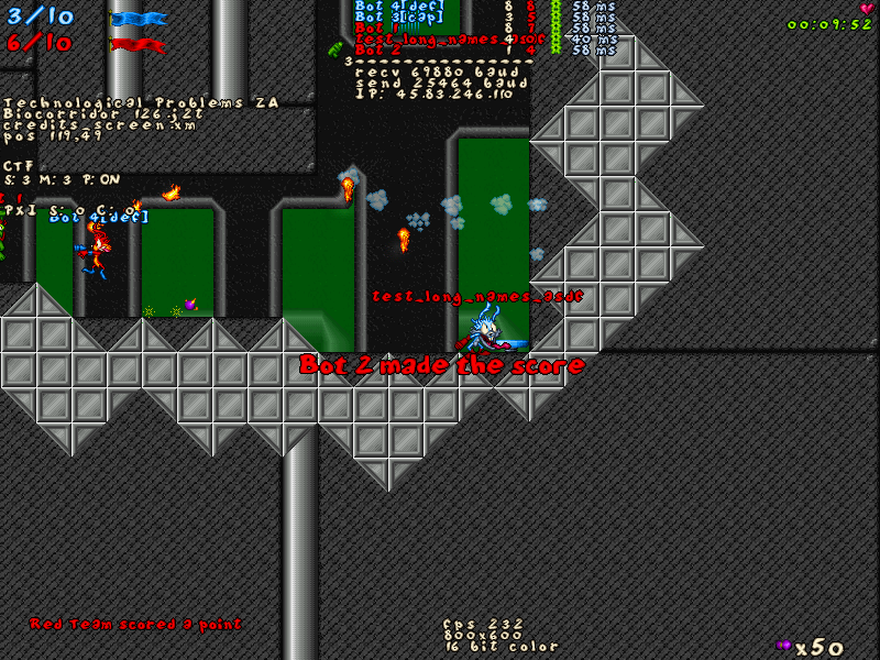 Since I doubt that people will want more empty space between short player names and player stats, I think the only reasonable is to further limit the maximum length of a player name, to let's say 15-16 because that seems to be on the border. If 16 is a safer choice in case of people playing with clantags etc. Then maybe a few more pixels (like 4-8?) could be added to the distance of player stats to the right? Considering this, we probably shouldn't be moving the player names conditionally depending on the display of player numbers.  I ran a quick scan on different player names found on https://jj2multiplayer.com/leaderboa...&mode=CTF_TEAM and it seems that the longest player names (13 characters) currently belong to [CDF]spaceboy and k43rSPLATinum. Otherwise to me it seems to me that people are generally used to short player names. One question regarding the game mode icons themselves; How many of those is it possible to have on a player simultaneously? Like is there any kind of a combination game mode where there could be more than 1 icon at a time? Or what is possible to achieve via scripting? Etc.
__________________
Find It Out SP: https://www.jazz2online.com/downloads/9371/find-it-out-single-player/ MP: http://www.jazz2online.com/J2Ov2/downloads/info.php?levelID=5021 |
||
| Dec 13, 2025, 10:38 AM | ||||||
|
Quote:
Quote:
(JJ2+'s current cog icon, used in the updater changelog screen, is blue, but I don't pretend that needs to be emulated.) Quote:
Quote:
Truncating player names altogether would probably go over badly, but I could get behind truncating them (based on pixel width) only in the player list, in order to, as you say, avoid overlapping the gems/deaths/whatever numbers. Quote:
Examples |
||||||
| Dec 13, 2025, 11:26 AM | ||||||
|
Quote:
Quote:
Quote:
Quote:
Quote:
I guess there ain't no easy solution to these, considering that we have to live with a 800x600 area on a computer screen. Perhaps if we one day raise the resolution to 1024x768 (and break a bunch of level visuals and change how they play etc), we can find more elegant options to try.
__________________
Find It Out SP: https://www.jazz2online.com/downloads/9371/find-it-out-single-player/ MP: http://www.jazz2online.com/J2Ov2/downloads/info.php?levelID=5021 |
||||||
| Dec 13, 2025, 11:40 AM | ||
|
I don't think the IP addresses are the biggest concern, in that most players in any given server are not the host, and even the host only sees them when double F9 is on, and they're drawn in front of everything.
Honestly, truncating the names (by pixel width) might be the missing piece of the puzzle here. What if there were three possible left-to-right orders:
This does bring back inconsistency, unfortunately, but only for specific mutators, and only because it seems like there's no option that involves leaving icons to the left of numbers that satisfies everyone. I suppose this would involve leaving the player numbers in all the time. It looks nicer without them, but Faw makes a reasonable point here: Quote:
|
||
| Dec 13, 2025, 01:14 PM | ||
|
Quote:
__________________
|
||
| Dec 14, 2025, 02:10 AM | ||
|
Quote:
I tried playing around with the gear-icon in the particular branch a bit and I came up with 2 candidates for the palette that would look alright to me. I know these matters are highly subjective and you might not necessarily agree with me, but in my personal opinion these do already look better, albeit it might take some time to get used to this kind of more subtle symbol for showing that a player is remote admin. I also moved the icon 2 pixels downwards so that it is more aligned with the rest of the text like pings and the most top icon will be fully visible too. EDIT: Of course, I forgot about the mute-icon at first, but naturally that would benefit from this y-position tweak too. For the first option I simply tried the normal drawing mode with the image's original palette. The only nitpick I have with this one is that the icon colors are quite close to the number of roasts/points/whatever, but I would still be fine with it if others perceive it to be fine.  The other option that I would be personally happy with as well, is this more "cold grey" palette shift (by value 8), which on the other hand is a bit closer towards the ping colors for players in game, but still more matt so it should be probably distinguishable enough. 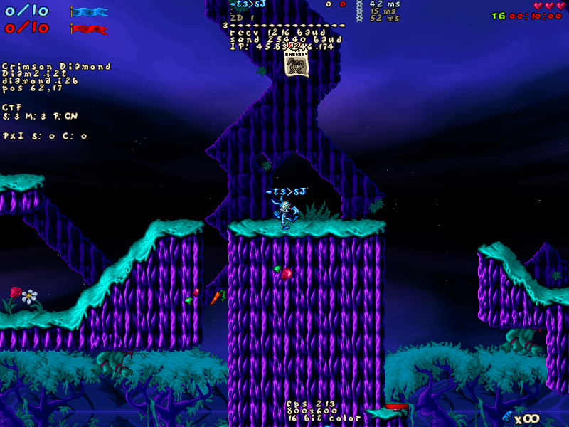 One additional thing I wanted to highlight regarding the display of remote admin icons on Double F9 is that there may be a couple of use cases where it is beneficial to know whether a player is remote admin or not, without extra steps. For example when you start typing in a chat message that is meant to be received only by remote admins via > or /, so you may want to double check who is logged in and who is not. If there is no better solution idea, the remote admin icons could be simply activated upon entering chat mode (if not already activated via Double F9 dashboard). Another case is when you should know whether you are logged in by yourself in the first place in order to use remote admin commands/chat (but there could be alternative ways to display this). While writing this message, I also quickly tried editing the code to always display remote admin icons in the player list, but I admit that it does look a bit distractive and overcrowded given the new design, so maybe let's not aim for that in the first place.
__________________
Find It Out SP: https://www.jazz2online.com/downloads/9371/find-it-out-single-player/ MP: http://www.jazz2online.com/J2Ov2/downloads/info.php?levelID=5021 Last edited by Superjazz; Dec 14, 2025 at 02:25 AM. |
||
| Dec 15, 2025, 04:56 AM | |
|
What if we contracted the spacing of the text instead of truncating the names?
__________________
Mystic Legends http://www.mysticlegends.org/ The Price of Admission - Hoarfrost Hollow - Sacrosanct - other - stuff |


| Dec 15, 2025, 07:38 AM | ||||
|
Quote:
Quote:
Quote:
|
||||
| Dec 21, 2025, 01:53 PM | |
|
Another build
 This tries out the stuff from the last few posts: contracted player names if they're too long, brown cog icons with darker edges, an optional "wide" argument at the end of jjPLAYER::iconSet and a "Ragged Flags" icon in the plus dropdown menu for people who want flags specifically to be on the right sides of names like they used to be. I didn't go through the effort of making ragged flags a chat command or a plus.ini setting because we're just trying stuff out here, sorry full-screen players. At some point I hope to see Kev reply to all these various test builds and discussions, since this is his thread 
|
| Dec 22, 2025, 03:59 PM | |
|
This build looks really good to me
Can 'Ragged flags' be made universal to also work with other default modes like JB and maybe also custom gamemodes using icons? And renamed to 'Swap scoreboard icon position'? Can 'Streaming' be renamed to "Streamer mode?" The first is ambigious as it can mean streaming your game. Also the second feels familiair with discord. For a moment I wondered if this is maybe a bit hidden and if it should tell you "IP: Streamer mode enabled". But it's confusing, and actually why does any client need the user IP anyway. Wouldn't mind if this is just defaulted true and let ppl that really need the base feature/IP for whatever reason figure it out.
__________________
|
| Dec 25, 2025, 03:35 AM | ||
|
Quote:
The ability to toggle between the left and right alignment for icons is definitely a safe bet, while I'm personally fine with both alignments. If there are no objections to these from the community, I think the icon alignment can be further applied to other game modes as well. Imo it should be called 'Classic icon alignment' or something like that in the Plus menu, possibly with a similarly named command and plus.ini configuration option. Unfortunately Kev said some time ago that he will be taking a break from JJ2 for some time. I don't remember if the timespan he mentioned was 3 weeks or 3 months or something else, but it might take a while until we hear back from him. That's why it would be especially important that other MP community members participate in giving feedback, especially to this test build.
__________________
Find It Out SP: https://www.jazz2online.com/downloads/9371/find-it-out-single-player/ MP: http://www.jazz2online.com/J2Ov2/downloads/info.php?levelID=5021 |
||
| Dec 29, 2025, 07:09 PM | |
|
Classic icon alignment sounds good to me also. Perhaps "position" instead of "alignment" is easier for non-native english speakers though. Also I wouldn't yet know how to turn it into a command. /classiciconalignment on/off doesn't really work. Does every option need a command?
It would be helpful for others to react to this thread if kev is going to take 3 months, maybe by posting it in the "suggest ideas" channel.
__________________
|
| Jan 2, 2026, 06:16 PM | ||||
|
hi I'm less sick now
Quote:
Suppose there is a single boolean setting, like most other settings. When the setting is off, I assume all icons are on the left. When the setting is on, flags are on the right, but what about padlocks and skulls? To me, "universal" sounds like it would put padlocks/skulls on the right, but "classic" sounds like it would leave them both on the left. But Faw has endorsed both words. Quote:
Quote:
|
||||
| Jan 2, 2026, 09:01 PM | |
|
ok if i get it correctly, following changes are currently on the line:
- remove stats of spectators, bcs they are useless - remove spectator symbol, bcs spectators' names are grey, indicating they are not playing - remove admin symbol on the left side, but add it to the right side - admin symbol only gets visible by pressing F9 twice - new admin symbol - player list now in the middle of the screen - flag symbol in playerlist toggleable either left of the name OR right of the name (like before) is that all correct? if that's the case, then i rly like these changes. fawful presented really fine ideas in this discussion. the playerlist is a bit cleaned up now. also yes violet, pls keep the flag symbol on the ingame nick name. earlier i suggested to remove it, bcs one can already clearly see that a player is the flagholder bcs he's carrying the flag itself. but the flag can get hidden behind objects (like inside the trees on Jungle's Edge). so it can be valuable to have the flag symbol still added there. thanks for the efforts everyone! |
 |
«
Previous Thread
|
Next Thread
»
| Thread Tools | |


|
|

All times are GMT -8. The time now is 09:11 AM.
Jazz2Online © 1999-INFINITY (Site Credits). Jazz Jackrabbit, Jazz Jackrabbit 2, Jazz Jackrabbit Advance and all related trademarks and media are ™ and © Epic Games. Lori Jackrabbit is © Dean Dodrill. J2O development powered by Loops of Fury and Chemical Beats. Powered by vBulletin® Copyright ©2000 - 2026, Jelsoft Enterprises Ltd.
Original site design by Ovi Demetrian. DrJones is the puppet master. Eat your lima beans, Johnny.