


| Feb 19, 2006, 06:35 PM | |
|
We should leave the statue of the man screaming in pain canary yellow, so Frank gets that happy bright color he wanted.
Clam pag.
__________________
GENERATION 22: The first time you see this, copy it into your sig on any forum and add 1 to the generation. Social experiment. <i>"This picture shows me that the gray bird man is just a bully and picks on smaller birds. Just because he has no friends and takes it out on others smaller than him to look good. I can see in the parrats eyes that it does however have a understanding of the gray bird man and is upset about getting cut."</i> - Speeza on cartoon birds. |


| Feb 19, 2006, 07:23 PM | |
|
Do not mess up the words "page claim" next time, or I shall STEAL IT FROM YOU.
Anyways, that idea is sux. >(
__________________
I'm sick and tired of this community. So goodbye. PS: Unreal > JJ2. |

| Feb 19, 2006, 07:32 PM | ||
|
Quote:
And I'll pag all the clams I want, thank you.
__________________
GENERATION 22: The first time you see this, copy it into your sig on any forum and add 1 to the generation. Social experiment. <i>"This picture shows me that the gray bird man is just a bully and picks on smaller birds. Just because he has no friends and takes it out on others smaller than him to look good. I can see in the parrats eyes that it does however have a understanding of the gray bird man and is upset about getting cut."</i> - Speeza on cartoon birds. |
||
| Feb 19, 2006, 08:06 PM | |
|
I'm working on a "Bunny" gargoyle-thingy... Don't ask why.
BTW: The "Screaming" one looks like he's smiling.
__________________

|

| Feb 19, 2006, 08:35 PM | |||
|
Quote:
 the other one makes my eyes hurt. Quote:
__________________
This message has been deleted by Fquist. Reason: "gj moo!!! :P" does not contribute to topic in any way |
|||


| Feb 20, 2006, 12:18 AM | |
|
this is a wrong color. I dont like it. It doesnt fit
  I say, keep the ladder. Can someone please update the tileset image now? WIth the old grassy plants, gargoyles in 2 colors, background tiles, ladder,.. do I forget something?
__________________
|

| Feb 20, 2006, 05:30 AM | |
|
Hey guys, 8 days left so far, so instead of random eyecandy we could do something practical like castle/grass transitions and actually some caves for the purple dirt.
|


| Feb 20, 2006, 05:35 AM | |
|
As for transitions, check out that image Franky posted. He mixed ground and brick-tiles together, which looked pretty okay already, except that the black color of the bricks was darker ( I think ) than the other ground tiles.. so I guess they should be made the same.
__________________
 |


 purple caves^^
| Feb 20, 2006, 08:50 AM | |
|
Also, the nonexistance of a distinction between ground and cave tiles hasn't been addressed yet. Are you just going to provide the same tiles in a masked and unmasked version? That would be quite confusing.
__________________
Interesting Jazz-related links: Thread: Gameplay Theories - Thread: Make Up Your Own Gametype |

| Feb 20, 2006, 12:15 PM | |
|
My understanding was that we don't have cave tiles... at least, I haven't seen anything that didn't look like the walls.
(I use "we" loosely.) |


| Feb 20, 2006, 12:40 PM | |
|
Yeah, there needs to be a cave background to match my purple cave tile ground stuff. Or was that not what you were saying?
__________________
<img src="http://i25.photobucket.com/albums/c100/Ashton_JX/the_web/stupid_prize.gif" border="0" alt="The rodent thingy wasn't worthy."> I would not want anyone having sex with my cocktail. ~ Radium |

| Feb 20, 2006, 08:25 PM | |
|
If that's going to be caves, then there should probably be more solid ground tiles.
__________________
<div style="float: right; width: 100px; height: 70px; margin: 5px 15px;"><img src="http://madskills.org/monolith/idleserver.gif" style="width: 98px; height: 65px;"><img src="http://madskills.org/monolith/theserver.gif" style="width: 98px; height: 65px; position: relative; top: -65px;"></div><div style="margin: 0 3em; font-size: 80%; font-style: italic;">Love is patient, love is kind. It does not envy, it does not boast, it is not proud. It is not rude, it is not self-seeking, it is not easily angered, it keeps no record of wrongs. Love does not delight in evil but rejoices with the truth. It always protects, always trusts, always hopes, always perseveres.</div><div style="text-align: right; text-size: 80%;">1 Corinthians 13:4-7</div> |

| Feb 21, 2006, 04:15 AM | |
|
I like the idea of ground and cave being the same color.. or at least almost the same. They should be distinguishable somehow...
As far as I know, it hasn't been done before, and it would allow for some in my opinion pretty cool level-designs, like in Super Mario, where you can see all those rectangular mountains but you can only walk on top of them...
__________________
|
| Feb 21, 2006, 08:44 AM | ||||
|
Well, the soil/grass tiles still tile poorly, aren't user friendly, and they could look better. It's also limiting that the right ledge requires the use of two tiles. I'll see what I can do once I get the chance. By the way, I think the cave tiles should be either some shade of blue or brown. And soil should stay the same color.
And while I have some time, soil/bricks transition tiles: 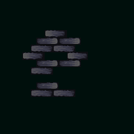
__________________
 |
||||


| Feb 24, 2006, 09:44 AM | ||||
|
Just so people don't think this month's LMAT died off, here's some of the progress I've made:
 I'm not done with all the details, and these tiles aren't being officially added just yet.
__________________
|
||||


| Feb 24, 2006, 12:42 PM | ||
|
Quote:
__________________
Interesting Jazz-related links: Thread: Gameplay Theories - Thread: Make Up Your Own Gametype |
||

| Feb 24, 2006, 06:25 PM | |
|
Eww. Oh well, have fun with this, everyone. You still have four days to figure out how to get rid of the red pipe stuff.
edit: that was not an instruction. Last edited by Violet CLM; Feb 24, 2006 at 09:37 PM. |


| Feb 25, 2006, 01:38 AM | |
|
I vote for making a tileset images with all the tiles put in. on this whole page, and I think on the biggest part of the previous page, there hasnt been any update. I really lost track of what is in, what is edited, what is out, what is not yet in..
@Blur: looks whee!
__________________
|
| Feb 25, 2006, 06:08 AM | ||||
|
Unknown Rabbit: Is there something in particular you don't like?
Birdie: I said those tiles weren't officially added yet, so please don't use them. FQuist: They should tile perfectly, according to what Unknown Rabbit set forth in this image.
__________________
|
||||
| Feb 25, 2006, 11:20 AM | ||
|
Quote:
|
||

| Feb 25, 2006, 02:28 PM | ||
|
Quote:
|
||

| Feb 25, 2006, 02:54 PM | ||||
|
Ugh... I was hoping Unknown Rabbit would't be so against my work, but it looks like I can't change any of his opinions at this point. I suppose two versions could be made, but the one that uses the original tiles (or the tiles edited by Neon) might as well not use the brick tiles either.
Violet, I particularly disagree with the "few possibilities" comment you made since I don't know what you had in mind and you didn't offer too much anyway. But I don't want to end this on bad terms. I just hope we can agree more on the next LMAT.
__________________
|
||||
| Feb 26, 2006, 12:58 AM | |
|
for now, LMATs seem to be doomed to die.
__________________
|
| Feb 26, 2006, 01:10 AM | |
|
Bad terms? Pff... I have nothing against you. I just don't like this as much as the way the tileset used to look. And I have no control over that, as this is a community project, and Cooba started it this time around anyway, and as you said I haven't really done much for it.
Don't bother making a different version. There is no reason to give me some sort of special powers. If I want to expand Deanset I'll do it myself when I have more time - have fun with whatever this ends up being called. |
| Feb 26, 2006, 02:42 AM | |
|
I can't say I'm particularly happy with the direction the tileset has shifted towards, but neither can I agree with what Violet said about the few possibilites issue. Sure, this tileset isn't as flexible as Kansas is, but that certainly doesn't mean nothing good can be made out of it.
Anyway, since two days left until February ending, we should really take a look at the tileset and consider whether some tiles should be there or not. I know that one may just not use tiles he/she dislikes, but on the other hand, such tiles might be as well spoiling the look of the tileset and overall making less people use it. So, here are the tiles I find questionable, and I want you all to state your stance on those. EU flag/Jazz statue These particular tiles were added between the 1st and the 2nd of February. They barely fit to the tileset back in the day they were added, and now they serve no real purpose in the current tileset theme as well. The rock statues These tiles actually kind of fit into the tileset theme as I see it, but unfortunately their very own quality destroys their point. We should either improve them somehow, or just delete them from the tileset. Smaller sky thing/Waterfalls The sky thing didn't serve much of a purpose (I wonder why have I added it in the first place) and the waterfalls look kind of ugly. I know that about 75% of the stuff is mine and I could easily delete it myself, but the other 25% is ShadowRabbit's horizontal version of my waterfall which serves little to no purpose and is even uglier as the vertical waterfalls. Shiny and less shiny Inferno trees I have no idea why were they added in the first place and by that they do nothing but waste tileset space (which is quite important at the moment). And now, here's some stuff we should add in the incoming two days. Event tiles This is what the tileset overall lacks. Hurt events, hooks, vines for the castle part, sucker tubes, maybe some warp tiles and perhaps a water block using the sky's texture? Slopes and a background for the cave tiles Self explanatory. Torches for the castle and cave part So that we had some ways of putting some color variety in the tileset. A roof for the castle Like Mike said. Last edited by cooba; Feb 26, 2006 at 03:46 AM. |
| Feb 26, 2006, 03:02 AM | |
|
I suppose I could extend the deadline in case things don't work well out...
Meanwhile, deal with this. Anarchy Inn-like horizontal rain and two white blocks which should go for a lighting (with the second one set on translucent.) 
|

| Feb 26, 2006, 01:49 PM | |
|
As for rain...
 I've never seen rain like this in a tileset, but I think it might work better.. granted, I have not tested it. Feel free to change it if something's wrong with it or so. And sorry for not contributing much of use.
__________________
|
 |
| Tags |
| let's make a tileset |
«
Previous Thread
|
Next Thread
»
| Thread Tools | |


|
|

All times are GMT -8. The time now is 07:18 AM.
Jazz2Online © 1999-INFINITY (Site Credits). Jazz Jackrabbit, Jazz Jackrabbit 2, Jazz Jackrabbit Advance and all related trademarks and media are ™ and © Epic Games. Lori Jackrabbit is © Dean Dodrill. J2O development powered by Loops of Fury and Chemical Beats. Powered by vBulletin® Copyright ©2000 - 2026, Jelsoft Enterprises Ltd.
Original site design by Ovi Demetrian. DrJones is the puppet master. Eat your lima beans, Johnny.